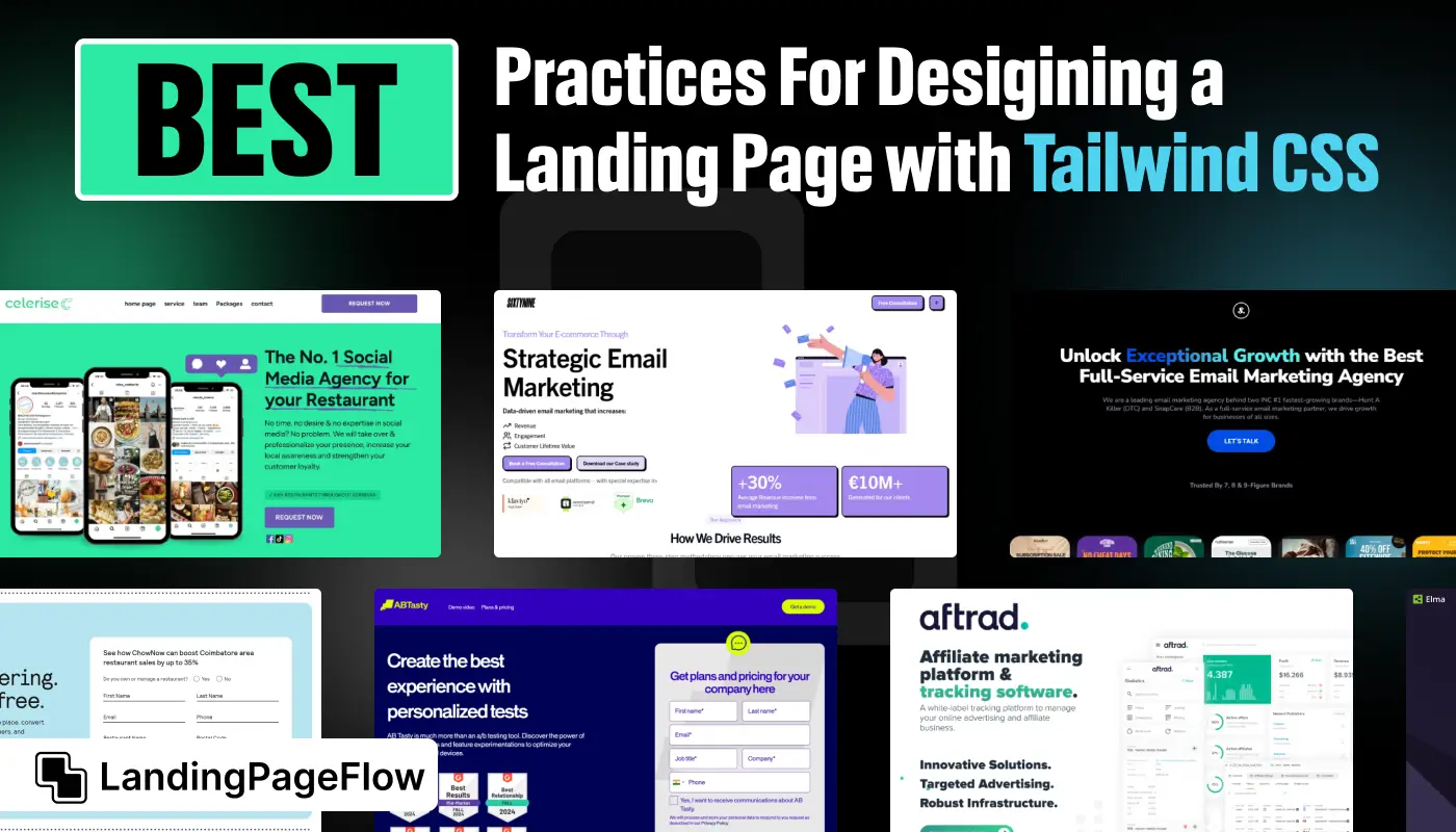
Crafting a landing page that adapts beautifully to any device is no longer optional, it’s essential for modern digital success. Responsive design ensures your visitors enjoy seamless browsing, no matter the screen size.
Tailwind CSS makes this process easier by giving developers ready-to-use utilities that speed up design and maintain consistency.
Every element of your landing page, from buttons to typography, must scale naturally across desktops, tablets, and smartphones. A responsive structure not only enhances user experience but also drives stronger conversions by reducing friction.
Tailwind CSS allows you to quickly prototype layouts while keeping them lightweight and visually balanced. An adaptive landing page also boosts SEO since search engines reward sites that provide mobile-friendly experiences.
A carefully structured, responsive design helps reduce bounce rates and improve rankings.
"Curious how top brands craft landing pages?
Grab your free Tailwind CSS strategy guide."
Table of Contents
- Why Tailwind CSS is Ideal For Responsive Landing Pages?
- Key Elements of a High-Converting Landing Page
- Best Practices For Building with Tailwind CSS
- Step-by-Step Guide For Designing a Landing Page
- Common Mistakes to Avoid
1. Why Tailwind CSS is Ideal For Responsive Landing Pages?

Tailwind CSS is gaining popularity for its utility-first approach, meaning it provides small CSS classes (utilities) that can be combined to build custom designs without writing new CSS rules.
This makes Tailwind an ideal framework for developers and designers looking to build fast, scalable, and responsive landing pages.
Here are some key reasons why Tailwind CSS works well:
- Mobile-first design: Tailwind promotes mobile-first development by encouraging you to build for smaller screens and scale up.
- Pre-defined responsive utilities: Its breakpoint utilities (
sm,md,lg, etc.) make it easy to design for multiple devices. - Customization without complexity: Tailwind allows extensive customization without requiring CSS overrides.
- Consistency and reusability: Pre-built classes ensure visual consistency and reduce development time.
- Performance-focused: Unused styles are purged from your final build, ensuring lightweight pages.
2. Key Elements of a High-Converting Landing Page

Every landing page must include certain elements to attract, engage, and convert visitors effectively. Here are the critical components of a successful landing page:
1. Clear and Impactful Headline
The headline is the first thing visitors see. It must grab attention and communicate your value proposition concisely and compellingly.
2. Subheadline or Supporting Text
The subheadline complements the main headline, providing additional information about your product or offer to persuade users to continue reading.
3. Eye-catching call-to-action (CTA)
A CTA button encourages users to take the desired action, such as signing up, making a purchase, or downloading a file. Make the CTA button visible and ensure it works on all screen sizes.
4. Visual Elements (Images or Videos)
Use high-quality visuals to engage users and make the page more attractive. Ensure images and videos are optimized and responsive across devices to avoid slow loading times.
5. Social Proof (Testimonials or Reviews)
Testimonials, customer reviews, or trust badges build credibility and reassure potential customers of your product’s quality.
6. Minimal Navigation
Landing pages perform best when they eliminate distractions. Keep the navigation simple or remove it entirely to keep users focused on the main goal.
7. Fast Loading Speed
Loading speed directly affects user experience and SEO. Compress files and use optimized assets to minimize load time. Tailwind CSS helps here by generating only the necessary CSS for the page.
3. Best Practices For Building with Tailwind CSS

1. Follow a Mobile-First Approach
Since a large portion of web traffic comes from mobile devices, begin designing your landing page for smaller screens and scale up for larger devices. Tailwind CSS encourages this practice by offering mobile-first breakpoints.
2. Keep the Design Simple and Clean
Minimalism is key to high-converting landing pages. Tailwind CSS’s utility classes make it easy to create a clean layout with proper spacing and alignment. Avoid unnecessary elements that could distract users.
3. Optimize for Speed and Performance
A responsive design must also be fast. Use compressed images and lazy-loading techniques to improve speed. Tailwind CSS automatically purges unused styles from the production build, keeping the page lightweight.
4. Maintain Consistent Typography
Tailwind CSS offers typography utilities that ensure text consistency across devices. Choose easy-to-read fonts and maintain a clear hierarchy with headings, subheadings, and body text.
5. Use Proper Spacing and Alignment
Balanced use of margins, padding, and grids improves readability and layout. Tailwind CSS allows fine-tuning with spacing utilities, helping you achieve perfect alignment on all screen sizes.
6. Test Across Devices and Browsers
A landing page that looks perfect on a desktop may not perform well on mobile. Regularly test your page on different devices and browsers to ensure consistent performance.
4. Step-by-Step Guide For Designing a Landing Page

- Define Your Goal:
Identify the purpose of your landing page, whether it’s to capture leads, promote a product, or drive downloads. - Plan the Page Structure:
Divide the content into logical sections, such as a hero section, features, testimonials, and a CTA area. Keep the layout simple. - Design the Mobile Layout First:
Use Tailwind CSS’s mobile-first utilities to ensure the page looks good on small screens. Then, enhance it for larger screens with breakpoints. - Add Visual Elements:
Incorporate responsive images or videos to keep the page engaging. Use background colors or gradients for contrast if necessary. - Create an Eye-Catching CTA:
Design the CTA to stand out with contrasting colors. Ensure the CTA button is easily tappable on mobile screens. - Incorporate Social Proof:
Add testimonials or client logos to build trust and encourage conversions. - Test and Optimize:
After designing, test the page on multiple devices and make necessary adjustments to ensure responsiveness and fast loading.
5. Common Mistakes to Avoid

- Overcomplicating the Design:
A cluttered layout confuses users. Stick to a simple structure that directs attention to the CTA. - Ignoring Mobile Users:
Failing to optimize for mobile users can lead to a poor user experience. Tailwind’s mobile-first approach ensures the design works on all screens. - Using Too Many Fonts and Colors:
Multiple fonts or clashing colors can disrupt the visual flow. Stick to two or three fonts and a consistent color palette. - Slow Loading Pages:
Large images and unnecessary code can slow down the page. Compress media files and purge unused CSS with Tailwind to keep loading times fast.
Conclusion
Strong landing pages aren’t just about aesthetic appeal, they’re about aligning design with results. Tailwind CSS provides the flexibility to build layouts that serve business goals while ensuring responsiveness.
A fluid design encourages users to stay longer, explore content, and engage with calls-to-action. Designers who adopt Tailwind CSS gain an edge in speed, scalability, and customization.
Every visitor expects mobile-ready content, and failing to deliver risks losing potential conversions. Building with Tailwind CSS ensures your landing page adapts intuitively to users’ needs.
Great performance, accessibility, and visual harmony come together when you follow proven best practices. Instead of struggling with inconsistent designs, you’ll have confidence in a solid framework.
By investing time in responsive design strategies, your landing page becomes a powerful conversion tool.

FAQ
1. Why should I use Tailwind CSS for landing pages?
Tailwind CSS provides utility-first classes that make responsive design faster, cleaner, and easier to manage, saving time on styling.
2. Can Tailwind CSS improve landing page performance?
Yes, Tailwind CSS generates lightweight code, which helps pages load faster and improves user experience across devices.
3. Is Tailwind CSS beginner-friendly?
Absolutely. While it has a learning curve, beginners quickly adapt since the framework relies on intuitive utility classes.
4. How does responsiveness affect conversions?
Responsive design ensures a smooth user experience across all devices, reducing bounce rates and increasing conversions.
5. Do I need to know advanced CSS to use Tailwind?
No, Tailwind CSS allows you to design visually appealing layouts without writing complex custom CSS.
6. Can I integrate Tailwind CSS with other frameworks?
Yes, Tailwind CSS works seamlessly with React, Vue, Next.js, and other popular frameworks, making it versatile.

Ansif


.webp)

