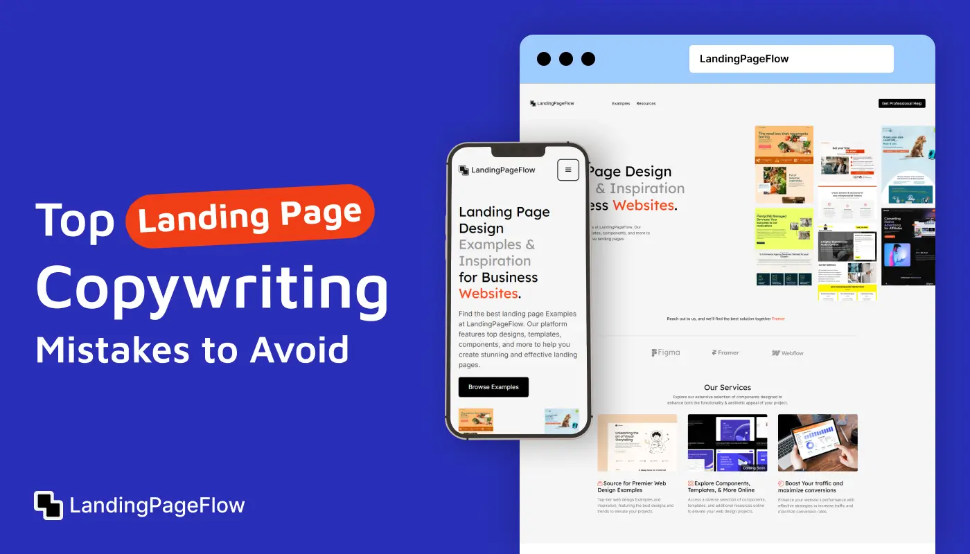
Using animation on landing pages in 2026 isn’t about flashy effects; it’s about creating a seamless, immersive user experience that builds trust, highlights your offer, and drives conversions.
Smart animation guides attention, improves readability, and adds emotional depth to your landing page design.
As user expectations evolve, static designs can feel outdated or disengaging. Visitors now look for motion cues that help them navigate, understand your content faster, and feel more connected to your brand.
From subtle micro-interactions like button hovers and icon shifts to bold scroll animations and parallax effects, motion can elevate the way users interact with your landing page.
But here’s the key: balance matters. Too much animation can slow down page load speed, distract from your call-to-action (CTA), or overwhelm mobile users.
The most effective animated landing pages strike a balance between lightness, purpose, and performance focus.
In this guide, we’ll walk you through the best practices for adding animations that convert, the top mistakes to avoid, and examples of how modern brands are using motion design to enhance clarity, visual hierarchy, and user engagement in 2026.
"Bring your landing page to life without slowing it down.
Schedule a free call & discover animation that converts."
Table of Contents
- What is a Landing Page?
- What is Animation in Web Design?
- Why Animation Matters For Landing Pages in 2026?
- Types of Animation You Can Use
- When to Use Animation Strategically?
- Benefits of Animation on Landing Pages
- Common Animation Mistakes to Avoid
- Examples of Animated Landing Pages That Convert
- Animation Tools for Non-Designers and Developers
- Animation in UX: Enhance or Kill?
1. What is a Landing Page?
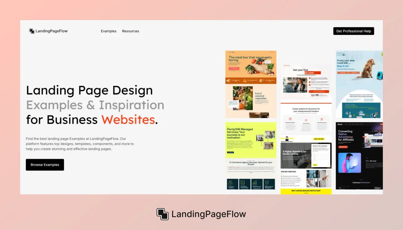
A landing page is a standalone web page created specifically for a marketing or advertising campaign. It's where visitors “land” after clicking on a link in an email, ad, or search result, and it’s designed with one primary goal in mind: conversion.
Unlike traditional websites that offer multiple navigation paths, a landing page focuses on a single offer or action, such as signing up, downloading, purchasing, or booking a demo.
This focused structure improves user attention, increases engagement, and boosts overall conversion rates.
In 2026, high-converting landing pages combine visual storytelling, fast performance, and persuasive copywriting to guide users from interest to action, often within seconds of arrival.
Pros:
✔ Higher Conversion Rates: Landing pages are built with a single goal, reducing distractions and increasing conversion efficiency.
✔ Targeted Messaging: Each page can be tailored to a specific audience segment, campaign, or product, boosting relevance.
✔ Better Ad Performance: When linked to paid ads, a focused landing page improves Quality Score and lowers cost-per-click.
✔ Easy A/B Testing: You can quickly test different headlines, CTAs, or visuals to optimize performance and user response.
✔ Data Collection Made Simple: Landing pages make it easier to capture leads through forms, surveys, or downloads.
Cons:
❌ Requires Ongoing Maintenance: To stay effective, landing pages need constant updates and testing based on performance data.
❌ Can Feel Disconnected: When not well-integrated, a landing page might seem isolated from your main website or brand.
❌ Limited Navigation: Minimal navigation improves focus but may frustrate users looking for more information or context.
❌ Risk of Overuse: Creating too many pages without a clear strategy can cause confusion and dilute your message.
2. What is Animation in Web Design?
Animation in web design refers to the use of motion-based elements to enhance user experience, guide attention, and create engaging interactions on a website.
These animations can range from simple effects like hover transitions and button movements to more complex features like scroll-triggered visuals, parallax effects, and micro-interactions.
In 2026, web animation is more than just decoration, and it’s a functional design tool used to improve navigation clarity, support brand storytelling, and drive conversion behavior. Well-designed animation helps visitors feel guided, informed, and emotionally connected to your content.
Modern landing pages often use animation to highlight key messages, visually explain products, or create dynamic storytelling experiences while maintaining performance and mobile responsiveness.
Pros:
✔ Enhanced User Engagement: Animations grab attention and keep users visually engaged, increasing session duration and interaction rates.
✔ Improved Visual Hierarchy: Motion can guide the viewer's eye to important content like headlines, CTAs, or form fields.
✔ Stronger Brand Storytelling: Animation adds personality and helps communicate your brand message in a more dynamic, emotional way.
✔ Better User Feedback: Micro-interactions (like button taps or hover effects) give users real-time visual feedback, improving usability.
✔ Higher Conversion Rates: Animated elements can highlight offers, show value, or explain features, supporting more effective conversion paths.
Cons:
❌ Slower Load Times: Poorly optimized animations can hurt performance, especially on mobile networks or slower devices.
❌ User Distraction: Too much motion can confuse visitors or draw attention away from your primary message or CTA.
❌ Accessibility Challenges: Animations may overwhelm users with cognitive or visual impairments if not implemented with care.
❌ Increased Development Time: Complex animations may require custom coding, increasing cost and production time.
3. Why Animation Matters For Landing Pages in 2026?
Surprisingly, animation isn’t just about adding flair in 2026, and it’s becoming a strategic tool to improve landing page performance, engagement, and conversion rates. Visitors expect smooth, interactive experiences that guide them through content without confusion or friction.
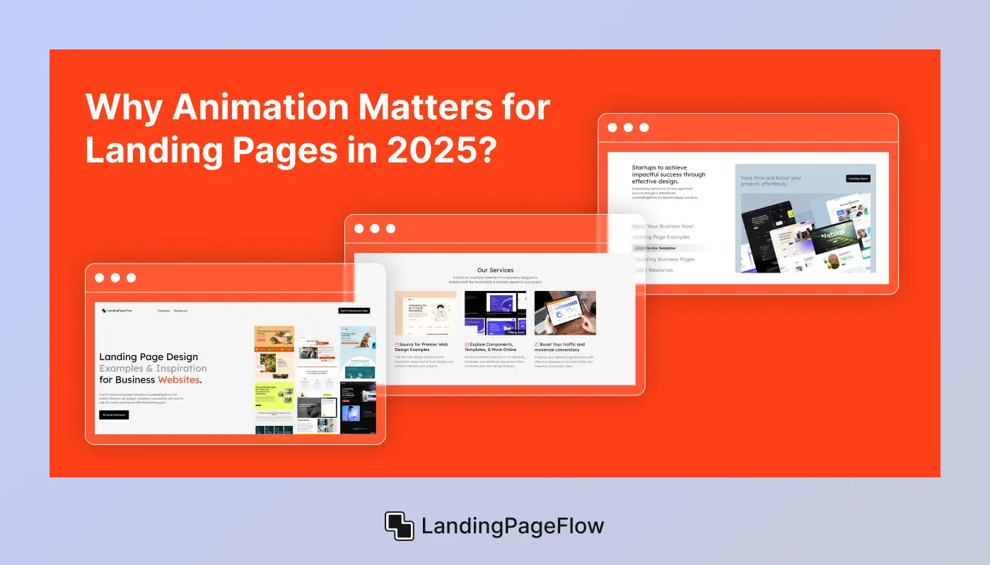
The following benefits highlight why animation is a game-changer in modern landing page design:
1. Reduces Bounce Rate
Motion-based engagement can hook users instantly, encouraging them to scroll and explore instead of leaving the page early.
2. Enhances Mobile UX
Smooth micro-animations and gestures offer a more intuitive experience for mobile users, improving navigation and usability.
3. Builds Visual Hierarchy
Animated entrances and staggered reveals help prioritize key sections, maintaining a clear information flow.
4. Supports Storytelling Through Visual Flow
Animation helps connect sections seamlessly, guiding users along a structured narrative that mirrors your sales funnel.
5. Makes Forms Feel Lighter
Animated progress bars, hover tips, and validation feedback make long forms feel less intimidating and more interactive.
6. Differentiates Your Brand
Subtle, purposeful animation gives your page a unique personality, instantly making your brand feel polished and modern.
4. Types of Animation You Can Use
In 2026, smart brands use targeted animation styles to improve engagement, reduce bounce rates, and guide users through a seamless experience. Each animation style serves a distinct purpose, and from emotional storytelling to functional clarity.
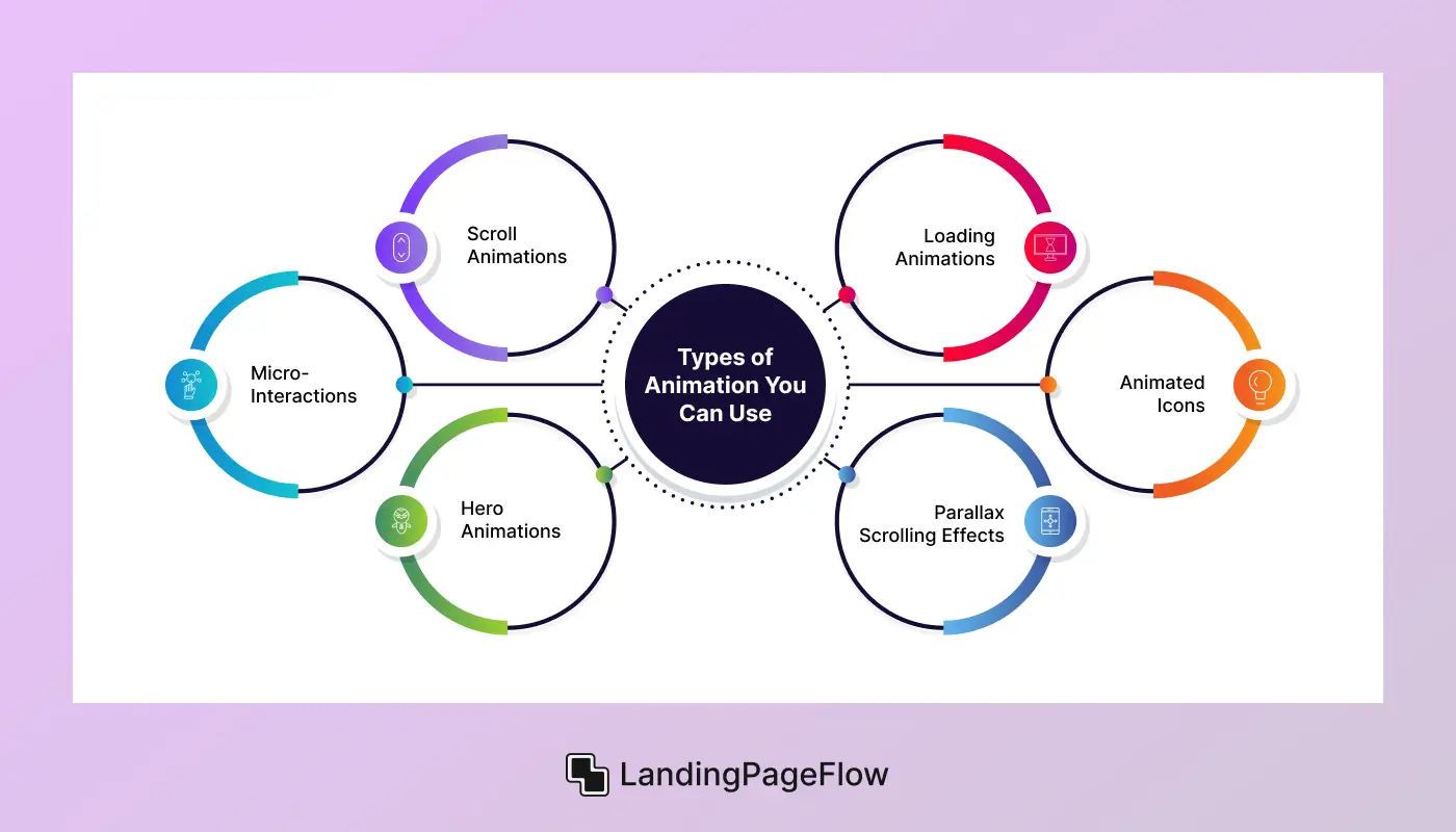
Here's how top-performing landing pages are applying them:
1. Scroll Animations
These trigger visual movement as users scroll down the page. They reveal content step-by-step, increasing user curiosity and encouraging deeper exploration of your offer.
2. Micro-Interactions
Subtle animations like button hovers, input highlights, or confirmation pops guide action without overwhelming users. They build interactivity and improve user satisfaction.
3. Hero Animations
Your first impression matters. Animated headlines, background visuals, or dynamic transitions in the hero section capture attention instantly and boost brand perception.
4. Loading Animations
Instead of a blank screen, animated loaders fill the wait time. They reassure users, reduce early abandonment, and make slower pages feel faster.
5. Animated Icons
Icons that pulse, rotate, or respond to cursor movement bring personality to key points. They help communicate complex ideas quickly and increase visual clarity.
6. Parallax Scrolling Effects
This animation creates a layered motion effect as users scroll, making background images move slower than foreground elements.
5. When to Use Animation Strategically?
The moment used purposefully, animation in web design can be a useful tool rather than just being used for show. End-users in 2026 want experiences that are quick, simple, and visually appealing.
Well-placed motion design can help with that. When used effectively, animation may strengthen brand identification, direct attention, and enhance usability without slowing down.
The key is knowing when animation adds value versus when it distracts. Below are smart, practical scenarios where animation enhances UX, storytelling, and overall landing page performance.
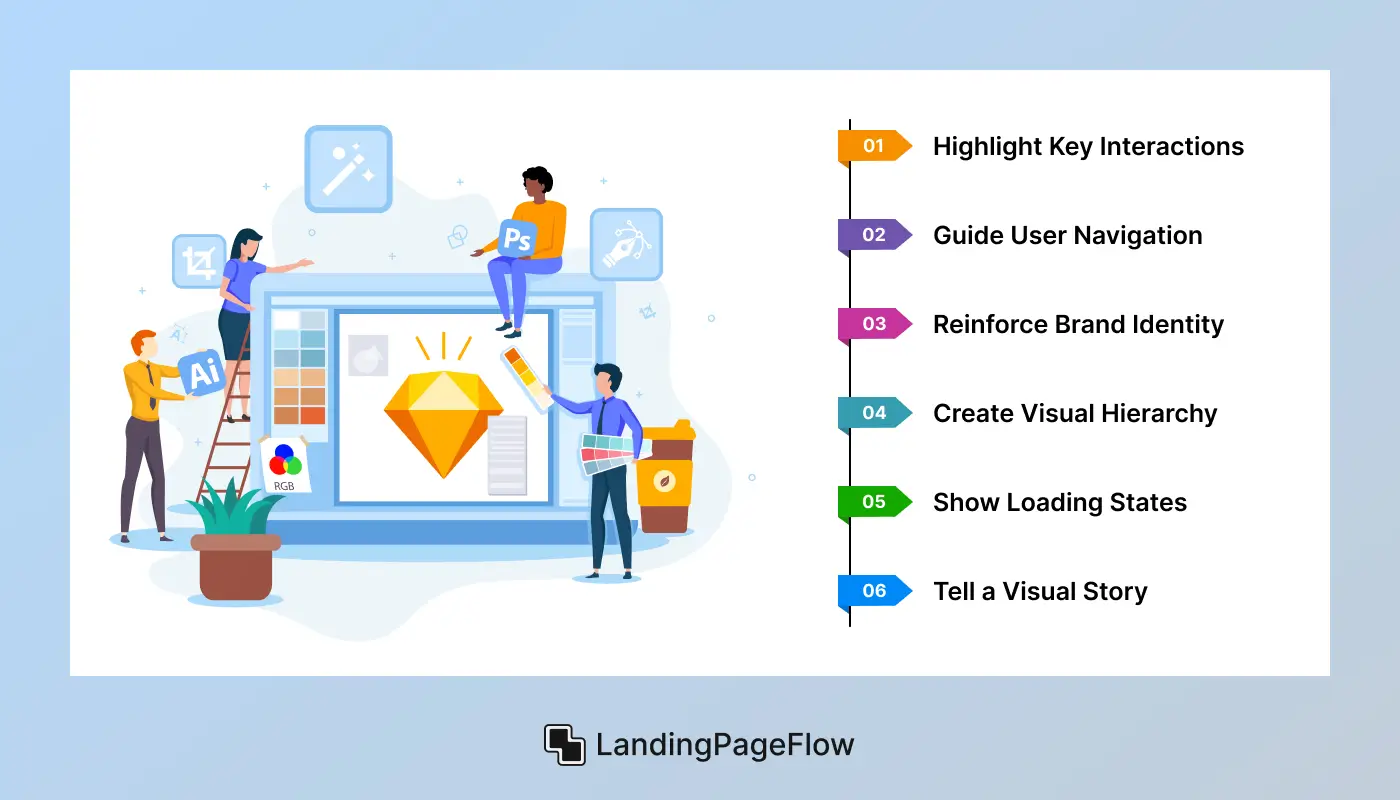
Here’s when to use animation intentionally:
1. Highlight Key Interactions
Use micro-animations to show button presses, form completions, or link hovers. These cues improve user experience by confirming action.
2. Guide User Navigation
Animations can direct attention during onboarding or step-by-step walkthroughs. They help users focus, especially on complex landing pages.
3. Reinforce Brand Identity
Your website might feel more polished and memorable with motion that complements your brand tone, such as smooth fades or humorous bounces.
4. Create Visual Hierarchy
Timed reveals and entrance animations let you control which content appears first. This boosts engagement by managing attention flow.
5. Show Loading States
Instead of blank screens, use animated loaders to reduce perceived wait time and prevent frustration.
6. Tell a Visual Story
Hero animations or scroll-triggered sequences can convey a product’s value visually. It’s perfect for elevating first impressions.
6. Benefits of Animation on Landing Pages
A situation like carefully, animation is a strategic tool that improves user experience and increases conversions. It's not simply for show. Static graphics are less successful at guiding, communicating, and holding attention than animated elements, whether they are bold or subtle.
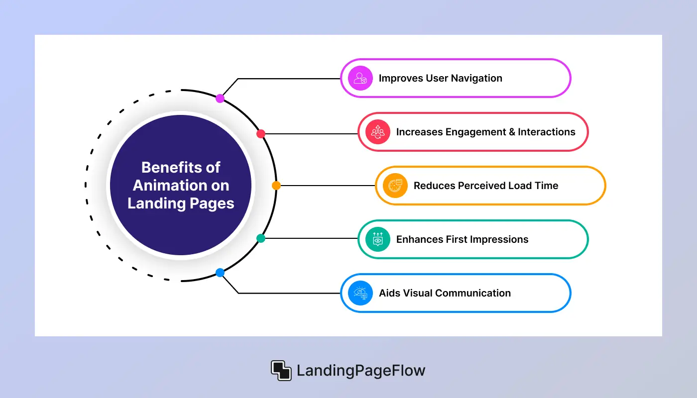
1. Improves User Navigation
Smooth scroll animations and directional cues guide users through content intuitively. These help reduce confusion and encourage deeper site exploration.
2. Increases Engagement & Interactions
Micro-animations on buttons, forms, and icons make interactions feel responsive and alive. Users are more likely to click and engage when the experience feels dynamic.
3. Reduces Perceived Load Time
Loading animations distract from delays and give the impression of a faster site. Keeping users visually engaged during waits lowers bounce rates significantly.
4. Enhances First Impressions
Animated hero sections with motion-rich text or visuals make landing pages feel premium and modern. They grab attention instantly and communicate brand quality.
5. Aids Visual Communication
Icons and illustrations that animate into view help convey complex ideas faster. Motion can simplify messages and make them more memorable.
7. Common Animation Mistakes to Avoid
Even the best animations can hurt user experience when misused. Below are the most frequent animation pitfalls and how to sidestep them for a smoother, more effective design:
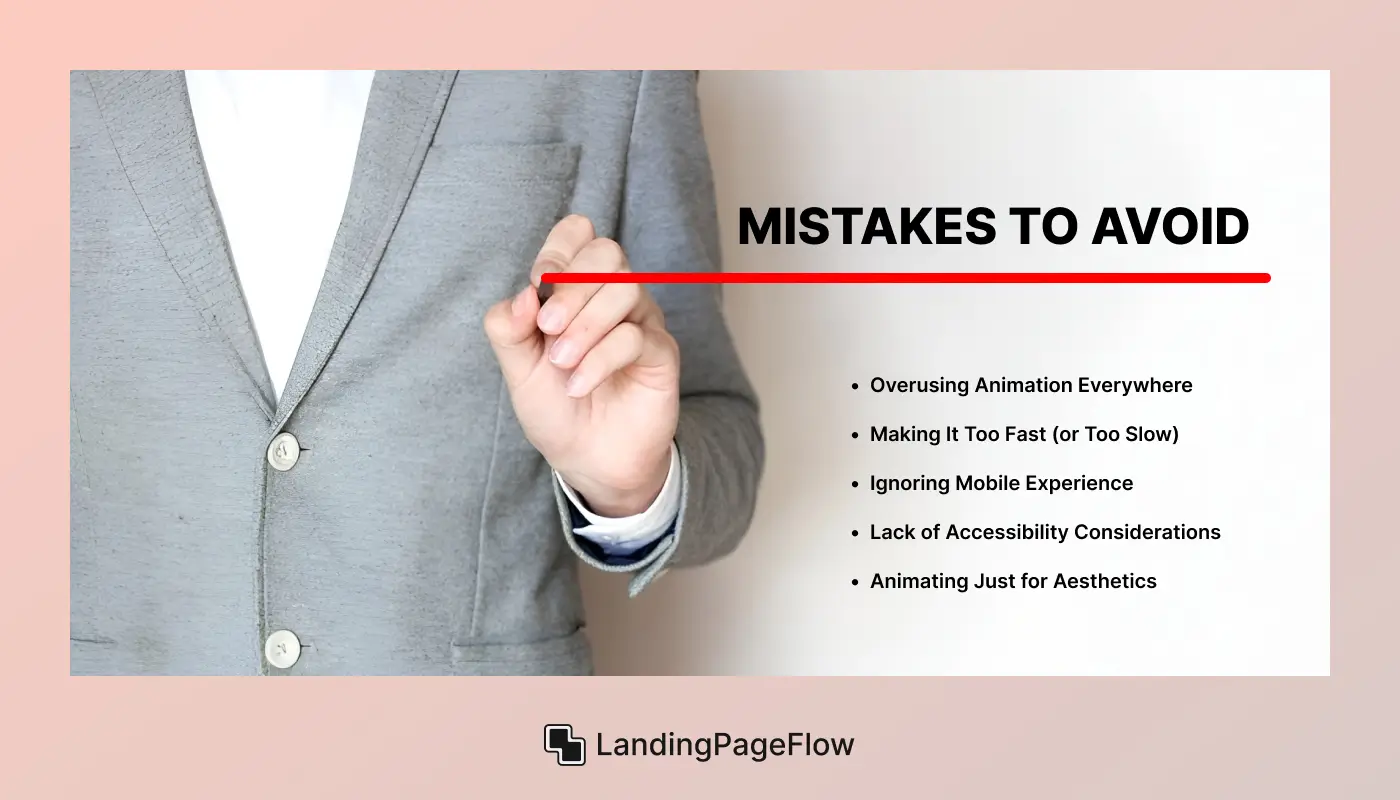
1. Overusing Animation Everywhere
Too many moving elements can overwhelm users and distract from your main message. Use animation sparingly and with a clear purpose.
2. Making It Too Fast (or Too Slow)
Animations that move too quickly confuse viewers, while sluggish ones feel clunky. Aim for smooth, natural timing, which is typically between 200–500ms.
3. Ignoring Mobile Experience
Some animations that look great on desktop may stutter or lag on mobile. Always test responsiveness and performance across all devices.
4. Lack of Accessibility Considerations
Flashing or looping animations can harm users with motion sensitivity. Offer reduced-motion options and ensure all animations support usability.
5. Animating Just for Aesthetics
Animations should serve a function and guiding attention, providing feedback, or simplifying content. Decorative-only motion adds clutter without benefit.
8. Examples of Animated Landing Pages That Convert
Animation, when done right, becomes more than eye candy, and it becomes a powerful conversion tool. Brands that understand this use motion to simplify information, guide attention, and create emotional resonance with users.
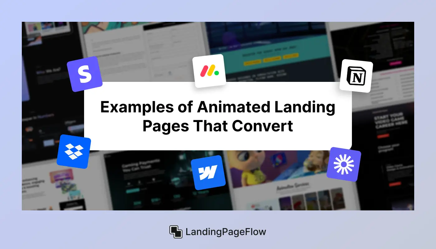
Below are standout examples of landing pages that use animation strategically to drive real results.
1. Stripe - Seamless Motion for Clarity
Stripe uses subtle animated transitions and hover effects to explain complex fintech products. Every animation feels purposeful, reinforcing a clean, modern UX.
2. Dropbox - Character-Driven Explainers
Dropbox features animated characters and scenes to demonstrate product benefits in a light, friendly tone. It simplifies tech while building an emotional connection.
3. Monday.com - Feature Highlights in Motion
Interactive UI animations show users how the platform works in real-time. This visual walkthrough converts better than static screenshots alone.
4. Webflow - Scroll-Based Storytelling
Webflow’s homepage uses parallax and scroll-triggered animations to educate users on no-code design power. It keeps visitors engaged from start to CTA.
5. Loom - Animated Demos that Sell
Loom uses motion to showcase video recording in action. Seeing the tool in use builds trust and pushes visitors toward sign-up faster.
6. Notion - Micro-Animations for Delight
Notion leverages subtle icon and menu animations to make the interface feel alive. These micro-interactions improve retention and usability.
9. Animation Tools for Non-Designers and Developers
Many of these tools integrate directly with website builders or offer export options for platforms like Webflow, WordPress, or Framer. You can animate elements like buttons, sections, icons, and even scroll-based transitions using presets or custom triggers. Real-time preview options make it easy to experiment and refine your motion design before publishing.

Here are the top tools built for non-designers and developers:
1. LottieFiles
Add lightweight, JSON-based animations using pre-built or custom designs. Great for web and mobile integration.
2. Haiku Animator
Create interactive animations with no-code workflows and export directly to React, Web, or iOS apps.
3. Motion. page
A WordPress-specific tool that brings scroll animations and micro-interactions without writing JavaScript.
4. Animista
Quickly prototype and copy-paste CSS animations with visual controls and timing presets.
5. Vev
Combine design, animation, and development visually. Perfect for creating immersive, code-free animated pages.
6. Spline
Bring 3D elements to life with drag-and-drop animation workflows. No coding or rendering tools required.
10. Animation in UX: Enhance or Kill
Animation has become a powerful part of modern UX design, but its impact isn’t always positive. Used well, it improves clarity and user satisfaction; used poorly, it leads to frustration and confusion.
Many designers fall into the trap of overusing motion, assuming more movement equals more engagement. In actuality, however, intelligent animation serves to direct the user journey rather than to divert it.
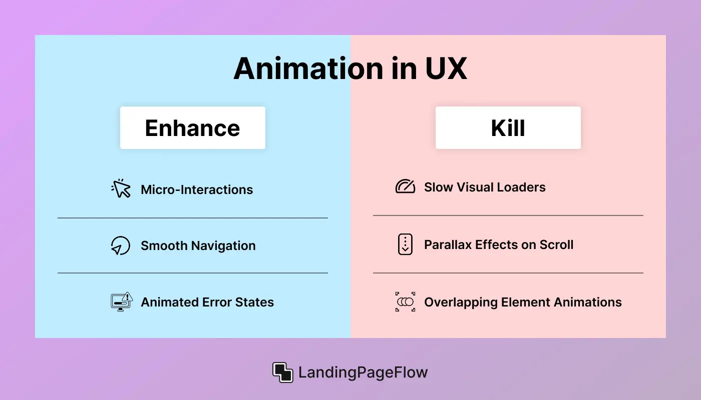
Let’s break it down through real-world scenarios:
Case 1: Micro-Interactions That Confirm User Actions
Verdict: Enhance
A subtle animation when clicking “Submit” offers immediate feedback and reinforces that the action was successful. This builds trust and confidence in the interface.
Case 2: Long Page Loaders With Overdone Visuals
Verdict: Kill
While loading animations can mask wait times, lengthy, flashy loaders increase bounce rates. Users leave if they feel delayed, especially on mobile.
Case 3: Smooth Navigation Transitions
Verdict: Enhance
Animated slide-ins or fades between pages can create a sense of continuity. When done quickly and consistently, they reduce cognitive load and make the flow feel natural.
Case 4: Auto-Playing Parallax Effects on Scroll
Verdict: Kill
Complex parallax movements can feel disorienting, especially when paired with heavy content. They often slow performance and confuse users.
Case 5: Animated Error States
Verdict: Enhance
A shake effect on a failed form submission draws attention without needing words. These quick animations improve clarity and reduce user frustration.
Case 6: Overlapping Element Animations
Verdict: Kill
When too many components animate at once (cards bouncing, buttons pulsing, text sliding), it overwhelms the user. Animation should guide, not compete for attention.
- Bottom Line: Animation enhances UX only when it aligns with function and user intention. In 2026, the best digital experiences are using motion to support clarity, not complexity.
Conclusion
By 2026, animation will be a strategic tool that can either increase or decrease the efficacy of your landing site. It is no longer only a decorative element.
When used purposefully, animation brings clarity to your message, guides user focus, and creates a polished, memorable experience. But when overdone or poorly timed, it becomes a distraction that increases bounce rates and damages trust.
Smart brands now use motion to lead users to key actions, tell stronger product stories, and stand out in a crowded digital landscape. This is about deliberate movement that helps you achieve your conversion goals, not about dazzling effects.
If your current landing page feels static or isn’t converting the way it should, animation might be the missing piece.
Make your pages turn into life consciously, purposefully, and in a way that boosts engagement, not just aesthetics. Now’s the time to turn clicks into customers with the right motion.

FAQ
1. Do animations slow down landing page speed?
Yes, if not optimized. Heavy animations can impact loading time, especially on mobile. Use lightweight formats like Lottie or CSS-based transitions to maintain performance.
2. What’s the best animation style for conversions?
Subtle, purposeful animations work best, such as button hover effects, scroll-triggered reveals, or directional cues. Avoid flashy or distracting styles that interrupt user flow.
3. Can I add animation without coding skills?
Absolutely. Tools like LottieFiles, Webflow, and Motion. Page lets you implement animations visually without writing code. These are ideal for marketers and non-developers.
4. When should I avoid using animation?
Avoid animations on slow-loading pages, during checkout flows, or when clarity is critical. Motion should never delay or confuse user actions, and it should guide, not distract.
5. How do I test if animation helps or hurts conversions?
Use A/B testing to compare versions of your landing page with and without animations. Track engagement metrics like time on page, scroll depth, and form submissions.
6. What animation trends will shape 2026 landing pages?
Expect to see more micro interactions, scroll-triggered motion, and AI-driven animations. Users crave smooth, responsive experiences that feel personalized and intuitive.

Ansif


.webp)