
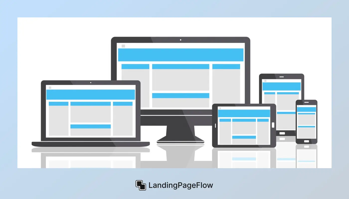
The rapid rise of mobile browsing has completely changed the way landing pages are designed and optimized. With smartphones and tablets accounting for the majority of web traffic, adopting a mobile-first design approach has become essential for online success.
This method focuses on building for smaller screens first, ensuring that layouts, visuals, and functionality deliver a smooth and responsive experience from the very start.
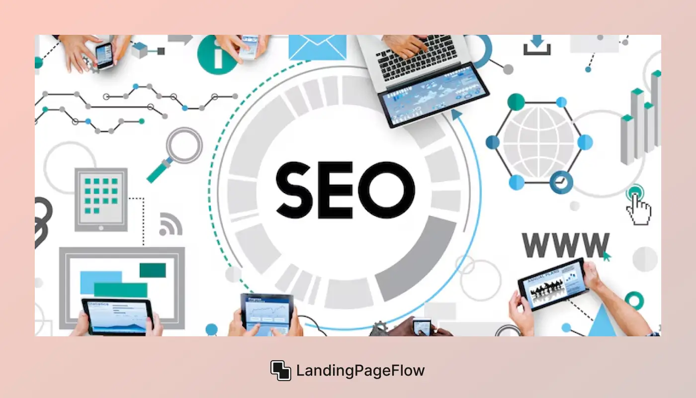
By designing with mobile users in mind, you not only enhance user experience but also strengthen your SEO performance. Search engines such as Google prioritize mobile-optimized pages, rewarding them with higher rankings and increased visibility.
Features like fast loading speeds, intuitive navigation, clear call-to-action buttons, and legible typography keep visitors engaged and reduce bounce rates.
A strong mobile-first strategy also drives higher conversion rates. Visitors who can effortlessly navigate your landing page, access key information, and complete actions with minimal effort are far more likely to become customers.
In today’s competitive online landscape, prioritizing mobile-first design ensures that your landing pages look exceptional, function seamlessly, &consistently deliver measurable results across all devices.
"Struggling with mobile visitors bouncing fast?
Book a free call & optimize your landing page for mobile users."
Table of Contents
- What is a Landing Page?
- Why Mobile-First Design Matters in Landing Pages?
- Principles of Mobile-First Landing Page Design
- 5+ Best Role of Mobile-First Design in the Landing Pages
- Common Mistakes to Avoid in Mobile Landing Pages
- Tools and Frameworks for Mobile-First Development
1. What is a Landing Page?
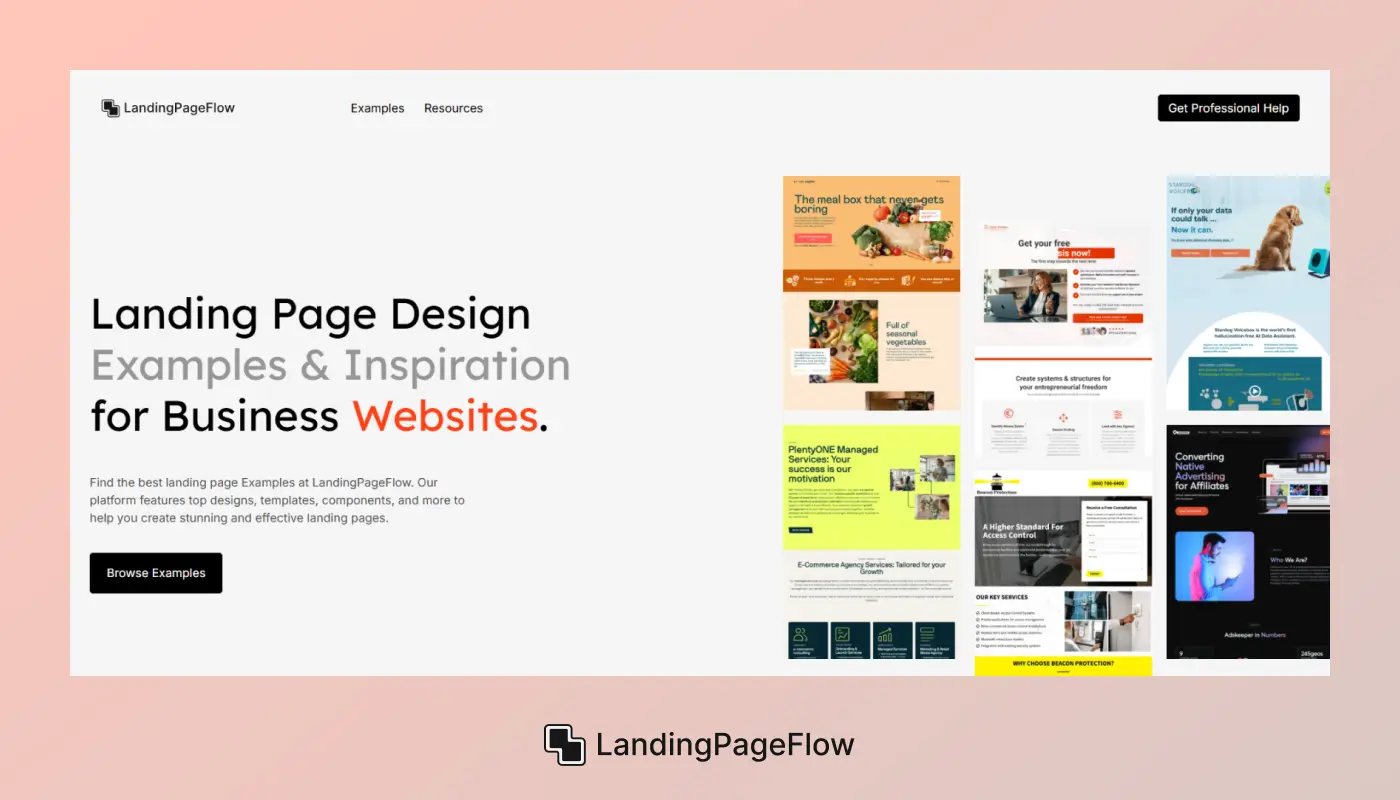
A landing page is a standalone web page created specifically to achieve a single, targeted objective, such as generating leads, promoting a product or service, or encouraging visitors to take a specific action, like filling out a form or making a purchase.
In the world of digital marketing, landing pages play a vital role in boosting SEO performance, enhancing the results of paid advertising campaigns, and increasing the impact of email marketing funnels.
An effective landing page uses persuasive copywriting, compelling headlines, strong visuals, and strategically placed call-to-action (CTA) buttons to capture attention and inspire action.
Search engines like Google reward mobile-friendly, well-structured pages with higher rankings, making SEO landing pages essential for online success.
By combining clear messaging, attractive design, and data-driven optimization, a landing page becomes a powerful tool for increasing conversion rates, improving audience engagement, and achieving measurable business results.
2. Why Mobile-First Design Matters in Landing Pages?
The Problem
Most users now browse the web on mobile devices, yet many landing pages are still designed with desktop as the priority. This leads to poor readability, slow loading, and frustrating navigation on smartphones.
The Solution
A mobile-first design approach starts with optimizing the landing page for smaller screens before scaling up to desktops. This ensures that every element, from headlines to call-to-action buttons, works flawlessly on mobile devices.
The Benefit
Not only does this improve user experience and reduce bounce rates, but it also supports SEO rankings due to Google’s mobile-first indexing. A mobile-first landing page delivers a smooth journey that increases conversions and maximizes ROI.
3. Principles of Mobile-First Landing Page Design
Designing a high-converting mobile-first landing page starts with prioritizing the mobile experience before scaling layouts and features for desktop users. This approach ensures that your page loads quickly, displays clearly on small screens, and provides a seamless navigation flow that keeps visitors engaged.
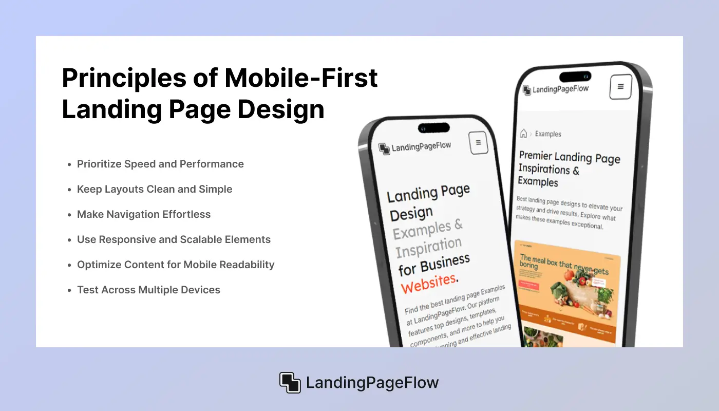
Below are the core principles that guide effective mobile-first design:
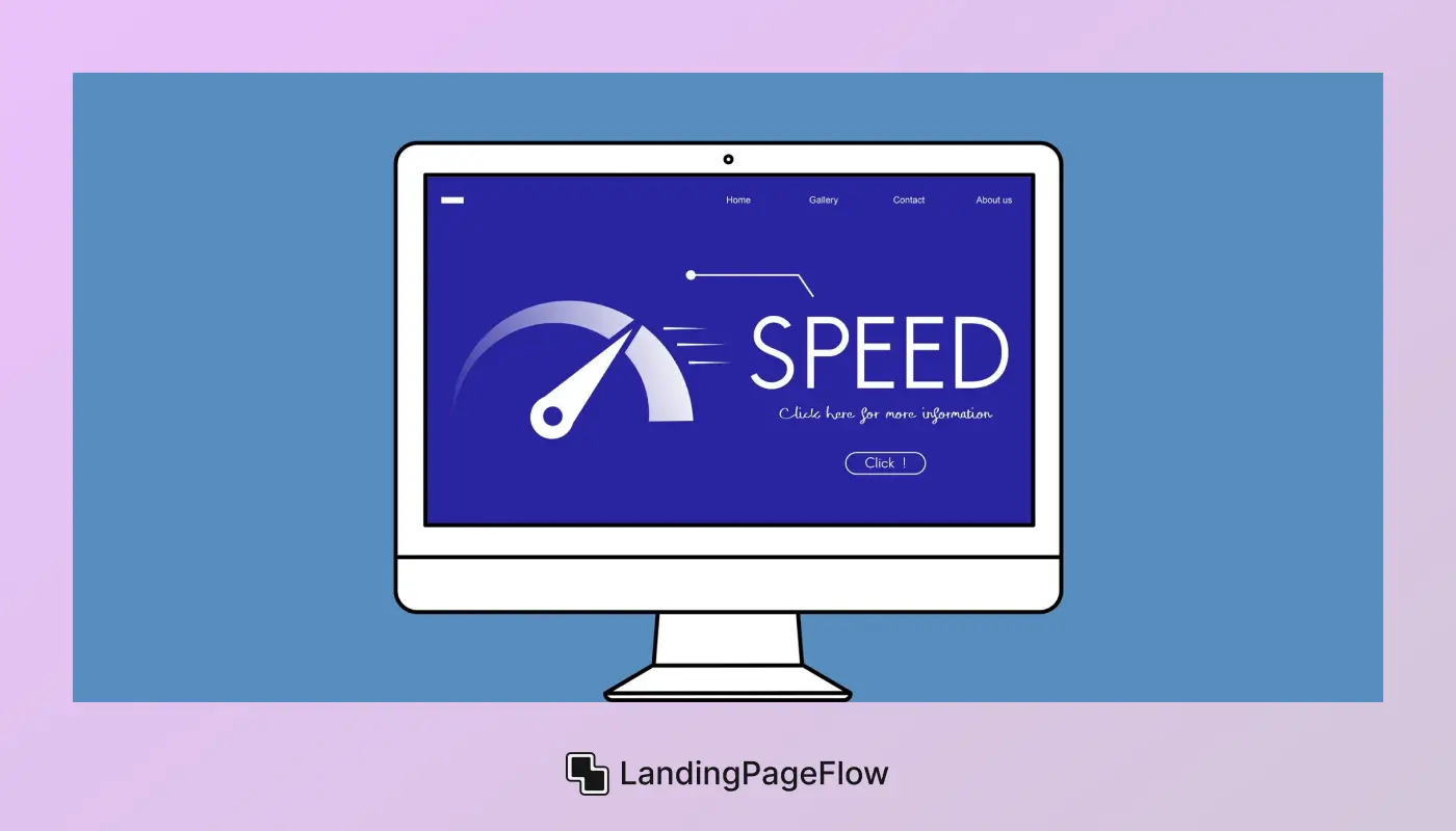
1. Prioritize Speed and Performance
Mobile users expect fast-loading pages. Optimize images, use compressed file formats, enable browser caching, and minimize unnecessary scripts to keep load times under three seconds. A speedy page improves both SEO rankings and conversion rates.
2. Keep Layouts Clean and Simple
Small screens demand a minimal, clutter-free design. Focus on a clear hierarchy, large tap-friendly buttons, and easy-to-read fonts to enhance usability and user experience.
3. Make Navigation Effortless
Adopt mobile-friendly menus, such as hamburger icons or sticky headers, that allow visitors to find what they need without scrolling excessively. Simple navigation reduces bounce rates and keeps users engaged longer.
4. Use Responsive and Scalable Elements
All elements are images, videos, and forms; they should resize automatically to fit different screen sizes without breaking the layout. This ensures visual consistency and improves mobile SEO performance.
5. Optimize Content for Mobile Readability
Short paragraphs, bullet points, and concise headings make content scannable on small screens. Include conversion-focused CTAs that stand out visually.
6. Test Across Multiple Devices
Regularly check your landing page on various devices and browsers to ensure consistent performance and appearance. Testing helps catch design flaws before they affect conversions.
4. 5+ Best Role of Mobile-First Design in the Landing Pages
1. Improved SEO Rankings
Mobile-first design directly influences search visibility by aligning with Google’s mobile-first indexing policy. Since the mobile version of your site is used as the primary basis for ranking, a well-optimized mobile landing page gains a competitive advantage.
A responsive and mobile-friendly page signals quality to search engines, increasing the likelihood of appearing higher in search results and attracting more organic traffic.
1. Faster Load Times
Optimizing media, reducing file sizes, and streamlining code in a mobile-first approach ensures your landing page loads quickly on smartphones, which boosts SEO performance.
2. Lower Bounce Rates
A mobile-optimized landing page offers a smooth user experience, encouraging visitors to stay longer, which signals relevance to search engines.
3. Better Mobile Usability
By prioritizing mobile functionality, you enhance accessibility and engagement, two factors Google values when ranking pages.
2. Faster Load Speeds
Mobile-first design prioritizes lightweight content and efficient coding to ensure landing pages load quickly on mobile devices. Fast loading times are crucial because mobile users tend to abandon sites that take too long to appear.
Improving page speed not only enhances the user experience but also positively impacts your SEO rankings, as search engines favor fast-loading pages. By focusing on mobile performance first, your landing page meets both user expectations and search engine criteria.
1. Optimized Media
Compressing images and using modern formats reduces data size without sacrificing quality, helping pages load faster on slower mobile networks.
2. Minimized Code
Streamlined HTML, CSS, and JavaScript eliminate unnecessary scripts and reduce load time, boosting overall performance.
3. Efficient Caching
Leveraging browser caching allows returning visitors to load your landing page quicker, further improving engagement and SEO.
3. Better User Experience
Mobile-first design ensures landing pages are crafted to meet the unique needs of mobile users, providing smooth navigation and easy access to key information. A seamless, intuitive experience keeps visitors engaged longer, reducing frustration caused by zooming, slow load times, or cluttered layouts.
Enhancing usability on mobile devices not only improves satisfaction but also drives higher conversion rates, as users can quickly find what they need and take action with confidence.

1. Intuitive Navigation
Simplified menus and clear pathways make it easy for visitors to explore your landing page without confusion or unnecessary steps.
2. Readable Content
Mobile-first design prioritizes legible fonts, appropriate text sizes, and clear contrast to ensure content is easy to read on small screens.
3. Touch-Friendly Elements
Buttons and interactive features are sized and spaced to prevent accidental taps, creating a frustration-free experience on touchscreens.
4. Higher Conversion Rates
Mobile-first design focuses on creating landing pages that make it simple for visitors to complete desired actions, such as signing up, purchasing, or downloading. By removing obstacles like complicated navigation and hard-to-tap buttons, mobile-optimized pages encourage more users to convert.
A streamlined, mobile-friendly experience builds trust and confidence, which directly leads to increased conversion rates and better return on investment (ROI) for your campaigns.
1. Clear Call-to-Actions
Prominently placed, easy-to-tap buttons guide users toward taking the next step without hesitation or confusion.
2. Simplified Forms
Mobile-first design minimizes form fields and uses input types that speed up completion, reducing abandonment.
3. Fast Loading Times
Quickly loading pages keeps users engaged and less likely to leave before completing a conversion.
5. Lower Bounce Rates
Mobile-first design helps reduce bounce rates by delivering a fast, seamless experience tailored to mobile users’ needs. When landing pages load quickly and navigation feels intuitive, visitors are more likely to stay longer and explore further.
Minimizing frustration caused by slow speeds, unreadable text, or hard-to-use interfaces keeps users engaged, signaling to search engines that your page is valuable and relevant.

1. Fast Loading Speeds
Pages optimized for mobile load swiftly, preventing visitors from abandoning due to delays.
2. Clear and Focused Content
Mobile-first layouts present information in a concise, easy-to-scan format that captures attention immediately.
3. User-Friendly Navigation
Simplified menus and well-placed CTAs help users find what they want quickly, reducing exit rates.
6. Future-Proof Design
Adopting a mobile-first design approach prepares your landing pages to perform well across a wide range of current and emerging devices. As new smartphones, tablets, and screen sizes enter the market, a flexible and responsive design ensures your content remains accessible and visually appealing.
This forward-thinking strategy reduces the need for frequent redesigns and keeps your site competitive in an ever-changing digital landscape.

1. Adaptive Layouts
Using responsive grids and scalable elements allows your landing page to automatically adjust to any screen size or orientation.
2. Compatibility with New Technologies
Mobile-first design often incorporates the latest web standards and frameworks, ensuring smooth operation on modern browsers and devices.
3. Easier Maintenance
Building with flexibility in mind simplifies updates and expansions, reducing costs and time spent on future redesigns.
7. Stronger Brand Perception
Mobile-first design projects professionalism and shows that your brand values its customers’ experience on every device. A polished, responsive landing page creates a positive first impression, building trust and credibility with visitors.
When users encounter a seamless, visually appealing mobile experience, they are more likely to associate your brand with quality and reliability, which encourages loyalty and repeat engagement.

1. Consistent Visual Identity
Maintaining brand colors, logos, and fonts across all screen sizes reinforces recognition and trust.
2. Professional Design Elements
Clean layouts, smooth animations, and well-placed content signal attention to detail and quality.
3. Positive User Interaction
Fast, intuitive experiences increase user satisfaction, making visitors more likely to view your brand favorably.
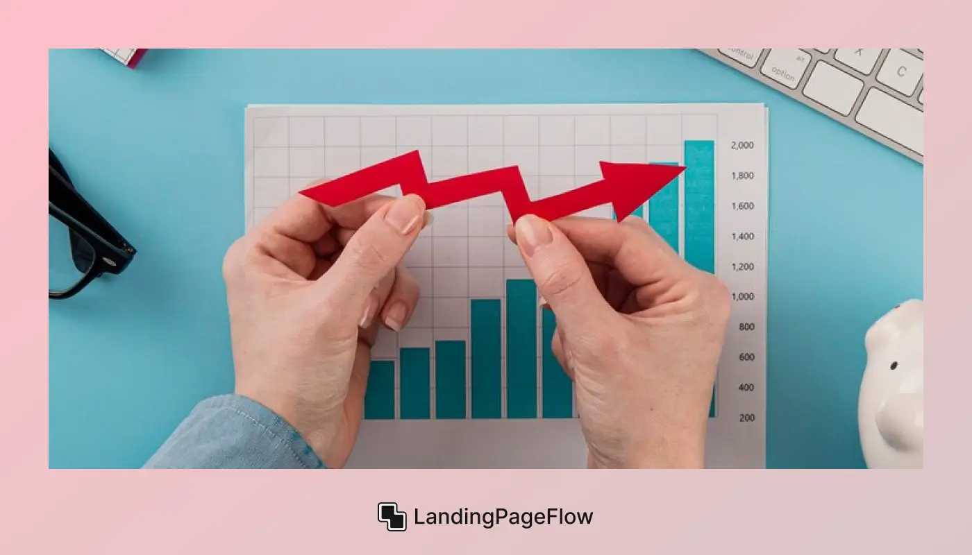
8. Better Ad Campaign ROI
Mobile-first design maximizes the return on investment (ROI) of your paid advertising campaigns by ensuring landing pages deliver fast, smooth, and relevant experiences to mobile users, the majority of ad traffic today.
When your landing page loads quickly and guides visitors effortlessly to conversion, you reduce wasted ad spend caused by high bounce rates or low engagement. This leads to more qualified leads and better overall campaign performance.

1. Optimized Mobile Experience
Delivering a seamless journey tailored to mobile users increases the likelihood that paid visitors complete desired actions.
2. Reduced Cost Per Conversion
Higher conversion rates from mobile-optimized pages lower your advertising costs and improve ROI.
3. Enhanced Tracking and Analytics
Mobile-first pages can be integrated with tracking tools that monitor user behavior for smarter campaign adjustments.
5. Common Mistakes to Avoid in Mobile Landing Pages

Mistake 1: Slow Loading Times
The Problem
Many landing pages have heavy images and unoptimized code that cause slow loading on mobile devices, frustrating users.
The Solution
Optimize images, minimize scripts, and leverage caching to speed up load times on smartphones.
The Benefit
Faster pages keep visitors engaged longer, reducing bounce rates and improving conversions.
Mistake 2: Cluttered and Overcrowded Layouts
The Problem
Trying to fit too much content on small screens creates clutter and overwhelms users.
The Solution
Prioritize key information and use clean, simple layouts tailored for mobile.
The Benefit
Clear designs enhance usability and guide visitors smoothly toward your call-to-action.
Mistake 3: Tiny Buttons and Links
The Problem
Small or closely spaced buttons cause tapping errors and frustrate mobile users.
The Solution
Design large, well-spaced touch targets that are easy to tap without mistakes.
The Benefit
Improved interaction leads to higher engagement and more successful conversions.
Mistake 4: Poor Readability
The Problem
Small fonts, low contrast, and dense text make content hard to read on mobile screens.
The Solution
Use legible font sizes, ample line spacing, and high contrast for clarity.
The Benefit
Easier reading keeps users on the page longer and increases trust and action.
Mistake 5: Complex Navigation
The Problem
Overcomplicated menus or hidden navigation frustrate mobile visitors and cause drop-offs.
The Solution
Implement simple, intuitive navigation, such as hamburger menus or sticky headers.
The Benefit
Easy navigation reduces bounce rates and helps users find information faster.
6. Tools and Frameworks for Mobile-First Development
Building effective mobile-first landing pages is easier with the right tools and frameworks. These solutions help streamline design, optimize performance, and ensure responsive layouts across all devices.
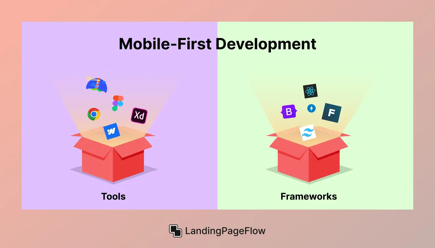
Tools For Mobile-First Development:
1. Figma
A collaborative cloud-based design tool perfect for mobile-first UI/UX design. It offers real-time feedback, prototyping, and responsive previews across devices.
2. Webflow
Visual web design platform that lets you build fully responsive, mobile-first landing pages without coding, while generating clean, SEO-friendly output.
3. Google Lighthouse
An open-source auditing tool that assesses page speed, accessibility, SEO, and best practices, essential for optimizing mobile landing pages.
4. Chrome DevTools
Developer toolset built into Chrome for debugging, performance testing, and simulating mobile devices, network throttling, and screen sizes.
5. Adobe XD
A vector-based design and prototyping tool with features tailored for mobile-first interfaces, enabling designers to create interactive mobile prototypes easily.
Frameworks For Mobile-First Development
1. Bootstrap
A widely used CSS framework with a mobile-first grid system and responsive components that speed up landing page development.
2. Tailwind CSS
A utility-first CSS framework offering mobile-first responsive classes to build custom, scalable designs efficiently.
3. Foundation by Zurb
A responsive front-end framework emphasizing mobile-first design, accessibility, and flexible grid layouts.
4. Google AMP (Accelerated Mobile Pages)
A framework for creating ultra-fast, lightweight mobile pages that boost SEO and improve user experience.
5. React Native
A JavaScript framework for building native mobile applications, useful when integrating landing pages within mobile apps.
Conclusion
In today’s mobile-driven world, adopting a mobile-first design strategy is essential for creating landing pages that truly perform. Prioritizing speed, usability, and responsiveness not only improves your SEO rankings but also delivers an exceptional user experience that drives higher conversion rates and maximizes your marketing ROI.
By investing in mobile-first design, you build stronger client trust and credibility. Visitors appreciate fast, intuitive, and seamless experiences - qualities that reflect well on your brand and encourage repeat engagement.
This positive impression helps establish valuable client cache, making your business a trusted choice in a competitive market.
Updating your landing page templates with mobile-first principles future-proofs your online presence, strengthens your brand perception, and helps you stay ahead of the competition.
Leveraging these design strategies empowers your business to connect with customers more effectively and achieve lasting growth in a mobile-first digital landscape.

FAQ
1. What is mobile-first design?
Mobile-first design means designing for mobile devices first, then scaling up for desktops to ensure a smooth user experience on smaller screens.
2. Why is mobile-first design important for landing pages?
It improves usability for the majority of users on mobile devices and boosts SEO rankings through Google’s mobile-first indexing.
3. How does mobile-first design impact SEO?
Google ranks mobile-optimized pages higher because they offer better speed, responsiveness, and user experience on mobile devices.
4. What are common mistakes in mobile landing pages?
Common mistakes include slow load times, cluttered design, small buttons, poor readability, and confusing navigation.
5. Which tools help create mobile-first landing pages?
Tools like Figma, Webflow, Google Lighthouse, Chrome DevTools, and Adobe XD support mobile-first design and testing.
6. How does mobile-first design increase conversions?
By making pages faster and easier to navigate on mobile, it reduces friction and encourages users to complete actions like sign-ups or purchases.

Altaf Rahman


.webp)


