Placing your call-to-action (CTA) in the right spot can make or break your landing page conversion rate in 2026. As users scroll faster, skim more, and expect seamless interaction, the importance of CTA placement has reached new heights.
From mobile-first layouts to scroll-triggered engagement, strategic CTA positioning helps guide attention, build urgency, and improve overall user experience.
The best-performing landing pages today focus on timing, clarity, and visual hierarchy to lead visitors to action, without relying on guesswork.
Smart CTA design goes beyond color and wording. Where you place it influences how many users engage, click, and convert.
This guide breaks down the most effective CTA placement strategies for 2026, helping you drive more clicks, leads, and results with every landing page you build.
"Need expert feedback on your CTA strategy?
Get your free 15-minute conversion layout review today."
Table of Contents
- What is a CTA in Web Design?
- Why CTA Placement Matters in 2026?
- Above the Fold vs Below the Fold: What Works Best?
- CTA in the Hero Section: First Impressions That Convert
- Mid-Page CTAs For Scrolling Users
- End-of-Page CTAs: Sealing the Deal
- Sticky & Floating CTAs For Better Mobile UX
- CTA Placement in Long-Form Landing Pages
- Best Practices For CTA Button Visibility
- Common Mistakes to Avoid in CTA Positioning
- Examples of High-Converting CTA Placements
1. What Is a CTA in Web Design?

A CTA (Call-to-Action) in web design is a focused prompt that encourages visitors to take a specific action, such as signing up, purchasing, or downloading. It acts as a conversion gateway, guiding users from passive browsing to active engagement.
In modern landing pages, a Call to Action often appears as a button or link, clearly labeled with phrases like “Start Free Trial,” “Get Quote,” or “Join Now.”
These elements are designed with attention-grabbing styles and positioned strategically to lead users through your funnel.
Strong CTA design and placement are essential for increasing click-through rates, enhancing user interaction, and improving the overall conversion performance of your website.
2. Why CTA Placement Matters in 2026?
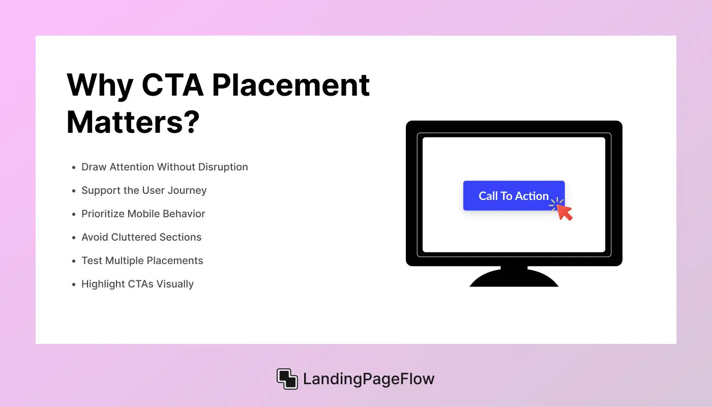
Driving conversions in 2026 starts with strategic CTA placement. A well-placed CTA doesn’t just look good - it guides action, reduces bounce, and increases interaction.
Modern users expect seamless flow, and your CTA's position plays a major role in their journey. A great layout earns attention, but CTA placement seals the conversion.
1. Draw Attention Without Disruption
Place CTAs where they feel natural - integrated into content, not forced or overlooked.
2. Support the User Journey
Position CTAs after key value sections to guide users at the right moment of interest.
3. Prioritize Mobile Behavior
Design for thumb-friendly zones and place CTAs where mobile users can tap without friction.
4. Avoid Cluttered Sections
Keep CTA areas clean, free from distractions, and easy to scan within 2–3 seconds.
5. Test Multiple Placements
Use A/B testing to see which positions convert best - hero, mid-scroll, or end-of-page.
6. Highlight CTAs Visually
Use bold colors, contrast, or motion to make your CTA buttons stand out without overwhelming.
3. Above the Fold vs Below the Fold: What Works Best?
Deciding where to place your CTA, above the fold or below the fold, can significantly affect user behavior. Each option has its strengths depending on the content, audience, and page length. A smart layout aligns placement with user intent and scroll behavior.

Above the Fold CTAs
1. Capture Immediate Attention
Perfect for high-intent visitors who are ready to act without needing more context.
2. Works Best For Simple Offers
Use this for clear, low-friction CTAs like signing up, trying a demo, or downloading.
3. Increase Visibility on First Load
Ensure your CTA appears on all screen sizes without requiring a scroll.
4. Ideal For Fast Decisions
Use when your headline and subtext clearly communicate value within seconds.
Below the Fold CTAs
1. Support Informed Decisions
Effective when users need more context, features, or social proof before acting.
2. Pair Well With Long-Form Content
Use storytelling, testimonials, or comparison tables to capture interest.
3. Great For Mid-Funnel CTAs
Perfect for guiding users from interest to consideration after deeper reading.
4. Encourage Confident Action
Works when the user is emotionally or logically ready to commit.
4. CTA in the Hero Section: First Impressions That Convert

Your hero section is the first thing users see - and often the last if it doesn’t engage. A strategically placed CTA in the hero area sets the tone for your landing page, helping you capture attention and drive action within seconds.
1. Boost Immediate Engagement
A strong hero CTA guides visitors who already know what they want to do.
2. Aligns With Brand Messaging
Pair your CTA with a clear headline and subtext to instantly convey your value proposition.
3. Ideal For Product Launches or Offers
Use in promotions, free trials, or limited-time campaigns to spark urgency.
4. Works Best With Visual Hierarchy
Design with clear spacing, bold contrast, and mobile responsiveness in mind.
5. Mid-Page CTAs For Scrolling Users

As users scroll and engage with your content, a mid-page CTA can catch them at just the right moment - when interest is building but commitment hasn’t yet formed. It’s a smart way to re-engage and gently guide action before attention fades.
1. Great For Storytelling Pages
Place CTAs after key benefits, use cases, or emotional highlights.
2. Boosts Interaction Without Pressure
Encourages clicks mid-scroll, without rushing users through the funnel.
3. Flexible For Multi-CTA Layouts
Combine with top and bottom CTAs to support users at different decision points.
4. Useful on Mobile and Desktop
Design mid-page CTAs with responsive spacing and accessible tap zones.
6. End-of-Page CTAs: Sealing the Deal

For users who make it to the bottom of your landing page, a well-timed end-of-page CTA offers a final push toward conversion. After consuming your full value story, these visitors are more likely to act - if you make it easy and persuasive.
1. Captures High-Intent Users
These visitors are engaged, informed, and ready to make a decision.
2. Works Well With Long-Form Content
Ideal for pages with feature breakdowns, comparisons, or testimonials.
3. Pairs With Emotional or Logical Closeness
Place after case studies, final proof points, or personal messaging for impact.
4. Should Include a Strong Offer
Use phrases like “Start Free,” “Book a Demo,” or “Let’s Talk” to seal the deal.
7. Sticky & Floating CTAs For Better Mobile UX

In 2026, mobile-first design demands CTA strategies that remain visible without overwhelming. Sticky or floating CTAs help users act anytime, especially useful on long-scroll pages where attention can drift before they reach the bottom.
1. Always Accessible on Screen
Floating CTAs stay visible as users scroll, keeping actions within thumb’s reach.
2. Great For Lead Gen and Mobile Offers
Use for newsletter signups, free trials, or cart buttons where timing is flexible.
3. Boosts Tap-Through Rates on Mobile
Improves performance by reducing friction and decision delay.
4. Must Balance Visibility and UX
Keep designs subtle, lightweight, and non-intrusive to avoid annoying users.
8. CTA Placement in Long-Form Landing Pages

Long-form landing pages are designed to educate, persuade, and convert, making CTA placement especially important. Users scroll through multiple sections, so your CTAs must align with their decision journey and appear at the right emotional or logical trigger points.
1. Distribute CTAs Strategically
Place CTAs after key sections: benefits, testimonials, pricing, or case studies.
2. Use Varied CTA Styles
Mix full-width buttons, in-line text links, and sticky footers for engagement diversity.
3. Repeat Your Main Goal
Ensure each CTA leads to the same core action to maintain clarity and focus.
4. Guide Users With Scroll Cues
Use arrows, spacing, or transitions to signal the next CTA moment and reduce drop-offs.
9. Best Practices For CTA Button Visibility

Even the best-placed CTA can fail if it’s not visually clear. Your CTA button must be impossible to miss, instantly understandable, and naturally integrated into your layout. Strong visibility leads to higher engagement and better conversion outcomes.
1. Use Bold Contrast and Color
Choose CTA colors that stand out from your background without clashing visually.
2. Make it Large Enough to Tap
Ensure CTA buttons are mobile-friendly with proper sizing and spacing for thumbs.
3. Write Action-Focused Text
Use clear verbs like “Start Free Trial,” “Get Quote,” or “Subscribe Now” to drive clicks.
4. Maintain Enough White Space
Avoid cramming CTAs in dense areas - let them breathe to command attention.
5. Limit Visual Competition
Keep other design elements around the CTA minimal so the user's focus stays on the action.
10. Common Mistakes to Avoid in CTA Positioning

Even great offers can underperform if your CTA positioning disrupts user flow or confuses users. Avoid these common pitfalls to ensure your CTAs guide action smoothly.
1. Placing CTAs Too Early
Don’t rush users - avoid showing a CTA before explaining value or building trust.
2. Hiding CTAs in Cluttered Sections
Buttons surrounded by dense content or graphics lose attention and lower conversions.
3. Using Too Many CTAs
Multiple conflicting CTAs create decision fatigue. Stick to one clear goal per section.
4. Ignoring Scroll Behavior
Failing to place CTAs based on user engagement points leads to missed opportunities.
5. Poor Mobile Adaptation
Buttons that don’t fit smaller screens or float off-screen kill usability and tap-through rates.
11. Examples of High-Converting CTA Placements

Strong CTA placement is backed by layout, timing, and clarity. These real-world examples show where brands get it right - and why the strategy works across devices and industries.
1. Above-the-Fold Hero CTA
A bold “Get Started” button right beneath a clear headline and subtext draws immediate clicks. Example: SaaS startup homepage.
2. Mid-Page CTA After Benefits
Placed after a value stack (like features or use cases), this CTA supports deeper engagement. Example: product landing page.
3. Sticky Mobile Footer CTA
A floating “Subscribe” or “Try Free” button that stays visible while scrolling keeps action within reach. Example: newsletter or trial page.
4. CTA After the Testimonials Section
Users gain trust, then see a prompt to act. Example: service business or coaching site.
5. End-of-Page Offer CTA
Placed after pricing or FAQs, this final “Let’s Talk” button catches users ready to convert. Example: agency or B2B landing page.
Conclusion
Placing your clear CTA needs in 2026 can dramatically impact how users interact with your page, how many leads convert, and how confident your visitors feel about taking action.
Every placement strategy brings different strengths based on your content depth, audience intent, and device behavior.
Some CTAs are best positioned upfront to catch fast movers (like above-the-fold buttons), while others thrive in context-rich environments (like end-of-page or testimonial-backed placements). Sticky CTAs work especially well on mobile, keeping actions always within reach.
Final Thoughts:
- Above-the-fold CTAs are ideal for landing pages with short, punchy messaging and fast decision-making users.
- Mid-page CTAs work best on scroll-heavy layouts where users need some convincing before acting.
- End-of-page CTAs are suited for in-depth, storytelling-driven pages with logical decision paths.
- Sticky/floating CTAs are perfect for mobile-first designs and action-focused experiences like signups or checkouts.
- Multi-CTA layouts benefit long-form landing pages that need touchpoints across different funnel stages.
"Build smarter in 2026 - use CTA placement not just as design, but as strategy.

FAQ
1. What is the best position for a CTA on a landing page in 2026?
The best position depends on your content and audience. Above-the-fold CTAs work for fast decisions, while mid-page and end-of-page options guide users after they’ve engaged with your content on the web page.
2. Can I use more than one CTA on a single landing page?
Yes, but keep the focus clear. Multiple CTAs can be effective if they lead to the same goal and are placed at strategic points, like after features, testimonials, and at the bottom.
3. How do sticky CTAs improve conversions on mobile?
Sticky or floating CTAs stay visible as users scroll, making it easy for mobile visitors to act anytime without hunting for the button, boosting tap-through rates and engagement.
4. What should a high-converting CTA button say?
Use action-driven words like “Start Free Trial,” “Get Instant Quote,” or “Download Now.” Keep it clear, concise, and aligned with the user’s intent.
5. How often should I test different CTA placements?
Run A/B tests regularly - at least monthly or per campaign - to see how placement, wording, or color affect performance. Small changes can lead to big conversion gains.
6. Does CTA color affect performance in 2026?
Absolutely. Use high-contrast colors that stand out from your background and align with your brand style. Color psychology still plays a strong role in drawing attention.

Altaf Rahman


.webp)


