In the fast-moving world of UI/UX design, the choice between gradient design and flat design can dramatically influence how users perceive and interact with your website or app.
In 2026, design trends are evolving rapidly, favoring experiences that not only look beautiful but also perform across diverse screen sizes and user needs.
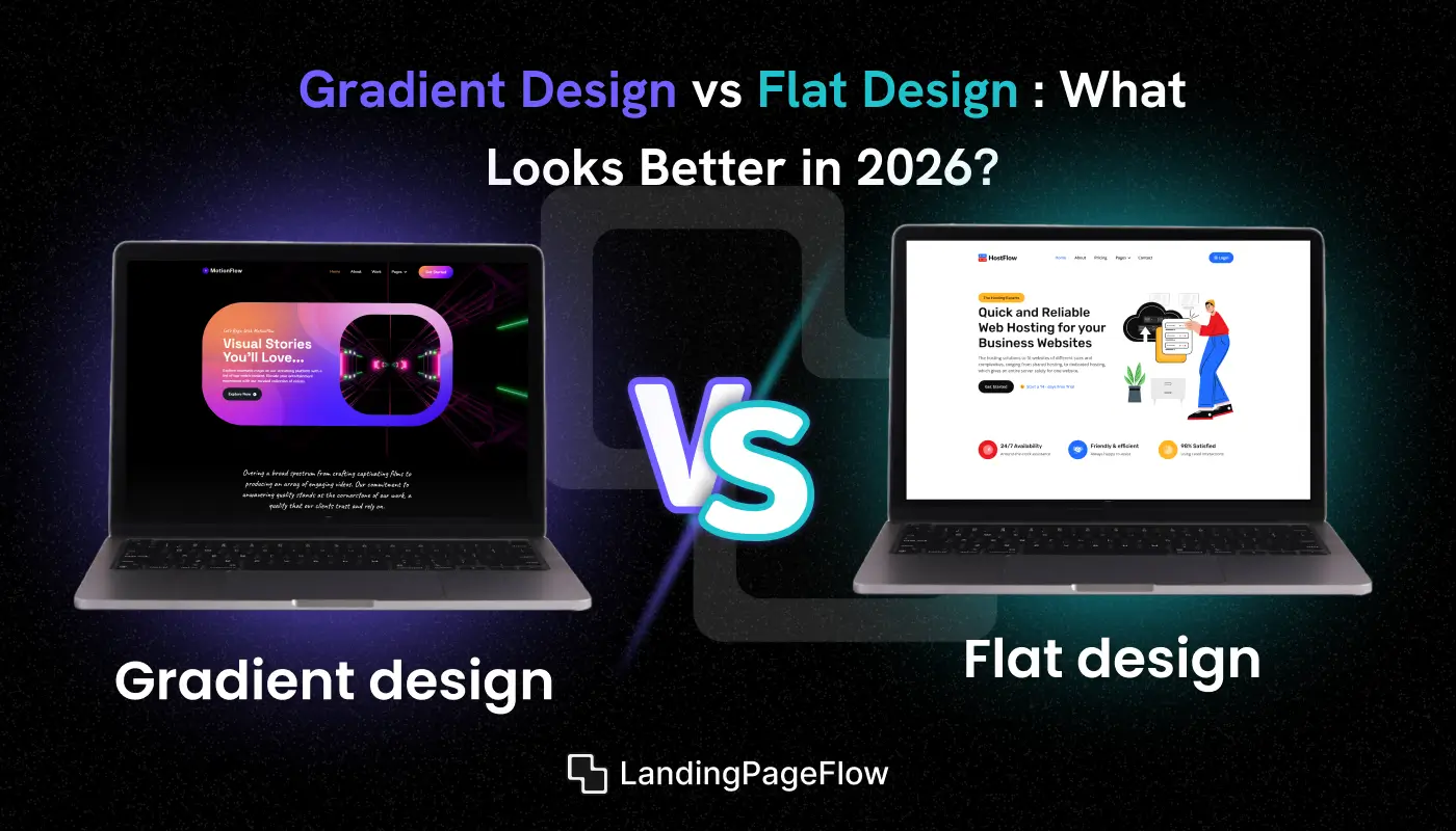
Flat design delivers simplicity, clean lines, and fast loading speeds. It’s favored in interfaces where clarity and usability matter most.
In contrast, gradient design brings visual depth, emotion, and dynamic color blending that can elevate brand appeal and storytelling.
Choosing the right design approach means thinking through your goals, user expectations, and the overall mood your platform should convey.
A strategic decision here strengthens both brand identity and user engagement, making your design work harder and smarter in 2026.
"Let’s craft a high-performing interface that reflects your vision.
Book your free 15-minute UI/UX consultation today."
Table of Contents
- What is Gradient Design?
- What is Flat Design?
- When to Use Gradient Design Effectively?
- When to Use Gradient Design Better?
- Modern UI/UX Examples Using Both Styles
- We Tested 10 Rounds Between Gradient Design vs Flat Design
- The Winner is?
1. What is Gradient Design?

Gradient design refers to the use of smooth color transitions that blend two or more shades, tones, or hues to create depth, motion, or visual interest.
This technique adds dimension to flat surfaces by simulating light, shadow, or fluid movement, giving digital interfaces a more immersive feel.
In 2026, gradient design has evolved beyond simple background effects. It’s now used in buttons, icons, illustrations, and full-page layouts to guide attention, establish mood, and reinforce brand personality.
Soft radial blends, multi-color overlays, and vibrant linear gradients are all part of today’s modern UI language. Designers favor gradients for their emotional impact and ability to breathe life into minimal layouts without overwhelming the user.
2. What is Flat Design?

Flat design is a minimalist design style that emphasizes clean lines, solid colors, and two-dimensional elements.
It avoids textures, shadows, and gradients to create a clear, distraction-free user interface that prioritizes simplicity and speed.
In 2026, flat design remains a popular choice due to its clarity, fast loading times, and ease of use across various devices.
This style is commonly seen in dashboards, mobile apps, and landing pages, where the focus is on usability and content over decorative detail. Designers use flat design to support a functional experience, removing excess styling so users can navigate and interact without confusion.
3. When to Use Gradient Design Effectively?

Gradient design isn't just about style - it serves a purpose when used strategically. These use cases show how to apply it for impact without overdoing it.
1. Emphasize Key Areas
Ideal for highlighting CTAs, hero sections, or featured content that needs extra visual attention.
2. Create Emotional Depth
Gradients help convey mood and support brand storytelling through smooth color transitions.
3. Modernize Your Layout
Great for adding a dynamic, premium look to otherwise minimal designs without cluttering the interface.
4. Enhance Brand Identity
Useful for visually reinforcing brand colors and tone across digital products or websites.
5. Add Layered Visuals
Effective when separating content sections in a soft, fluid way without using harsh lines or blocks.
6. Best For Visual Industries
Works well in tech, creative, fashion, or media sectors that rely on design-led communication.
4. When to Use Flat Design Effectively?

Flat design focuses on clarity, speed, and usability. These scenarios highlight when it's the smart choice for modern, user-centered interfaces.
1. Prioritize Usability
Best for interfaces that require quick scanning and intuitive navigation.
2. Improve Performance
Flat visuals reduce file sizes and support fast loading speeds, especially on mobile.
3. Enhance Content Focus
Ideal for websites that emphasize text, data, or functionality over decoration.
4. Maintain Visual Simplicity
Ideal for a clean layout that minimizes distractions and visual clutter.
5. Support Responsive Design
Scales easily across screen sizes, making it highly effective for mobile-first experiences.
6. Use in Dashboards and Tools
Common in SaaS, admin panels, and apps, where clarity is more important than visual flair.
5. Modern UI/UX Examples Using Both Styles

Modern UI/UX design often blends both flat and gradient styles to create visually engaging yet highly functional interfaces. These examples show how brands combine them effectively in real-world products.
Apple Music
Uses subtle gradients in album art and background overlays, paired with a flat, minimal interface for clean usability.
Spotify
Blends vibrant gradients in playlists and promotions, while the core UI stays flat and clean for easy navigation.
Stripe
Combines a flat design structure with occasional gradient accents on buttons and illustrations to add visual depth.
Notion
Maintains a mostly flat design for content clarity, occasionally introducing soft color transitions in visuals and callouts.
Adobe Creative Cloud
Leverages bold gradient backgrounds for product branding, layered onto a flat, functional dashboard for user control.
6. We Tested 10 Rounds Between Gradient Design vs Flat Design

Round 1: Visual Appeal
Gradient Design
Gradient design delivers an engaging, expressive look using layered color transitions that create depth and visual richness. It helps establish mood, adds personality, and draws users in through subtle movement - even on static screens.
Flat Design
Flat design emphasizes simplicity and clarity, using solid colors and minimal decoration. It avoids distractions and keeps the interface clean, allowing content and layout to take center stage without overwhelming the user.
Final Verdict
Gradient design wins this round for its dynamic visual impact, ability to evoke emotion, and enhanced brand personality, making interfaces feel more modern and memorable in 2026.

Round 2: Readability
Gradient Design
Gradient design can enhance mood and depth, but may reduce text clarity if color contrast isn't handled carefully. Background blends or overlays can make it harder to read body content, especially on small screens or for users with visual impairments.
Flat Design
Flat design excels in text clarity by using high-contrast, solid backgrounds and clean typefaces. Its minimalist nature supports easy scanning, better accessibility, and consistent performance across devices and screen sizes.
Final Verdict
Flat design takes the win here for providing better contrast, superior text visibility, and a cleaner reading experience, crucial for usability and accessibility in 2026.

Round 3: Branding Flexibility
Gradient Design
Gradient design offers bold opportunities to express brand identity through unique color transitions and custom visual themes. It supports a more emotive look, making it perfect for brands that want to feel modern, expressive, or forward-thinking.
Flat Design
Flat design provides a clean and consistent foundation that adapts easily across different industries. It’s reliable for broad branding, offering neutral styling that works well for startups, enterprise sites, or professional portfolios.
Final Verdict
Gradient design wins this round for its strong branding potential, visual storytelling power, and ability to help modern brands stand out through custom color systems and personality-driven visuals.

Round 4: Performance
Gradient Design
Gradient design can introduce slight delays in load times, especially when using high-resolution backgrounds, layered effects, or custom-coded transitions. Extra CSS or image assets may impact page speed if not optimized properly.
Flat Design
Flat design is lightweight by nature, relying on simple shapes, solid colors, and minimal styling. It delivers faster load times, better performance on mobile devices, and less strain on system resources, making it ideal for speed-focused builds.
Final Verdict
Flat design wins this round for its faster load speeds, lower resource demands, and smoother performance, crucial for SEO and user retention in 2026.

Round 5: Emotional Impact
Gradient Design
Gradient design excels at triggering emotional responses through rich, blended color palettes that evoke mood and atmosphere. Soft transitions and vibrant overlays help create a visually immersive experience, ideal for storytelling and brand memorability.
Flat Design
Flat design feels neutral and efficient, focusing more on functionality than emotion. It offers clarity and structure but lacks the expressive energy often needed to stir strong user feelings or convey personality.
Final Verdict
Gradient design takes this round for its ability to spark emotional engagement, enhance brand storytelling, and deliver a more visually expressive experience in modern UI.

Round 6: Mobile Optimization
Gradient Design
Gradient design can look stunning on mobile but often requires additional optimization to maintain clarity and contrast. Complex color blends and layered effects might strain performance or reduce legibility on smaller screens if not carefully designed.
Flat Design
Flat design is naturally suited for mobile due to its lightweight structure, simple layouts, and clear visual hierarchy. It adapts easily across screen sizes, ensuring consistent usability and faster mobile load speeds.
Final Verdict
Flat design wins this round for its mobile-friendly efficiency, better scalability, and dependable performance across devices, crucial in a mobile-first world.

Round 7: Attention Focus
Gradient Design
Gradient design naturally draws attention using color depth, transitions, and visual movement. It’s highly effective for guiding users to CTAs, featured content, or key sections by using layered emphasis that subtly leads the eye.
Flat Design
Flat design relies on contrast and layout structure to direct focus. It avoids extra styling, which keeps things clean, but sometimes lacks visual cues that help steer user behavior or highlight interactive elements.
Final Verdict
Gradient design wins this round for its ability to guide user attention, highlight key areas, and create more engaging visual flow without sacrificing usability.

Round 8: Ease of Implementation
Gradient Design
Gradient design often requires more complex styling, including CSS layering, image overlays, or gradient tools. Designers need to ensure contrast, performance, and responsiveness, making implementation slightly more time-consuming and technical.
Flat Design
Flat design is fast and simple to implement, relying on basic shapes, solid colors, and minimal code. It works well across builders, frameworks, and devices, requiring fewer assets and offering faster production timelines.
Final Verdict
Flat design wins this round for its efficiency, developer-friendliness, and ease of deployment, making it the smarter choice for fast, scalable builds.

Round 9: Trend Relevance(2026)
Gradient Design
Gradient design is making a strong comeback in modern UI, embraced for its vibrant visuals and expressive potential. It aligns well with 2026 trends that favor emotion-driven interfaces, color-rich branding, and more immersive, layered aesthetics.
Flat Design
Flat design remains reliable but feels less bold compared to newer visual styles. Though still valued for simplicity and accessibility, it may appear dated when not combined with micro-interactions or subtle enhancements in current digital spaces.
Final Verdict
Gradient design wins this round for being more visually current, emotionally resonant, and aligned with 2026 design trends pushing toward expressive, layered, and branded experiences.
.webp)
Final Round: Engagement Potential
Gradient Design
Gradient design enhances user engagement by creating visually stimulating environments that invite exploration. Its use of depth, color variation, and soft transitions keeps users visually interested, helping reduce bounce rates and increase interaction.
Flat Design
Flat design promotes usability, but its minimalist approach can sometimes feel static. Without dynamic elements or emotional draw, users may move through content quickly without deeper interaction or retention.
Final Verdict
Gradient design wins this round for its ability to boost visual engagement, support longer interaction, and deliver a more immersive user experience that captures attention in 2026.
7. The Winner is?

Gradient Design and Flat Design both offer unique strengths in modern UI/UX, but in our 10-round comparison, Gradient Design edges ahead with 6 out of 10 wins.
- Gradient Design excels in visual appeal, emotional engagement, brand flexibility, and trend alignment. It's the go-to choice for brands looking to create immersive experiences, guide user focus through color depth, and make bold visual statements that resonate with audiences in 2026.
- Flat Design, by contrast, remains unbeatable in performance, readability, mobile optimization, and ease of implementation. It's ideal for clean, fast-loading sites where simplicity, clarity, and accessibility are top priorities.
Each style serves a distinct purpose:
- Gradient Design suits creative brands, media platforms, and modern startups seeking standout aesthetics.
- Flat Design benefits corporate websites, SaaS products, and lean teams focused on speed and structure.
Note: "In 2026, Gradient Design wins for its expressive power and trend-forward impact - but the right choice still depends on your brand’s goals, development resources, and user expectations."

FAQ
1. What is the main difference between gradient and flat design?
Gradient design uses layered color transitions to create depth and emotion, while flat design sticks to solid colors and minimalism for clarity and speed.
2. Which design style is more modern in 2026?
Gradient design leads in 2026 trends, offering a more visually dynamic and emotion-driven experience that aligns with current UI/UX expectations.
3. Is flat design still relevant today?
Yes, flat design remains valuable for mobile-first sites, SaaS dashboards, and performance-heavy platforms where speed and readability are key.
4. Do gradients impact website performance?
They can - if not optimized. Gradient visuals may require more assets or CSS, so performance depends on implementation and device handling.
5. Which design works better for branding?
Gradient design offers stronger brand expression with custom color systems and emotional tone, while flat design ensures consistency and neutrality.
6. How do I choose the right design for my project?
Base your choice on brand goals, target users, and resources. Use flat design for fast, accessible sites, and gradient design when emotional connection and uniqueness matter.

Ansif


.webp)


