Gradient backgrounds have become a powerful design trend for modern landing pages, combining visual depth, color harmony, and strong brand expression. When applied with intent, gradients can guide attention, evoke emotion, and create a seamless visual journey that supports your message.
They help landing pages feel more dynamic and polished, especially in today’s highly visual digital landscape. Beyond just decoration, gradients contribute to the overall user experience by reinforcing mood, enhancing readability, and making key elements stand out.
Designers now use them not only for aesthetic value but also to improve layout structure and storytelling flow. From soft, calming blends to bold, energetic transitions, the right gradient can dramatically elevate a page’s perceived quality.
In this curated collection, you’ll explore over 18+ of the best gradient background examples, each selected for its ability to improve engagement, support conversion goals, and complement brand identity.
These examples offer practical inspiration for anyone designing in 2026, from marketers and founders to creative teams looking to stand out with a modern, professional look.
"See why modern gradients drive stronger engagement.
Book your free consult & learn which designs truly convert."
Table of Contents
- What is Color Gradient?
- Why Gradients Work in Modern Landing Page Design?
- How to Use Gradient Backgrounds Strategically?
- 18+ Color Gradient For Choosing the Right Pairings
- Common Mistakes to Avoid When Using Gradients
1. What is Color Gradient?
A color gradient is a gradual transition between two or more colors, used to create depth, dimension, and visual interest in digital design.
Unlike solid backgrounds, gradients blend hues, either linearly (from one side to another), radially (from the center out), or at angles, producing a smooth flow that draws the eye naturally across a space.
In landing page design, gradients serve as both a functional and aesthetic tool. They help guide attention, emphasize specific sections (like CTAs or hero areas), and add a modern, professional feel without overwhelming the content.
Designers often use gradients to reflect a brand’s tone, soft for elegance, bold for energy, or vibrant for creativity.
When implemented with care, a color gradient enhances the user experience, improves visual hierarchy, and supports overall conversion goals.
2. Why Gradients Work in Modern Landing Page Design?

Gradients aren’t just trendy - they’re a modern design tool that adds depth, emotion, and sophistication to landing pages. Used effectively, gradients can highlight key areas, support branding, and create a more immersive user experience. Their subtle shifts in tone can make a page feel more fluid, dynamic, and engaging.
- Draws visual interest: Smooth color transitions grab attention without being overwhelming, helping your landing page stand out in a crowded digital space.
- Improves content hierarchy: Gradients help define sections and lead users naturally from one block of content to another.
- Adds depth and modernity: Unlike flat colors, gradients provide a sense of dimension and movement, making designs feel more current and professional.
- Supports emotional storytelling: Gradient color schemes can evoke specific moods - from calm and trustworthy to bold and energetic - amplifying your message.
- Highlights important elements: Designers use gradient overlays or accents to draw focus to CTAs, headers, or feature highlights that need user attention.
3. How to Use Gradient Backgrounds Strategically?
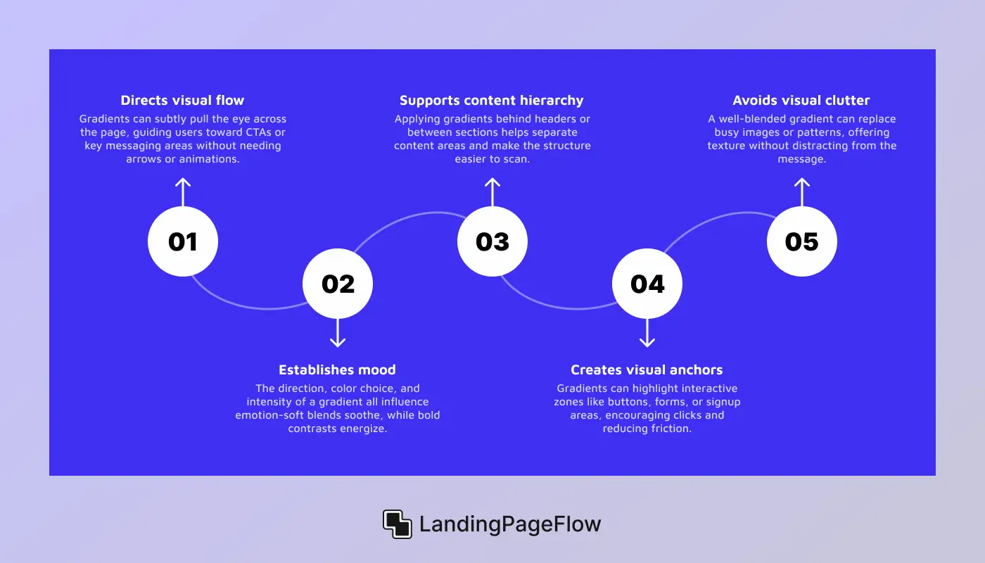
Gradients aren’t just visual flair - they’re a tool for creating intentional focus, guiding flow, and reinforcing messaging. Strategic use of gradient backgrounds can transform a basic landing page into an engaging, conversion-optimized experience. The key is applying gradients with purpose, not just for aesthetics.
- Directs visual flow: Gradients can subtly pull the eye across the page, guiding users toward CTAs or key messaging areas without needing arrows or animations.
- Establishes mood: The direction, color choice, and intensity of a gradient all influence emotion-soft blends soothe, while bold contrasts energize.
- Supports content hierarchy: Applying gradients behind headers or between sections helps separate content areas and make the structure easier to scan.
- Creates visual anchors: Gradients can highlight interactive zones like buttons, forms, or signup areas, encouraging clicks and reducing friction.
- Avoids visual clutter: A well-blended gradient can replace busy images or patterns, offering texture without distracting from the message.
4. 18+ Color Gradient For Choosing the Right Pairings
1. Fresh Green Energy

This fresh green gradient blends a vibrant lime tone with a soft leafy finish, creating a clean and rejuvenating visual experience. It evokes feelings of growth, health, and eco-consciousness.
The smooth transition adds a natural sense of movement without overwhelming the content. It feels both energetic and grounded, ideal for landing pages that aim to inspire trust and action. This palette can also suggest innovation with a calm edge - perfect for mindful tech or green startups.
Color Name & Code
- Color 1: Leaf Green - #56AB2F
- Color 2: Soft Lime - #A8E063
Suitable For
- Health & wellness brands
- Organic or eco-friendly products
- Clean tech and sustainability startups
- Mindfulness or fitness platforms
Not Suitable For
- Luxury or fashion brands
- Editorial or artistic portfolios
- Financial institutions need bold authority tones
- High-drama or nightlife event pages
2. Ocean Breeze Blend

This cool-toned gradient merges a rich aqua base with a crisp blue-teal finish, creating a refreshing and tranquil visual flow. It evokes a sense of clarity, calm confidence, and clean professionalism.
It feels light and fluid - ideal for landing pages aiming to build trust through simplicity. This palette also suggests forward-thinking and innovation, making it a great match for tech-driven businesses or health-focused platforms.
Color Name & Code
- Color 1: Deep Aqua - #06BEB6
- Color 2: Teal Mist - #48B1BF
Suitable For
- SaaS and startup landing pages
- Tech companies focused on wellness or clarity
- Health platforms or mental wellness apps
- Clean and minimalist web services
Not Suitable For
- Luxury retail or fashion brands
- Heavy editorial or vintage layouts
- Bold entertainment or nightlife themes
- Food and beverage sites requiring warmth
3. Royal Fusion

This striking gradient combines a strong indigo blue with a warm lavender-purple, delivering a bold, expressive visual tone. It conveys feelings of creativity, ambition, and confidence, making it perfect for brands that want to stand out while maintaining a polished edge.
This palette feels both modern and visionary - great for landing pages that showcase innovation, design thinking, or personal branding. It also carries a sense of sophistication, appealing to users who value style as much as substance.
Color Name & Code:
- Color 1: Indigo Blue - #4568DC
- Color 2: Royal Lavender - #B06AB3
Suitable For
- Creative portfolios and personal brands
- Tech startups with a bold visual identity
- Digital design agencies
- Online courses or coaching services
Not Suitable For
- Minimalist wellness brands
- Nature-based or eco product pages
- Corporate financial platforms
- Traditional or conservative institutions
4. Sunset Glow

This vibrant gradient merges a lively coral red with a soft sunny peach, creating a warm and emotionally charged visual experience. It instantly evokes feelings of passion, energy, and enthusiasm, making it ideal for landing pages that aim to spark immediate attention or inspire bold action.
This palette delivers a fun and inviting tone that can help boost engagement for emotionally driven or experience-based products. It works especially well for modern brands that want to come across as bold, accessible, and youthful.
Color Name & Code
- Color 1: Coral Flame - #FF5F6D
- Color 2: Peach Glow - #FFC371
Suitable For
- Event promotions and festival sites
- Youth-focused product launches
- Fitness or lifestyle campaigns
- Influencer or creator landing pages
Not Suitable For
- Financial or legal service brands
- Luxury or monochrome designs
- Minimalist tech companies
- Serious health or medical platforms
5. Navy Depth

This deep, moody gradient blends a rich midnight blue with a cool graphite-steel tone, delivering a sleek and professional aesthetic. It creates a sense of authority, focus, and mystery, ideal for landing pages that prioritize seriousness and sophistication.
The smooth, dark transition reinforces trust while drawing attention to highlighted content and calls to action. It feels strong and minimal - perfect for brands that want to convey confidence, reliability, and technical precision. This palette supports a no-nonsense tone without feeling harsh, making it especially suited to B2B platforms or security-focused tech.
Color Name & Code
- Color 1: Midnight Blue - #141E30
- Color 2: Steel Navy - #243B55
Suitable For
- Cybersecurity or IT service providers
- B2B SaaS platforms
- Dark-mode product pages
- Law firms or financial tools
Not Suitable For
- Wellness or lifestyle brands
- Youth-oriented marketing pages
- Creative portfolios need vibrance
- Food, fashion, or hospitality sites
6. Velvet Crush

This intense gradient fuses a bold magenta-pink with a deep plum purple, creating a luxurious and passionate visual effect. It evokes strong emotions - drama, romance, and depth - making it ideal for landing pages aiming to make a powerful, stylish first impression.
The rich tones suggest both artistic flair and high-end sophistication. This palette delivers high contrast with elegance, giving brands the ability to showcase confidence, individuality, and creative identity. It's perfect for pages that want to captivate and hold attention through strong visuals and a moody yet upscale atmosphere.
Color Name & Code
- Color 1: Rich Magenta - #aa076b
- Color 2: Deep Plum - #61045f
Suitable For
- Fashion or beauty product launches
- Artistic or editorial brands
- Bold personal portfolios
- Luxury event or photography sites
Not Suitable For
- Financial, legal, or conservative platforms
- Minimalist or light-tone branding
- Wellness or health tech
- Educational landing pages
7. Lime Gold Rush

This lively gradient blends a vibrant tropical green with a bright lemon-yellow, creating a punchy and energetic visual. It radiates freshness, positivity, and movement, making it perfect for landing pages that aim to energize users or promote eco-conscious and youth-driven brands.
The sharp contrast adds excitement without sacrificing clarity. It gives off a dynamic, active tone - ideal for pages that need to spark immediate interest and convey a feeling of growth, fun, or health. This palette feels both playful and powerful when applied with the right layout.
Color Name & Code
- Color 1: Tropic Green - #009245
- Color 2: Lemon Zing - #FCEE21
Suitable For
- Health drinks and fitness brands
- Youth-focused or eco startups
- Travel or summer promotions
- Sustainability or lifestyle apps
Not Suitable For
- Formal business or fintech pages
- Luxury or high-end fashion
- Calm or minimal wellness brands
- Medical or serious educational content
8. Concrete Mist

This muted gradient flows from a soft, cool gray to a deep urban charcoal, delivering a calm, refined, and minimal visual tone. It feels grounded, modern, and slightly mysterious, making it ideal for brands that prioritize subtle sophistication over flashy visuals.
The low-contrast blend adds a gentle sense of depth without drawing too much attention away from the content. It gives a professional, neutral, and balanced impression, great for mature brands or product-focused pages that want users to focus on messaging, features, or interface clarity.
Color Name & Code
- Color 1: Soft Graphite - #868F96
- Color 2: Urban Charcoal - #596164
Suitable For
- B2B platforms or SaaS dashboards
- Architecture and industrial portfolios
- UX case studies or design systems
- Modern tech or AI-related products
Not Suitable For
- Fashion or lifestyle influencer pages
- Children’s products or colorful branding
- Bold personal brands
- Emotional or storytelling-based content
9. Plum Flame

This bold and luxurious gradient merges a deep cherry red with a rich royal purple, delivering high contrast and unmistakable drama. It conveys elegance, passion, and a creative edge, making it ideal for landing pages that aim to leave a powerful impression.
The saturated tones suggest a sense of prestige while keeping the layout visually compelling. It creates a stylized and memorable aesthetic, especially suited to artistic or premium brands that want to evoke emotion, richness, and attention with every scroll.
Color Name & Code
- Color 1: Crimson Rose - #CC2B5E
- Color 2: Velvet Purple - #753A88
Suitable For
- Luxury fashion or beauty campaigns
- Art portfolios or editorial brands
- Bold digital product showcases
- Personal branding for creatives
Not Suitable For
- Clean tech or medical platforms
- Educational sites or finance tools
- Minimalist corporate branding
- Pages requiring calm, neutral tones
10. Fiery Fade

This fiery gradient transitions from a vivid cherry red to a warm sunset orange, delivering high energy and urgency. It immediately grabs attention with its bold, warm tones, perfect for driving conversions, highlighting offers, or amplifying emotional impact.
The intensity of the colors creates a sense of momentum and action. It projects confidence, passion, and clarity, making it ideal for high-impact landing pages that need to quickly engage and direct users toward a call to action.
Color Name & Code
- Color 1: Cherry Red - #EB3349
- Color 2: Sunset Orange - #F45C43
Suitable For
- Limited-time promotions or sales
- Call-to-action sections or banners
- Fitness or lifestyle product launches
- Bold eCommerce landing pages
Not Suitable For
- Calm or meditative wellness brands
- Financial institutions need trust tones
- Editorial storytelling platforms
- Luxury brands prefer subdued elegance
11. Indigo Steel

This sophisticated gradient combines a muted plum purple with a cool steel blue, creating a balanced and subtly moody effect. It feels both intellectual and grounded, giving your landing page a calm yet modern vibe.
The gentle contrast offers just enough depth without overwhelming the content or visuals. It works well for brands seeking a refined, thoughtful, or even slightly mysterious tone, perfect for landing pages that value professionalism with a creative edge.
Color Name & Code
- Color 1: Plum Indigo - #614385
- Color 2: Steel Blue Gray - #516395
Suitable For
- Creative tech products
- Design portfolios and case studies
- Educational or coaching platforms
- Modern SaaS or productivity tools
Not Suitable For
- Bold eCommerce brands
- Youth lifestyle or fashion pages
- Wellness or nature-themed sites
- High-energy or entertainment pages
12. Deep Ocean Drive

This intense gradient flows from a nearly black navy to a bold electric blue, creating a sleek and commanding aesthetic. It feels modern, powerful, and slightly mysterious - perfect for landing pages aiming to impress with bold contrast and visual authority.
The deep hues suggest depth, innovation, and technical precision. It’s highly effective for drawing attention to CTAs, headers, or product features without overpowering the content. This blend gives a futuristic and premium tone, ideal for tech-forward or design-driven brands.
Color Name & Code
- Color 1: Deep Navy - #000428
- Color 2: Electric Blue - #004E92
Suitable For
- SaaS or cybersecurity platforms
- Finance or investment dashboards
- AI, Web3, or blockchain brands
- Premium hardware or tech showcases
Not Suitable For
- Wellness or lifestyle brands
- Children's products or playful brands
- Artistic or boho-style portfolios
- Bright, minimalist aesthetic pages
13. Sand & Sea

This radiant gradient transitions from a soft golden beige to a rich deep ocean blue, creating a warm-to-cool blend that evokes feelings of calm discovery and professional polish.
The contrast between the soft top and moody bottom makes it visually engaging without overpowering the layout. It’s perfect for landing pages that want to feel welcoming, trustworthy, and insightful, especially when storytelling or long-scroll interaction is involved.
Color Name & Code
- Color 1: Golden Sand - #FFD89B
- Color 2: Deep Marine - #19547B
Suitable For
- Coaching or personal brand sites
- Real estate or travel landing pages
- Portfolio and agency sites with case studies
- Platforms that blend warmth and credibility
Not Suitable For
- Bold youth-focused eCommerce
- Hyper-minimalist or grayscale layouts
- Fast-paced gaming or nightlife themes
- Luxury brands that rely on dark tones
14. Fresh Flow
This clean and energetic gradient blends a crisp aqua blue with a smooth minty green, giving off a fresh and modern vibe. It communicates clarity, innovation, and approachability, ideal for brands that want to appear sleek, reliable, and current.
The harmony between tones adds movement without distraction. It’s perfect for creating a light, forward-looking aesthetic that feels uplifting, user-friendly, and subtly futuristic.
Color Name & Code
- Color 1: Aqua Blue - #02AAB0
- Color 2: Mint Green - #00CDAC
Suitable For
- Fintech and SaaS startups
- Health and productivity apps
- Agency or consultant landing pages
- Clean tech or eco-innovation platforms
Not Suitable For
- Luxury fashion or editorial brands
- Dark-themed product showcases
- Artistic portfolios with rich texture
- Brands needing deep emotional tones
15. Soft Bloom

This gentle gradient fades from a light lavender mist to a soft blush pink, creating a dreamy and delicate visual effect. It radiates calm, femininity, and warmth - perfect for designs where elegance and approachability matter most.
The subtle contrast maintains clarity without overpowering your message. It works well for brands that want to evoke a softer emotional connection, while still feeling polished and modern.
Color Name & Code
- Color 1: Lavender Mist - #DDD6F3
- Color 2: Blush Petal - #FAACA8
Suitable For
- Beauty or skincare landing pages
- Personal brands and lifestyle blogs
- Creative portfolios or event pages
- Wedding, floral, or boutique services
Not Suitable For
- Bold tech or SaaS platforms
- High-energy youth brands
- Industrial or construction-related content
- Gaming or entertainment landing pages
16. Arctic Wave

This refreshing gradient blends a deep ocean blue with a soft icy teal, creating a crisp, clean aesthetic that evokes feelings of trust, clarity, and calm momentum.
The tonal shift adds visual interest while maintaining a minimalist and professional edge. Perfect for brands looking to project a tech-forward, dependable, and cool-toned presence, this gradient supports clarity while subtly guiding the eye.
Color Name & Code
- Color 1: Deep Ice Blue - #13547A
- Color 2: Frosted Teal - #80D0C7
Suitable For
- SaaS dashboards or productivity apps
- Medical or wellness platforms
- Tech portfolios or agency landing pages
- Finance, insurance, or consulting brands
Not Suitable For
- High-energy lifestyle brands
- Bold eCommerce sites targeting Gen Z
- Artistic or expressive personal portfolios
- Pages needing warm, emotional appeal
17. Arctic Depth

This sophisticated gradient shifts from a dark steel blue-gray to a soft glacial teal, creating a cool and composed visual tone. It conveys confidence, professionalism, and a calm authority -ideal for brands that value clarity and subtle impact.
The gradient has a polished, slightly futuristic feel without being too bold. Its balance between dark and light makes it a versatile background choice that supports strong typography and clear visual hierarchy.
Color Name & Code
- Color 1: Slate Blue - #2C3E50
- Color 2: Arctic Teal - #4CA1AF
Suitable For
- Corporate or B2B landing pages
- Consulting and SaaS platforms
- Minimalist design studios
- Health tech or financial services
Not Suitable For
- Bold creative portfolios
- Fashion or luxury brands need drama
- Playful or youth-oriented brands
- High-contrast marketing splash pages
18. Rose Mist

This romantic gradient transitions from a vibrant rose pink to a gentle pastel peach, creating a dreamy and elegant atmosphere. It radiates warmth, comfort, and subtle femininity, making it ideal for brands that want to appear caring, lighthearted, and stylish.
The soft contrast supports text while adding an airy charm. It’s an excellent choice for storytelling, emotional appeal, or visual softness that doesn’t sacrifice clarity.
Color Name & Code
- Color 1: Rose Pink - #FF9A9E
- Color 2: Peach Blush - #FAD0C4
Suitable For
- Beauty, skincare, or lifestyle brands
- Event planning or wedding sites
- Personal blogs or influencer pages
- Boutique shops or handmade goods
Not Suitable For
- High-tech or finance platforms
- Gaming, nightlife, or bold entertainment brands
- Industrial or heavy visual styles
- Serious corporate or medical content
19. Crimson Rush

This fiery gradient flows from a bold sunset orange to a deep magenta rose, creating a powerful, high-energy aesthetic. It commands attention and evokes passion, creativity, and momentum, making it perfect for bold brands and impactful CTAs.
The sharp color transition adds dynamic movement across the design. It works best when your goal is to stir emotion, spark action, and drive visual excitement on landing pages.
Color Name & Code
- Color 1: Sunset Orange - #FF512F
- Color 2: Magenta Rose - #DD2476
Suitable For
- Bold marketing or launch pages
- Music, fashion, or lifestyle brands
- Creative portfolios or design agencies
- Events, festivals, or entertainment
Not Suitable For
- Minimalist or corporate platforms
- Healthcare, finance, or legal services
- Eco-conscious or wellness-focused brands
- Formal business-to-business (B2B) websites
20. Lavender Haze

This gentle gradient moves from a deep violet-purple to a soft rosy pink, creating a romantic and modern visual that feels both calm and expressive. It brings a sense of creativity, calm confidence, and style, ideal for brands that want a delicate yet bold presence.
The transition is smooth and visually pleasing, making it a standout without overwhelming the page. It’s especially effective for platforms that want to blend artistic flair with a professional tone.
Color Name & Code
- Color 1: Royal Lavender - #654EA3
- Color 2: Petal Pink - #EAAFC8
Suitable For
- Beauty or skincare brands
- Editorial landing pages
- Art, fashion, or creative portfolios
- Boutique product showcases
Not Suitable For
- High-tech or data-driven dashboards
- Industrial or construction-based platforms
- Minimalist corporate sites
- Financial or legal institutions
21. Electric Bloom

This vibrant gradient blends a hot magenta pink with a fiery coral red, bursting with energy and intensity. It feels youthful, passionate, and loud - designed to grab attention instantly.
The strong saturation and contrast make it perfect for landing pages that need to stand out and push users to take action. It delivers a playful yet rebellious tone, ideal for bold, creative brands with a confident voice.
Color Name & Code
- Color 1: Neon Fuchsia - #EC008C
- Color 2: Coral Heat - #FC6767
Suitable For
- Fashion, beauty, or cosmetics brands
- Music, influencer, or entertainment pages
- Limited-time campaign or product launches
- Creative event and pop culture landing pages
Not Suitable For
- Professional or B2B services
- Wellness or sustainability-focused brands
- Corporate legal, medical, or financial platforms
- Pages requiring soft or minimalist aesthetics
5. Common Mistakes to Avoid When Using Gradients

1. Overuse
Problem:
Using too many gradients on a single page can make the design feel busy, chaotic, and hard to navigate. This overwhelms visitors and reduces visual hierarchy.
Solution:
Use gradients selectively - apply them to highlight key sections like headers, CTAs, or hero areas. Keep surrounding design elements more minimal for balance.
2. Poor Color Choice
Problem:
Choosing colors that don’t align with your brand or evoke the wrong emotions can confuse or repel your target audience.
Solution:
Choose gradient colors that reflect your brand personality and appeal to your target audience emotionally and visually. Test them in different lighting and device conditions.
3. Ignoring Context
Problem:
Applying gradients without considering the tone, purpose, or industry context can make a design look inappropriate or unprofessional.
Solution:
Match the gradient style with your page’s goal—use bold gradients for creative brands, soft ones for wellness, and avoid flashy combos in formal industries like finance or law.
4. Inadequate Testing
Problem:
Skipping visual or usability testing can lead to gradients that look poor on some screens, hinder accessibility, or affect text readability.
Solution:
Test gradients across various devices, screen resolutions, and lighting conditions. Ensure contrast levels meet accessibility standards for legibility.
5. Clashing Colors
Problem:
Using gradient colors that don’t transition smoothly or clash in hue can result in jarring visuals that disrupt the page flow.
Solution:
Choose colors within the same color family or that sit well on the color wheel. Use gradient tools to preview smooth transitions before finalizing.
6. Not Considering the Scale of the Space
Problem:
Applying complex gradients in small or crowded spaces can make the layout feel cramped and unclear.
Solution:
Use subtle gradients in compact areas and reserve bold, sweeping gradients for large backgrounds or hero sections where they can shine without distraction.
Conclusion
Gradients, when used thoughtfully, can elevate your landing page design from ordinary to impactful. They create visual interest, guide user attention, and communicate brand emotion - all in a smooth, modern way.
But like any design tool, poor execution leads to confusion and reduced performance. By choosing the right color combinations, testing across devices, and avoiding common pitfalls like overuse or clashing hues, you can turn gradients into a strategic advantage.
Always prioritize clarity, contrast, and alignment with your brand’s tone. The key is balance - use gradients to enhance, not overwhelm.
Let them work with your content, not against it. Invest time in selecting the right palette and pairing it with a clean design. When done right, gradients boost both engagement and conversion.

FAQ
1. Are gradients still relevant in modern web design?
Yes, gradients are more popular than ever in 2026. When used with intention, they add depth, vibrancy, and emotional tone to landing pages without feeling outdated.
2. How many colors should I use in a gradient?
Ideally, stick to two or three colors. More than that can overwhelm users and dilute your message. Keep it clean and purpose-driven.
3. Can I use gradients behind text?
Yes, but only if the contrast is high enough. Always test readability, especially for headings or CTAs. Consider overlaying text on dark or neutral gradient sections.
4. Do gradients affect page loading speed?
When applied via CSS or lightweight SVGs, gradients have minimal impact on speed. Avoid using heavy image files when a CSS gradient can achieve the same look.
5. Should I use gradients throughout the entire landing page?
Use them strategically, not everywhere. Gradients work best in hero sections, backgrounds behind CTAs, or to divide key sections - overusing them can confuse users.

Altaf Rahman


.webp)


