Color psychology in web design continues to shape digital experiences in 2026, playing a crucial role in driving user engagement, increasing conversion rates, and reinforcing brand identity.
Warm tones like red, orange, and yellow tend to create urgency, excitement, and energy, often used in call-to-action buttons and eCommerce landing pages.
In contrast, cool hues such as blue, green, and purple evoke calmness, trust, and clarity, making them ideal for corporate websites, tech brands, and healthcare platforms.
This guide explores which performs better for different goals, backed by current data, behavioral research, and design best practices.
If you're looking to optimize your landing pages, boost engagement, or refine your website color palette, this breakdown of warm vs cool color psychology in 2026 will help you make confident, conversion-focused decisions.
"Warm or cool? We’ll help you pick based on audience behavior and trends.
Schedule a free strategy call to align your colors with performance."
Table of Contents
- What is Warm Color?
- What is Cool Color?
- What are Warm Colors?
- What are Cool Colors?
- Best Use Cases For Warm Color Palettes
- Best Use Cases For Cool Color Palettes
- 2026 Color Trends in Web and UI Design
1. What is Warm Color?
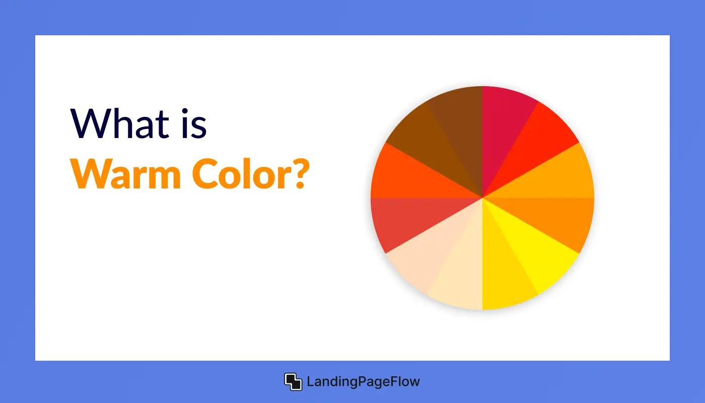
Warm colors are hues that evoke warmth, energy, and stimulation - often associated with sunlight, fire, and emotion. These include red, orange, yellow, and various shades in between. In design, they create a sense of urgency, excitement, and emotional intensity.
Warm colors are powerful tools for attracting attention and encouraging action. They are commonly used in call-to-action buttons, sales banners, and advertising visuals because they stimulate the viewer's senses and drive engagement.
However, overusing warm tones can sometimes feel overwhelming or aggressive if not balanced with neutral or cooler elements.
2. What is Cool Color?
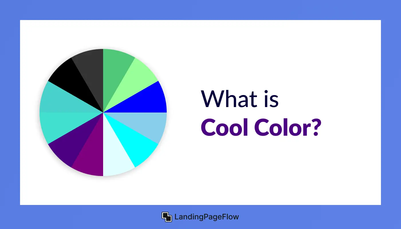
Cool colors are hues that evoke calmness, trust, and professionalism - typically associated with water, sky, and tranquility. These include blue, green, purple, and variations like teal or violet. In design, cool tones create a soothing atmosphere, reduce visual tension, and build a sense of reliability.
These colors are often used in corporate websites, finance platforms, tech brands, and healthcare services where trust and clarity are key.
Unlike warm colors, cool shades are less aggressive, making them ideal for longer content consumption, form fields, and brand storytelling.
3. What are Warm Colors?
Warm colors are hues found on the red, orange, and yellow side of the color wheel. These shades are visually associated with heat, energy, sunlight, and passion, which is why they tend to evoke feelings of excitement, urgency, and positivity.
In color psychology, warm tones are known for stimulating emotional responses and encouraging action. They're ideal for grabbing attention and are widely used in marketing, branding, and web design to drive conversions or highlight important elements.
Explore the Warm Color Palette Below:
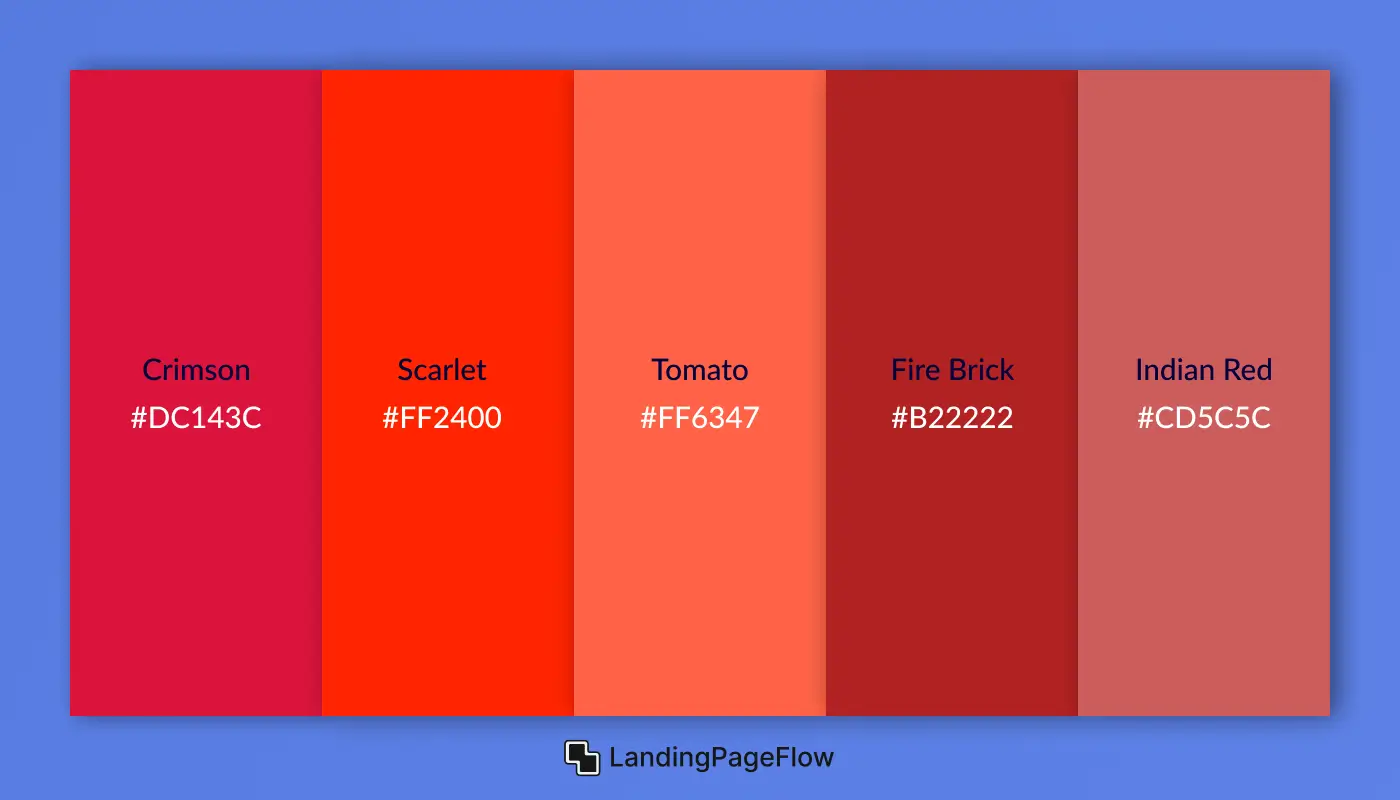
1. Warm Reds
Warm reds are bold, emotionally intense colors often used to create urgency, passion, and excitement. These shades stimulate action and are widely used in calls-to-action, branding, and food industry design. They draw attention quickly and work well for creating high-energy interfaces.
1. Crimson
- HEX: #DC143C
- RGB: 220, 20, 60
- HSL: 348, 83%, 47%
2. Scarlet
- HEX: #FF2400
- RGB: 255, 36, 0
- HSL: 9, 100%, 50%
3. Tomato
- HEX: #FF6347
- RGB: 255, 99, 71
- HSL: 9, 100%, 64%
4. Fire Brick
- HEX: #B22222
- RGB: 178, 34, 34
- HSL: 0, 68%, 42%
5. Indian Red
- HEX: #CD5C5C
- RGB: 205, 92, 92
- HSL: 0, 53%, 58%
2. Warm Oranges
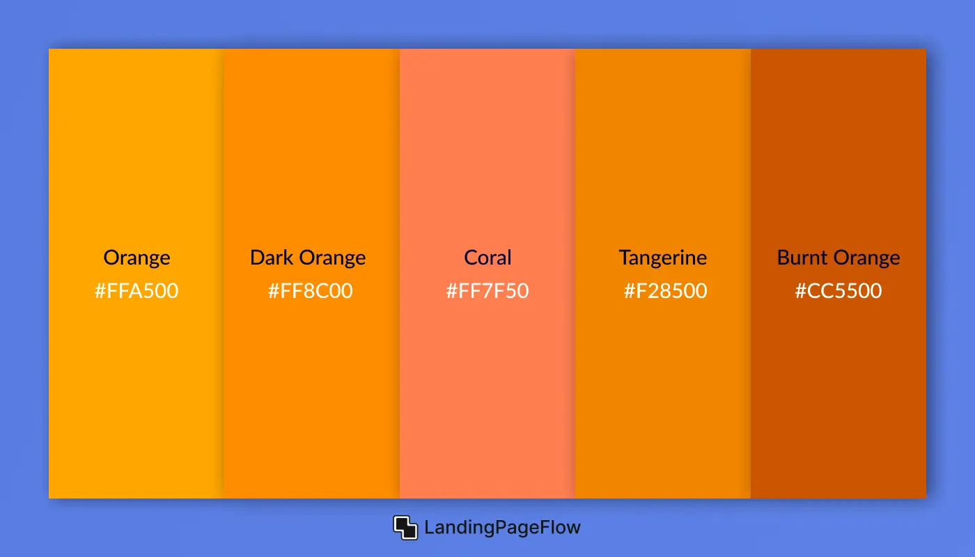
Warm oranges radiate energy, friendliness, and creativity. These hues sit between red and yellow on the color wheel and are often used in CTA buttons, youth brands, and seasonal campaigns. They instantly grab attention while keeping the tone inviting and upbeat.
1. Orange
- HEX: #FFA500
- RGB: 255, 165, 0
- HSL: 39, 100%, 50%
2. Dark Orange
- HEX: #FF8C00
- RGB: 255, 140, 0
- HSL: 33, 100%, 50%
3. Coral
- HEX: #FF7F50
- RGB: 255, 127, 80
- HSL: 16, 100%, 66%
4. Tangerine
- HEX: #F28500
- RGB: 242, 133, 0
- HSL: 35, 100%, 47%
5. Burnt Orange
- HEX: #CC5500
- RGB: 204, 85, 0
- HSL: 24, 100%, 40%
3. Warm Yellow
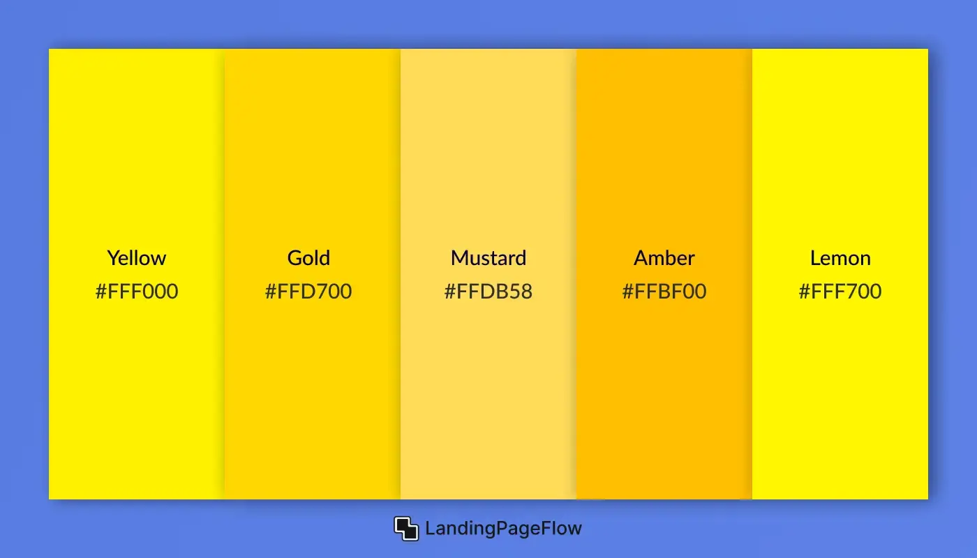
Warm yellows convey optimism, clarity, and cheerfulness. These colors instantly brighten interfaces, making them perfect for positive branding, highlighting elements, and youthful digital products. When used correctly, they uplift user emotion and draw attention without overwhelming.
1. Yellow
- HEX: #FFF000
- RGB: 255, 255, 0
- HSL: 60, 100%, 50%
2. Gold
- HEX: #FFD700
- RGB: 255, 215, 0
- HSL: 51, 100%, 50%
3. Mustard
- HEX: #FFDB58
- RGB: 255, 219, 88
- HSL: 48, 100%, 67%
4. Amber
- HEX: #FFBF00
- RGB: 255, 191, 0
- HSL: 45, 100%, 50%
5. Lemon
- HEX: #FFF700
- RGB: 255, 247, 0
- HSL: 57, 100%, 50%
4. Warm Peach
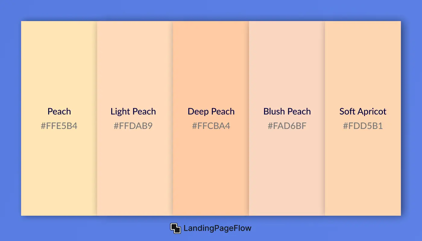
Peach colors blend soft orange and pink hues to create a warm, friendly, and welcoming vibe. These shades are ideal for feminine branding, lifestyle websites, and health or beauty products. They bring a sense of softness while still feeling fresh and emotionally engaging.
1. Peach
- HEX: #FFE5B4
- RGB: 255, 229, 180
- HSL: 37, 100%, 85%
2. Light Peach
- HEX: #FFDAB9
- RGB: 255, 218, 185
- HSL: 28, 100%, 86%
3. Deep Peach
- HEX: #FFCBA4
- RGB: 255, 203, 164
- HSL: 27, 100%, 82%
4. Blush Peach
- HEX: #FAD6BF
- RGB: 250, 214, 191
- HSL: 23, 83%, 86%
5. Soft Apricot
- HEX: #FDD5B1
- RGB: 253, 213, 177
- HSL: 30, 92%, 84%
5. Warm Vermilion
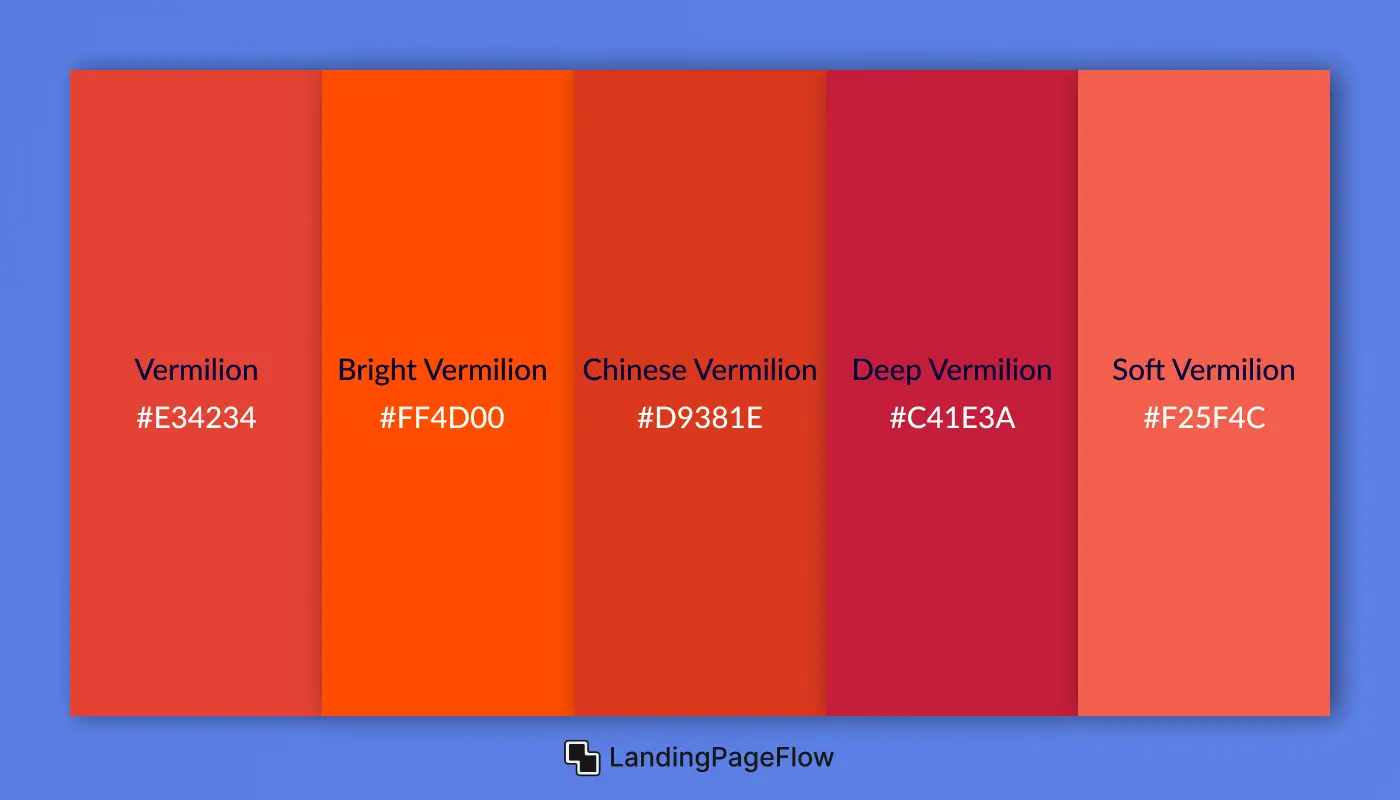
Vermilion is a bold, fiery red-orange hue that symbolizes energy, confidence, and vitality. Long used in art, branding, and cultural symbolism, this striking shade is perfect for bold CTAs, branding for creators, and campaigns seeking high visual impact. It demands attention and conveys passion with edge.
1. Vermilion
- HEX: #E34234
- RGB: 227, 66, 52
- HSL: 5, 77%, 55%
2. Bright Vermilion
- HEX: #FF4D00
- RGB: 255, 77, 0
- HSL: 18, 100%, 50%
3. Chinese Vermilion
- HEX: #D9381E
- RGB: 217, 56, 30
- HSL: 9, 75%, 48%
4. Deep Vermilion
- HEX: #C41E3A
- RGB: 196, 30, 58
- HSL: 348, 73%, 44%
5. Soft Vermilion
- HEX: #F25F4C
- RGB: 242, 95, 76
- HSL: 8, 85%, 62%
6. Warm Brown
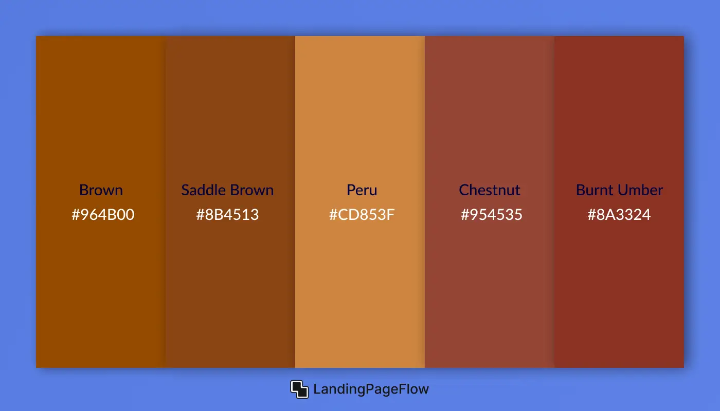
Brown colors represent stability, earthiness, and comfort, making them ideal for organic brands, coffee shops, artisan products, and rustic web designs. These warm neutrals add a grounded, natural feel to digital spaces, creating a sense of trust and authenticity.
1. Brown
- HEX: #964B00
- RGB: 150, 75, 0
- HSL: 30, 100%, 29%
2. Saddle Brown
- HEX: #8B4513
- RGB: 139, 69, 19
- HSL: 25, 76%, 31%
3. Peru
- HEX: #CD853F
- RGB: 205, 133, 63
- HSL: 30, 59%, 53%
4. Chestnut
- HEX: #954535
- RGB: 149, 69, 53
- HSL: 10, 48%, 40%
5. Burnt Umber
- HEX: #8A3324
- RGB: 138, 51, 36
- HSL: 10, 59%, 34%
4. What are Cool Colors?
Cool colors are hues that create a calming, soothing, and refreshing visual effect. These shades are typically found on the color wheel's blue, green, and purple side and are commonly associated with water, sky, and nature. Cool colors evoke trust, stability, and relaxation in design, making them a popular choice for corporate brands, health platforms, and tech interfaces.
Unlike warm colors that stimulate action, cool tones encourage users to stay longer, feel secure, and focus. They're often used as background shades, accent sections, or brand palettes where subtlety and professionalism are key.
Explore the Cool Color Palette Below:
1. Cool Green
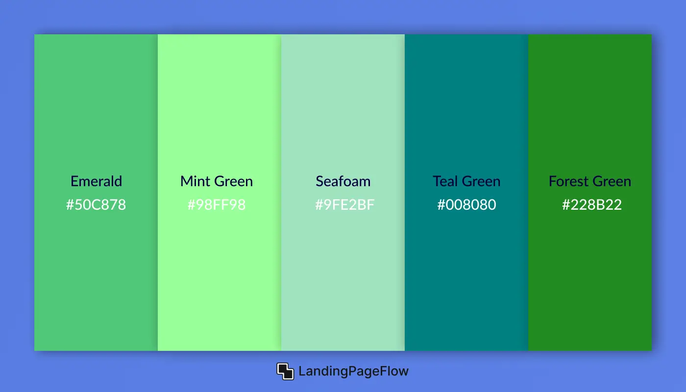
Cool greens reflect balance, renewal, and nature. These hues are calming yet fresh, often used in healthcare, eco-friendly brands, tech startups, and finance platforms to convey stability, growth, and trust. They’re perfect for clean designs that feel grounded and refreshing without being too bold.
1. Emerald
- HEX: #50C878
- RGB: 80, 200, 120
- HSL: 140, 52%, 55%
2. Mint Green
- HEX: #98FF98
- RGB: 152, 255, 152
- HSL: 120, 100%, 80%
3. Seafoam
- HEX: #9FE2BF
- RGB: 159, 226, 191
- HSL: 150, 52%, 75%
4. Teal Green
- HEX: #008080
- RGB: 0, 128, 128
- HSL: 180, 100%, 25%
5. Forest Green
- HEX: #228B22
- RGB: 34, 139, 34
- HSL: 120, 61%, 34%
2. Cool Blue
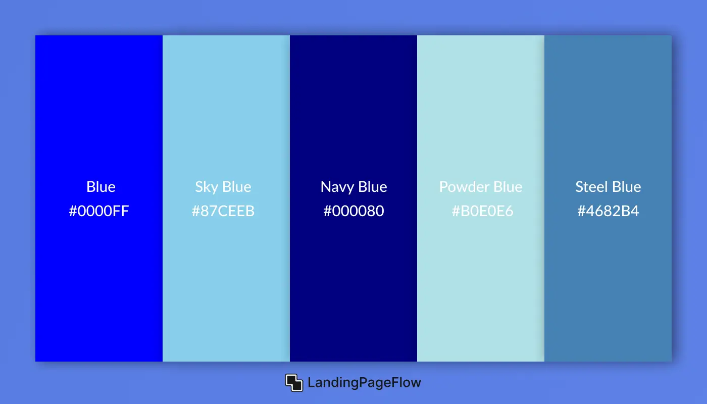
Cool blues represent trust, stability, and professionalism. These shades are calm and focused, making them ideal for tech companies, financial platforms, corporate brands, and medical websites. Blue is also one of the most universally liked colors, often used to build user confidence and communicate clarity.
1. Blue
- HEX: #0000FF
- RGB: 0, 0, 255
- HSL: 240, 100%, 50%
2. Sky Blue
- HEX: #87CEEB
- RGB: 135, 206, 235
- HSL: 197, 71%, 73%
3. Navy Blue
- HEX: #000080
- RGB: 0, 0, 128
- HSL: 240, 100%, 25%
4. Powder Blue
- HEX: #B0E0E6
- RGB: 176, 224, 230
- HSL: 187, 52%, 80%
5. Steel Blue
- HEX: #4682B4
- RGB: 70, 130, 180
- HSL: 207, 44%, 49%
3. Cool Cyan
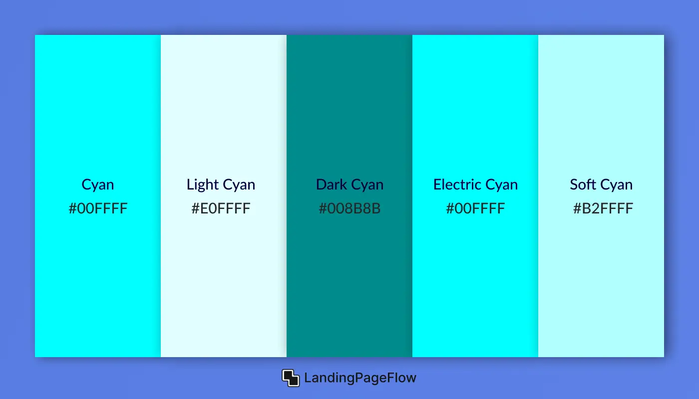
Cyan is a crisp, refreshing cool tone that blends the calm of blue with the clarity of green. It evokes feelings of cleanliness, tech innovation, and fresh thinking. Often used in modern UI design, data dashboards, medical platforms, and futuristic branding, cyan communicates precision and sleekness without harshness.
1. Cyan
- HEX: #00FFFF
- RGB: 0, 255, 255
- HSL: 180, 100%, 50%
2. Light Cyan
- HEX: #E0FFFF
- RGB: 224, 255, 255
- HSL: 180, 100%, 94%
3. Dark Cyan
- HEX: #008B8B
- RGB: 0, 139, 139
- HSL: 180, 100%, 27%
4. Electric Cyan
- HEX: #00FFFF
- RGB: 0, 255, 255
- HSL: 180, 100%, 50%
5. Soft Cyan
- HEX: #B2FFFF
- RGB: 178, 255, 255
- HSL: 180, 100%, 85%
4. Cool Purple
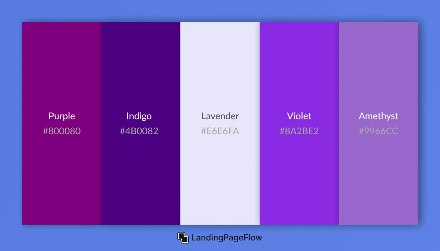
Cool purples blend the mystery of blue with the creativity of red, resulting in tones that feel sophisticated, futuristic, and imaginative. Often used in luxury branding, tech startups, beauty products, and artistic portfolios, cool purples add a sense of depth, innovation, and premium elegance.
1. Purple
- HEX: #800080
- RGB: 128, 0, 128
- HSL: 300, 100%, 25%
2. Indigo
- HEX: #4B0082
- RGB: 75, 0, 130
- HSL: 275, 100%, 25%
3. Lavender
- HEX: #E6E6FA
- RGB: 230, 230, 250
- HSL: 240, 67%, 94%
4. Violet
- HEX: #8A2BE2
- RGB: 138, 43, 226
- HSL: 271, 76%, 53%
5. Amethyst
- HEX: #9966CC
- RGB: 153, 102, 204
- HSL: 270, 50%, 60%
5. Cool Turquoise
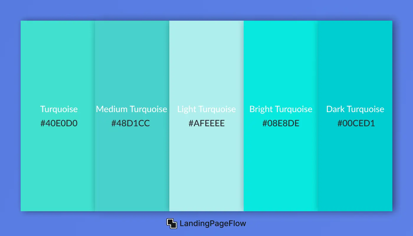
Turquoise sits perfectly between blue and green, evoking feelings of freshness, clarity, and vitality. It’s commonly used in health brands, spa websites, tech startups, and ocean-inspired designs. Turquoise brings a clean, modern, and uplifting mood that feels both cool and energetic.
1. Turquoise
- HEX: #40E0D0
- RGB: 64, 224, 208
- HSL: 174, 72%, 56%
2. Medium Turquoise
- HEX: #48D1CC
- RGB: 72, 209, 204
- HSL: 178, 60%, 55%
3. Light Turquoise
- HEX: #AFEEEE
- RGB: 175, 238, 238
- HSL: 180, 65%, 81%
4. Bright Turquoise
- HEX: #08E8DE
- RGB: 8, 232, 222
- HSL: 177, 93%, 47%
5. Dark Turquoise
- HEX: #00CED1
- RGB: 0, 206, 209
- HSL: 181, 100%, 41%
6. Cool Black
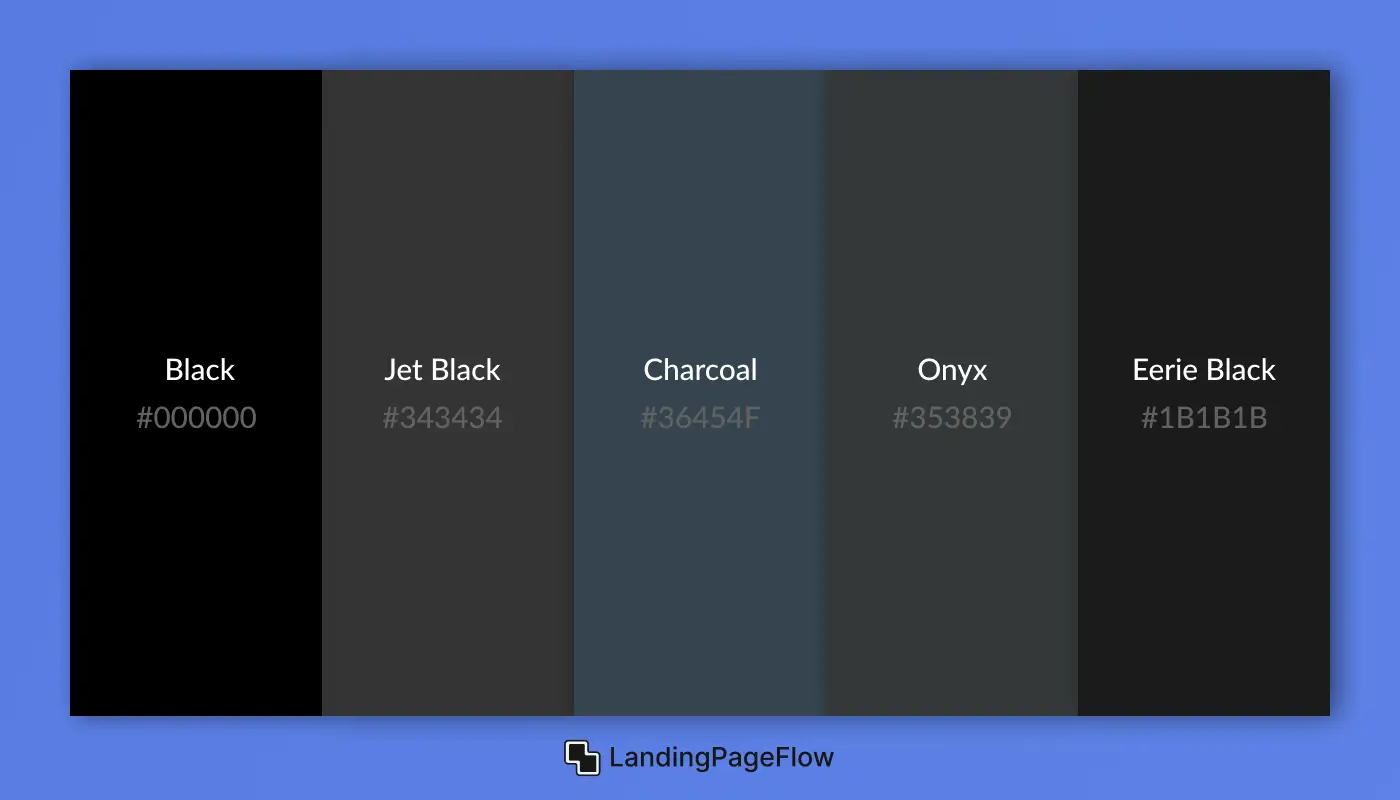
Black symbolizes power, elegance, and sophistication. It’s a staple in luxury branding, minimalist design, and high-contrast interfaces. While pure black delivers drama and depth, near-black shades add subtle variation for more nuanced, modern UI and typography without the harshness of true black.
1. Black
- HEX: #000000
- RGB: 0, 0, 0
- HSL: 0, 0%, 0%
2. Jet Black
- HEX: #343434
- RGB: 52, 52, 52
- HSL: 0, 0%, 20%
3. Charcoal
- HEX: #36454F
- RGB: 54, 69, 79
- HSL: 210, 19%, 26%
4. Onyx
- HEX: #353839
- RGB: 53, 56, 57
- HSL: 192, 4%, 22%
5. Eerie Black
- HEX: #1B1B1B
- RGB: 27, 27, 27
- HSL: 0, 0%, 11%
5. Best Use Cases For Warm Color Palettes
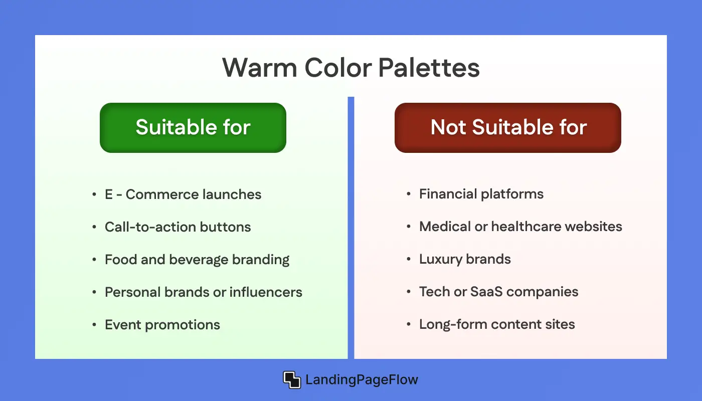
Warm color palettes - featuring reds, oranges, and yellows, evoke energy, urgency, and emotional warmth. These hues are visually stimulating and excellent for creating impactful first impressions, driving engagement, and prompting quick decisions. When used strategically, warm tones can enhance emotional resonance and guide user behavior effectively.
Suitable For
- eCommerce launches and flash sales that require attention and urgency.
- Call-to-action buttons need high visibility and fast engagement.
- Food and beverage branding that stimulates appetite and energy.
- Personal brands or influencers aiming for warmth and emotional connection.
- Event promotions or countdown campaigns are looking to build momentum.
Not suitable For
- Financial platforms or insurance sites where trust and neutrality are key.
- Medical or healthcare websites requiring calm and reassurance.
- Luxury brands or minimalist portfolios need elegance and restraint.
- Tech or SaaS companies focused on clarity, structure, and logic.
- Long-form content sites where warm tones may cause visual fatigue.
6. Best Use Cases For Cool Color Palettes
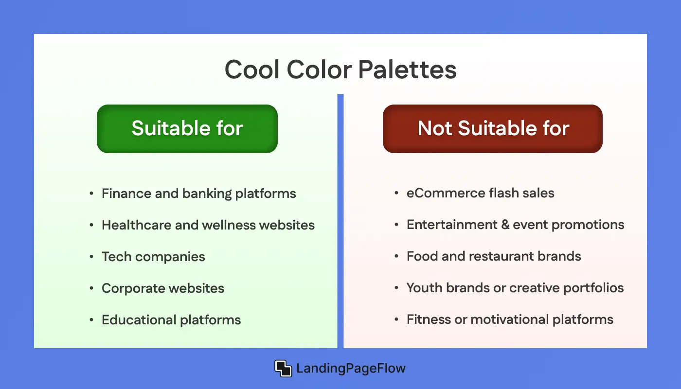
Cool color palettes - built around blues, greens, and purples, are known for promoting calmness, trust, and clarity. These shades create a relaxing visual experience and are ideal for brands that want to feel professional, clean, and dependable. Cool tones help users feel safe and focused, making them perfect for informative, long-form, or detail-heavy content.
Suitable For
- Finance and banking platforms require authority and trust.
- Healthcare and wellness websites focused on calm and care.
- Tech companies that want to convey logic, innovation, and clarity.
- Corporate websites seek a clean, professional appearance.
- Educational platforms or long-form content sites that prioritize focus.
Not suitable For
- eCommerce flash sales need urgency or high-impact visuals.
- Entertainment and event promotions that depend on excitement.
- Food and restaurant brands where appetite stimulation is key.
- Youth brands or creative portfolios are looking for warmth and boldness.
- Fitness or motivational platforms that rely on energetic color cues.
7. 2026 Color Trends in Web and UI Design
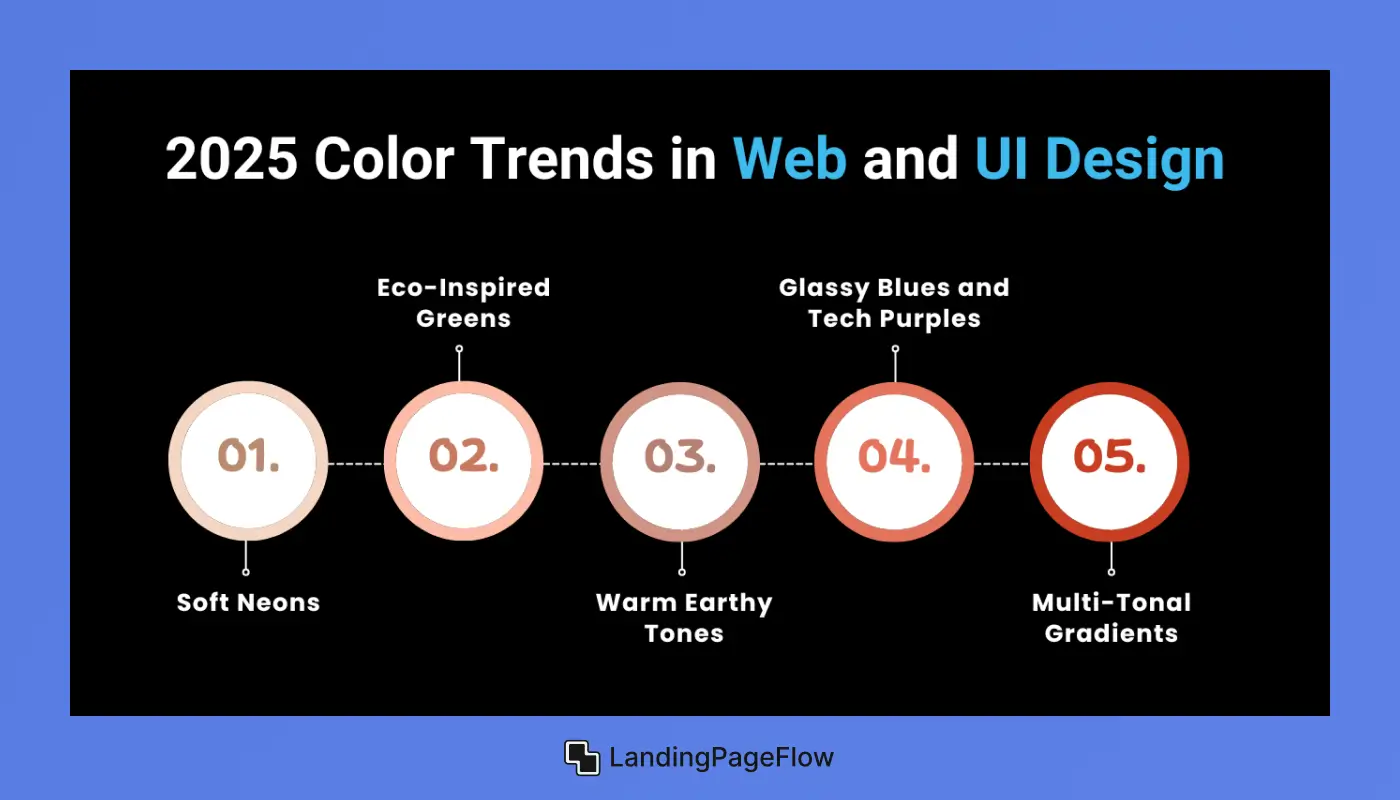
Design in 2026 is shaped by the need for clarity, emotional intelligence, and brand distinction. Colors are no longer just visual tools - they're strategic assets. Brands are blending digital minimalism with expressive palettes that balance mood, usability, and storytelling.
1. Soft Neons
Muted yet vibrant versions of neon shades like mint, electric lavender, and digital cyan are trending. They create a modern, futuristic aesthetic without overwhelming the viewer.
- Why it works: Eye-catching without causing fatigue
- Popular with: Startups, crypto, AI tools
2. Eco-Inspired Greens
Tones like sage, moss, and seafoam reflect themes of sustainability, calmness, and organic living. These are everywhere, from product sites to fintech dashboards.
- Why it works: Feels safe, natural, and grounded
- Popular with: Wellness brands, eco-tech, finance
3. Warm Earthy Tones
Shades like terracotta, burnt orange, and clay pink bring back warmth and humanity in digital interfaces. Used to build emotional trust and visual depth.
- Why it works: Emotionally grounded, less sterile
- Popular with: Creators, eCommerce, lifestyle blogs
4. Glassy Blues and Tech Purples
Modern UIs are embracing cooler tones like frosted blue, ultraviolet, and graphite purple to express clarity, tech elegance, and futuristic vibes.
- Why it works: Clean and trustworthy
- Popular with: SaaS, productivity tools, dashboards
5. Multi-Tonal Gradients
Designers are layering subtle color transitions instead of flat fills - think sunset fades, depth overlays, and iridescent shimmer effects.
- Why it works: Adds richness without clutter
- Popular with: Portfolios, landing pages, Gen Z brands
Conclusion
Color theory in 2026 plays a powerful role in shaping user experience, brand perception, and emotional engagement. It’s no longer just a visual accent - it’s a core part of how a product communicates, feels, and performs.
From calming eco-greens to expressive soft neons, the year’s palettes reflect a demand for designs that feel both intentional and human.
Each color trend serves a unique purpose: building trust, evoking energy, or creating emotional resonance. Designers are using color to lead attention, reduce friction, and support deeper storytelling across digital platforms.
Selecting the right palette requires more than aesthetic preference - it demands an understanding of your audience, platform, and message. When thoughtfully applied, color can transform a digital space into a functional, expressive, and unforgettable experience.

FAQ
1. What are the top color trends in 2026 for web design?
The leading trends include soft neons, eco-inspired greens, earthy tones, tech blues, and multi-tonal gradients. These colors reflect emotional clarity, brand trust, and immersive UI storytelling.
2. Why are cool colors like blue and green popular in 2026?
Cool colors continue to dominate because they promote calmness, trust, and professionalism, especially in tech, finance, and healthcare designs.
3. Are warm colors still relevant in modern UI?
Yes, warm colors like red, orange, and gold are widely used in eCommerce, CTA buttons, and campaign landing pages to drive action and emotional urgency.
4. How do I choose the right color palette for my website?
Focus on your brand message, target audience, and content goals. Choose colors that support your emotional tone and usability while aligning with 2026's best design practices.
5. What tools can help me apply 2026 color trends?
Tools like Coolors, Adobe Color, Figma plugins, and Tailwind CSS palettes can help you explore, test, and apply trending color systems with ease.

Ansif


.webp)


