
Color isn’t just a design detail - it’s a strategic tool that directly impacts how users interact with your landing page. The right color scheme helps guide attention, highlight key elements, build visual hierarchy, and increase conversion rates, while poor choices can create confusion, reduce trust, and lead to higher bounce rates.
Every shade, contrast level, and color pairing influences user behavior. From background tones and typography accents to CTA button colors, each choice should support your goal of moving visitors closer to action.
Effective landing page design relies on color to shape emotion and enhance clarity. In this guide, you'll learn how to apply color psychology, maintain consistency, and use contrast to improve readability and visual flow.
You’ll also uncover the most common color mistakes that harm landing page performance, and how to fix them for better results. Mastering color can turn passive visitors into active customers - and give your page a competitive edge.
"Take the guesswork out of color psychology.
Book your free consult & learn what works best in 2026."
Table of Contents
- Understanding Color Psychology For Conversions
- Choosing the Right Color Scheme for Your Brand
- Using Contrast to Guide Visitor Attention
- Color Tips For Effective CTA Buttons
- Common Color Mistakes That Hurt Landing Page Performance
- How to Maintain Color Consistency Across Your Page?
- Testing and Optimizing Colors for Better Results
- Tools and Resources For Color Selection
1. Understanding Color Psychology For Conversions

Colors have a powerful impact on how users feel and act on your landing page. Mastering this element is key to creating effective, high-converting pages. Choosing the right colors sets the foundation for a memorable and engaging user experience.
- Emotional Influence: Each color triggers specific emotions. For instance, blue inspires trust and calm, while red can evoke urgency and excitement.
- Brand Alignment: Choosing colors that reflect your brand’s personality strengthens recognition and builds credibility.
- Target Audience: Different demographics respond uniquely to colors. Understanding your audience ensures your palette resonates and motivates.
- Action Drivers: Colors like orange and green often boost clicks on CTA buttons by creating a sense of friendliness and positivity.
- Cultural Considerations: Colors may carry varied meanings across cultures, so it’s important to keep your audience’s background in mind.
By applying color psychology strategically, your landing page can connect emotionally with visitors and guide them smoothly toward conversion.
2. Choosing the Right Color Scheme For Your Brand

Your color scheme should reflect your brand's identity and help establish trust the moment a visitor lands on your page. It sets the emotional tone and directly influences how users perceive your content.
- Know Your Brand Personality: Are you bold, calm, luxurious, or playful? Choose colors that align with those traits: blue for trust, yellow for optimism, and black for elegance.
- Limit Your Palette: Stick to 2–3 main colors, primary, secondary, and accent, to maintain visual clarity and prevent distraction.
- Ensure Readability: Always test color contrast between background and text. High contrast boosts readability and improves user experience.
- Be Consistent: Use the same shades across headings, buttons, icons, and backgrounds to build a unified landing page design.
- Test and Iterate: Analyze how your color scheme performs in real time. Small tweaks can lead to noticeable gains in conversion rates.
A strategic color palette doesn’t just look good; it reinforces your brand and supports every user decision on your landing page.
3. Using Contrast to Guide Visitor Attention

Strong visual contrast is one of the most effective tools for directing your visitors’ focus and emphasizing important elements on your landing page. It separates key areas from background noise and naturally draws the eye to what matters most.
- Highlight CTAs: Use high color contrast between your call-to-action buttons and the surrounding elements to make them instantly stand out.
- Emphasize Headlines: Make your headings pop by pairing bold text colors with lighter backgrounds or vice versa to enhance readability and hierarchy.
- Create Section Breaks: Alternate background shades or use white space to visually separate sections, helping users move smoothly through your landing page layout.
- Avoid Visual Overload: While contrast is powerful, too many competing elements can confuse. Use it selectively to spotlight your most conversion-focused elements.
- Use Typography Contrast: Pair different font weights, sizes, and colors to structure content clearly and make scanning easier for visitors.
When used intentionally, contrast improves user experience, supports faster decision-making, and leads users exactly where you want them to go.
4. Color Tips For Effective CTA Buttons

Your call-to-action (CTA) buttons are the conversion hotspots of your landing page; getting their colors right can significantly impact performance. A well-chosen color doesn’t just look appealing; it tells users where to click and when to act.
- Choose High-Contrast Colors: Ensure your CTA button color sharply contrasts with the background to make it stand out instantly on the page.
- Use Emotionally Charged Colors: Colors like red and orange create urgency, while green feels safe and encourages action. Match the tone to your offer.
- Stay On-Brand But Visible: Pick a CTA color that complements your brand palette without blending in. It should be consistent, yet attention-grabbing.
- Limit Button Colors: Use only one or two CTA colors across the page to avoid confusing users or diluting focus.
- Test for Performance: Even slight changes in button color can affect conversions. Run A/B tests to identify which shade drives more clicks.
Strategic use of color in CTA buttons makes it easier for users to take the next step, boosting both engagement and overall conversion rates.
5. Common Color Mistakes That Hurt Landing Page Performance

Choosing the wrong colors, or using the right ones incorrectly can seriously reduce the impact of your landing page. These common mistakes disrupt the user journey, weaken your message, and lower conversion rates.
- Poor Contrast: Low contrast between text and background reduces readability, making it hard for users to engage with your content.
- Overuse of Bright Colors: Intense, clashing colors can overwhelm visitors and lead to decision fatigue, hurting user experience.
- Ignoring Brand Consistency: Using colors that don’t align with your brand identity can create confusion and damage trust.
- Too Many Accent Colors: Excessive color variation can distract users from your primary CTAs and disrupt visual hierarchy.
- Using Red for Everything: While red can drive urgency, overusing it (especially for non-action elements) may create anxiety or send the wrong signal.
Avoiding these color mistakes helps ensure your page looks polished, keeps users focused, and supports a clear, persuasive conversion path.
6. How to Maintain Color Consistency Across Your Page?
Consistent use of color builds trust, strengthens your visual identity, and improves the overall flow of your landing page. It creates a seamless experience that helps guide visitors smoothly from top to bottom.
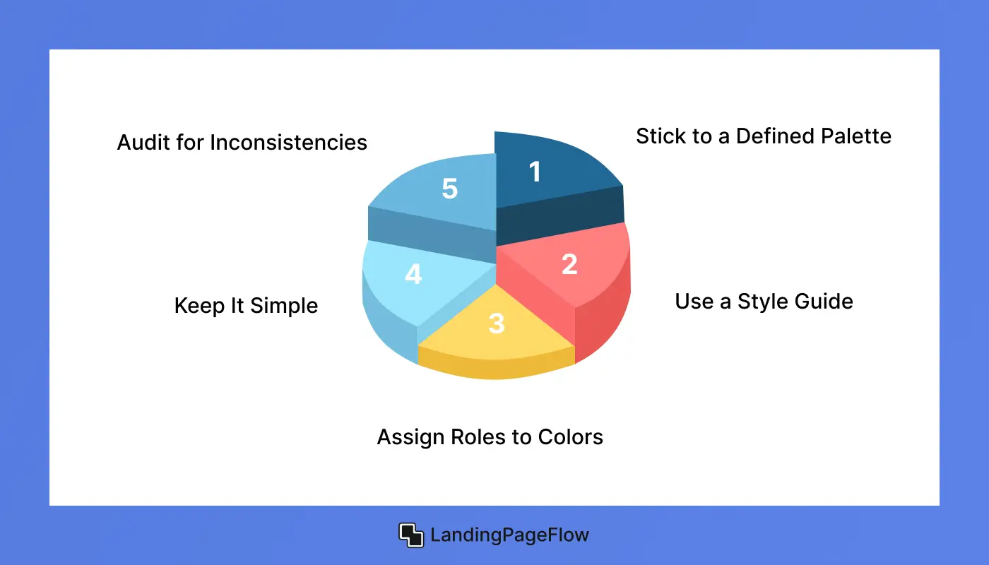
- Stick to a Defined Palette: Choose a set of 2–3 main brand colors and apply them consistently across text, backgrounds, buttons, and icons.
- Use a Style Guide: A clear color style guide ensures your team applies the same shades, tones, and accents across all page elements.
- Assign Roles to Colors: Designate specific colors for CTAs, headings, links, and background sections to build a predictable visual hierarchy.
- Keep It Simple: Avoid experimenting with too many tints or variations. Simplicity improves user experience and reinforces brand recognition.
- Audit for Inconsistencies: Regularly review your landing page design to catch and correct any off-brand color usage or mismatched tones.
Maintaining strong color consistency helps users focus, increases brand credibility, and supports a polished, professional appearance across your entire landing page.
7. Testing and Optimizing Colors For Better Results

Even the most well-chosen colors need real-world testing to ensure they support your conversion goals. What works in theory might not perform in practice, so continuous experimentation is key.
- Run A/B Tests: Compare two versions of a landing page element, like a CTA button in different colors, to see which drives more clicks.
- Use Heatmaps: Tools like Hotjar or Crazy Egg can show how users interact with different colored sections of your page.
- Test One Element at a Time: Isolate variables so you know exactly which color change impacted performance - start with CTAs, then try headers or backgrounds.
- Measure the Right Metrics: Track not only clicks but also conversion rates, bounce rates, and scroll depth to get a full picture of color impact.
- Iterate Based on Data: Let the results guide your design updates. Small, data-driven color tweaks can make a measurable difference.
Consistent color optimization ensures your design stays effective, your visuals stay relevant, and your landing page continues converting at a higher rate over time.
8. Tools and Resources For Color Selection

Choosing the perfect colors for your landing page is easier when you have the right tools at your disposal. These resources help you explore palettes, test contrast, and ensure your choices align with best practices.
- Color Palette Generators: Tools like Coolors and Adobe Color let you create and customize harmonious color schemes quickly.
- Contrast Checkers: Use apps such as WebAIM Contrast Checker to guarantee your text meets accessibility standards and stays readable.
- Inspiration Galleries: Websites like Dribbble and Behance showcase trending designs and innovative uses of color psychology for inspiration.
- Browser Extensions: Tools like ColorZilla help you pick and analyze colors directly from any webpage, making it easier to replicate successful palettes.
- A/B Testing Platforms: Services like Optimizely and VWO allow you to test different color variations and track their impact on conversion rates.
Leveraging these tools and resources empowers you to select the most effective colors, enhance your landing page design, and boost overall user engagement.
Conclusion
Mastering color psychology and applying strategic color choices on your landing page plays a vital role in driving visitor engagement and boosting conversion rates.
Every color decision, from your overall color scheme to the hues used in CTA buttons, shapes how users perceive your brand and interact with your content.
Maintaining strong color consistency across your page creates a cohesive, professional look that builds trust and keeps visitors focused.
Avoiding common color mistakes, such as poor contrast or overwhelming palettes, helps improve user experience and prevents distractions that can reduce conversions.
Leveraging the right tools and resources for color selection and conducting ongoing A/B testing ensures your colors perform at their best, allowing you to optimize for maximum impact.
This intentional approach transforms your landing page into a powerful tool that not only captures attention but also encourages action, ultimately driving business growth and success.

FAQ
1. Why is color important for landing page conversions?
Colors evoke emotions and influence user behavior. The right color scheme helps build trust, highlight CTAs, and guide visitors toward taking action, boosting conversion rates.
2. How many colors should I use on my landing page?
Stick to 2–3 main colors - a primary, a secondary, and an accent color - to maintain clarity, brand consistency, and visual focus.
3. What tools can I use to pick effective colors?
Popular options include Coolors for palettes, WebAIM Contrast Checker for accessibility, and Optimizely for A/B testing color variations.
4. How do I test if my landing page colors are effective?
Conduct A/B testing by comparing different color options on CTAs or backgrounds, and use heatmaps to track user engagement and click behavior.
5. Can using too many colors harm my landing page?
Yes. Overusing colors can distract visitors, reduce readability, and dilute focus, lowering overall user experience and conversions.
6. How can I ensure color consistency across my landing page?
Create a clear color style guide, assign roles for each color, and regularly audit your design to prevent off-brand or mismatched colors.

Altaf Rahman


.webp)


