
Typography can make or break your landing page design. Choosing the right clean and modern fonts not only enhances visual appeal but also improves readability, strengthens brand identity, and drives more conversions.
The best fonts for landing pages are crafted to deliver clarity, support smooth eye movement, and create hierarchy across headlines, body text, and calls to action.
In modern web design, especially for platforms like Webflow, Framer, or WordPress, typography is crucial in how users perceive your message and interact with your content.
Sans-serif fonts, geometric styles, and neutral typefaces are favored for their clean appearance and mobile responsiveness, making them ideal for minimalist designs, SaaS pages, and eCommerce landing pages alike.
Selecting the right font can improve user experience (UX), increase dwell time, and reduce bounce rates. In this guide, we’ll explore 15+ of the best font choices that balance style, clarity, and performance for modern, high-converting landing pages in 2026.
"Fonts can make or break your landing page conversions.
Claim your free consult & choose typefaces that convert."
Table of contents
- Why Typography Matters on Landing Pages?
- Best Practices For Using Fonts on Landing Pages
- Mobile Responsiveness and Font Performance
- 15+ Clean, Modern Fonts For Landing Pages
1. Why Typography Matters on Landing Pages?

Typography is more than just choosing a pretty font - it’s a strategic design element that directly affects how users engage with your landing page. The right font choice enhances readability, creates visual hierarchy, and helps users navigate content effortlessly.
Clean and modern fonts support brand credibility, establish tone, and guide users’ attention toward key areas like CTAs and product highlights.
On a landing page where you often have seconds to make an impression, typography becomes essential to communicating trust and professionalism.
Additionally, font selection plays a crucial role in conversion rate optimization (CRO). A poorly chosen font - too decorative, too light, or hard to read - can increase bounce rates and reduce user confidence.
Roles & Responsibilities:
1. Establishing Visual Hierarchy
Typography defines the reading order by differentiating headings, subheadings, and body content. This helps users scan quickly and focus on what matters most.
2. Enhancing Readability and Accessibility
Clean font choices ensure that your message is easy to read, especially across devices. Good typography supports legibility, reduces eye strain, and helps users consume content effortlessly.
3. Communicating Brand Voice
The tone and style of your fonts reflect your brand identity - whether it’s bold and modern, minimal and elegant, or professional and trustworthy.
4. Driving User Action
Well-placed, well-styled text can guide users toward CTAs, forms, or key conversion points. Typography helps draw attention without needing excessive design elements.
5. Supporting Mobile Responsiveness
Fonts must scale and display properly across screen sizes. Typography needs to stay clear and consistent across mobile, tablet, and desktop views.
6. Boosting Engagement and Dwell Time
By improving content flow and reducing friction, effective typography increases engagement, reduces bounce rates, and enhances user experience (UX).
2. Best Practices For Using Fonts on Landing Pages

Choosing the right typography isn’t enough - it must also be implemented effectively. These best practices help ensure your fonts enhance readability, support conversion goals, and maintain design consistency across your landing page.
1. Limit Font Families
Stick to two or three font families - typically one for headings and one for body text. Too many fonts can clutter the page and confuse users.
2. Prioritize Readability
Use clean, legible fonts with appropriate line height, spacing, and font weight. Avoid overly thin or decorative typefaces, especially for body text.
3. Use Visual Hierarchy
Vary font size, weight, and style to guide users from headline to CTA. Make sure your headings stand out and create a clear flow of content.
4. Optimize for Mobile Devices
Ensure fonts are responsive and scale well on smaller screens. Maintain at least 16px for body text and avoid tightly spaced elements.
5. Maintain Strong Contrast
Use sufficient color contrast between text and background to improve accessibility and readability, especially in low-light conditions.
6. Pair Fonts Wisely
Choose font combinations that complement each other, like a bold sans-serif for headlines and a neutral serif for body text, for visual balance and harmony.
7. Test Across Browsers and Devices
Not all fonts render the same everywhere. Always test your landing page fonts on multiple browsers and devices to catch inconsistencies.
3. Mobile Responsiveness and Font Performance

In today’s mobile-first world, your font choices must be just as effective on small screens as they are on desktops. Poor typography on mobile can lead to low engagement, higher bounce rates, and lost conversions. That’s why ensuring mobile responsiveness in your font setup is a critical part of modern landing page design.
1. Use Scalable Font Sizes
Choose fonts that scale fluidly across screen sizes. Set sizes using relative units like rem or em instead of fixed pixels to maintain consistency on all devices.
2. Prioritize Readability on Small Screens
Maintain a minimum body text size of 16px for comfortable reading. Avoid lightweight fonts or thin strokes that may appear blurry on high-density displays.
3. Avoid Overcrowding
Use generous line height, letter spacing, and padding to prevent text from feeling cramped. Clean spacing improves user experience (UX) and touch navigation.
4. Limit Font Weight Variations
Stick to 2–3 font weights per page to reduce load times. Excessive font weights increase HTTP requests and hurt page speed, especially on mobile networks.
5. Choose Web-Safe or Web-Optimized Fonts
Select web-safe fonts like system defaults or Google Fonts with optimized performance. Always preload custom fonts and enable font-display: swap to reduce layout shift.
6. Test Across Devices
Test your landing page on real mobile devices to see how your typography performs in context. Emulators help, but physical testing ensures optimal rendering and legibility.
4. 15+ Clean, Modern Fonts For Landing Pages
1. Inter

Inter is a highly versatile, modern sans-serif font designed for optimal readability on digital interfaces. Its open letterforms, balanced spacing, and tall x-height make it perfect for clean, minimalist landing page design.
Originally created for screen-first usage, Inter works exceptionally well in both body text and UI elements. It maintains excellent clarity across devices and scales beautifully on mobile, tablet, and desktop. As a free Google Font, it’s also highly accessible and performance-friendly.
Ideal For
- Clean tech websites
- SaaS platform landing pages
- Mobile-first design
- UI components and body text
- Minimalist branding
Not Ideal For
- Print-focused materials
- Luxury fashion or editorial brands
- Decorative or expressive design themes
Designed By
Rasmus Andersson
2. Poppins

Poppins is a geometric sans-serif font known for its bold structure, circular curves, and modern aesthetic. Its uniform stroke width and clean form make it ideal for digital interfaces that require clarity and visual balance.
The font shines in headings and hero sections while remaining readable in smaller text sizes. With multiple weights and wide availability through Google Fonts, Poppins is both versatile and easy to integrate into any landing page design.
Ideal For
- SaaS product landing pages
- Startup websites
- Bold headings and hero sections
- Tech and app-based branding
- Clean UI/UX layouts
Not Ideal For
- Long-form body text
- Traditional, serif-style branding
- Vintage, artistic, or highly expressive design themes
Designed By
Indian Type Foundry
3. Roboto

Roboto is a widely used sans-serif font designed for clarity, neutrality, and readability across digital platforms. Its open curves and natural letterforms make it ideal for both body text and interface design, especially on modern, responsive landing pages.
Blending a mechanical skeleton with a humanist touch, Roboto delivers a balanced tone that works well across a range of industries. As a default font in Android and a staple on Google Fonts, it’s trusted, tested, and globally accessible.
Ideal For
- Tech and mobile app websites
- Body text in landing pages or blogs
- General-purpose UI/UX design
- SaaS and product documentation
- Content-focused layouts
Not Ideal For
- High-end luxury or fashion brands
- Creative portfolios with expressive tone
- Retro or serif-based visual identities
Designed By
Christian Robertson
4. Montserrat

Montserrat is a bold, modern sans-serif font inspired by early 20th-century urban typography. Its sharp edges, geometric forms, and wide letter spacing give it a strong visual presence, making it ideal for attention-grabbing headlines, hero sections, and branding.
Frequently used in startups and creative websites, Montserrat offers multiple weights and pairs well with lighter body fonts for balanced layout design. Its popularity on Google Fonts makes it a reliable, high-performance choice for landing pages.
Ideal For
- Startup and agency landing pages
- Bold hero headlines
- Creative and personal branding
- High-contrast UI design
- Display text with a strong visual hierarchy
Not Ideal For
- Long-form reading or dense body copy
- Soft, minimalistic brand tones
- Traditional, serif-focused layouts
Designed By
Julieta Ulanovsky
5. Lato

Lato is a clean and friendly sans-serif font designed for balance, warmth, and high readability. Its semi-rounded characters give it a slightly humanist feel, making it suitable for both body text and headings on modern landing pages.
With a professional yet approachable tone, Lato is a flexible choice for brands that want to appear trustworthy without feeling too formal. Widely available through Google Fonts, it performs well across screen sizes and devices.
Ideal For
- Marketing and business landing pages
- Body copy with high legibility
- Professional blogs and content hubs
- Product feature sections
- Clean, UX-driven design
Not Ideal For
- Bold, expressive branding
- High-impact hero text
- Luxury or editorial-style layouts
Designed By
Lukasz Dziedzic
6. Open Sans

Open Sans is a highly legible, neutral sans-serif font designed for clarity and ease of reading on both desktop and mobile screens. Its clean lines, open letterforms, and generous spacing make it an excellent choice for content-heavy landing pages and long-form text.
With a friendly yet professional appearance, Open Sans adapts well across industries and platforms. Available on Google Fonts, it loads quickly and maintains a consistent appearance across browsers and devices.
Ideal For
- Content-rich landing pages and blogs
- Professional service websites
- Body text across desktop and mobile
- Corporate or government websites
- Clean UI with accessible typography
Not Ideal For
- Hero sections needing visual impact
- Highly creative or artistic brands
- Luxury-focused design aesthetics
Designed By
Steve Matteson
7. DM Sans

DM Sans is a low-contrast, geometric sans-serif font designed specifically for digital interfaces and high-legibility environments. Its minimalist curves and open letterforms make it ideal for clean, modern landing page layouts, especially on mobile.
Lightweight, elegant, and versatile, DM Sans supports a professional yet soft tone, perfect for startups, fintech, or personal brands. As part of the Google Fonts library, it's optimized for performance and easy to implement across platforms.
Ideal For
- Mobile-first and responsive websites
- Fintech, SaaS, and tech startup landing pages
- Clean UI components and dashboards
- Minimalist, modern branding
- Light body text and feature descriptions
Ideal For
- Bold headlines need a strong contrast
- Editorial or print-style designs
- Expressive or decorative branding
Designed By
Colophon Foundry (for Google)
8. Work Sans

Work Sans is a modern, minimalist sans-serif font designed for digital environments, especially optimized for screen readability. It features simple letterforms with a neutral tone, making it ideal for clean, UI-focused landing pages.
At lower weights, it's well-suited for body text, while the bolder weights deliver a strong presence in headlines. With variable styles and wide browser support through Google Fonts, Work Sans adapts seamlessly across device types and screen sizes.
Ideal For
- Startup and SaaS landing pages
- Clean user interface text
- Tech product sites and apps
- Body text and navigation labels
- Contemporary, minimalist layouts
Ideal For
- Luxury or fashion branding
- High-contrast, expressive displays
- Print-heavy projects
Designed By
Wei Huang
9. Manrope

Manrope is a modern, semi-geometric sans-serif font that blends minimalism with a touch of warmth and character. Designed for high performance in digital interfaces, it offers great readability across large headlines and small body text.
Its balanced proportions and smooth curves make it ideal for creating clean, elegant landing pages that feel both professional and contemporary. Available on Google Fonts, Manrope is lightweight, accessible, and pairs well with other minimalist typefaces.
Ideal For
- Modern SaaS and tech websites
- Minimalist landing pages
- Headings and large-scale hero sections
- Clean UI/UX design
- Cross-platform digital branding
Not Ideal For
- Playful or expressive brands
- Dense editorial content
- Classic, serif-driven visual styles
Designed By
Mikhail Sharanda
10. Space Grotesk

Space Grotesk is a contemporary sans-serif typeface that combines geometric structure with subtle humanist details. Originally based on Space Mono, it brings a more polished, proportional feel while maintaining personality.
Its bold character and sharp styling make it excellent for headline text, hero sections, and standout landing page design. With a unique aesthetic that feels modern and slightly technical, Space Grotesk is great for brands that want to stand out visually without sacrificing readability.
Ideal For
- Creative agency and portfolio sites
- Bold headlines on landing pages
- Tech startups and digital products
- Futuristic or experimental layouts
- Attention-grabbing hero design
Not Ideal For
- Body text in dense paragraphs
- Traditional or conservative brands
- Print-heavy editorial formats
Designed By
Florian Karsten
11. Nunito Sans

Nunito Sans is a balanced, rounded sans-serif font designed for high legibility and a friendly, modern appearance. With smooth curves and gentle terminals, it brings a soft, approachable tone to any landing page layout while still maintaining professional clarity.
Its versatility across weights makes it great for both headlines and body text, especially in mobile-first or customer-facing designs. As a free and widely used Google Font, it loads fast and performs well across devices.
Ideal For
- Friendly product landing pages
- Customer onboarding flows
- Wellness, education, and lifestyle brands
- Mobile-optimized designs
- Accessible, approachable UIs
Not Ideal For
- Corporate or ultra-minimal branding
- Bold, high-impact headlines
- Editorial or traditional design tones
Designed By
Vernon Adams, Jacques Le Bailly
12. Rubik
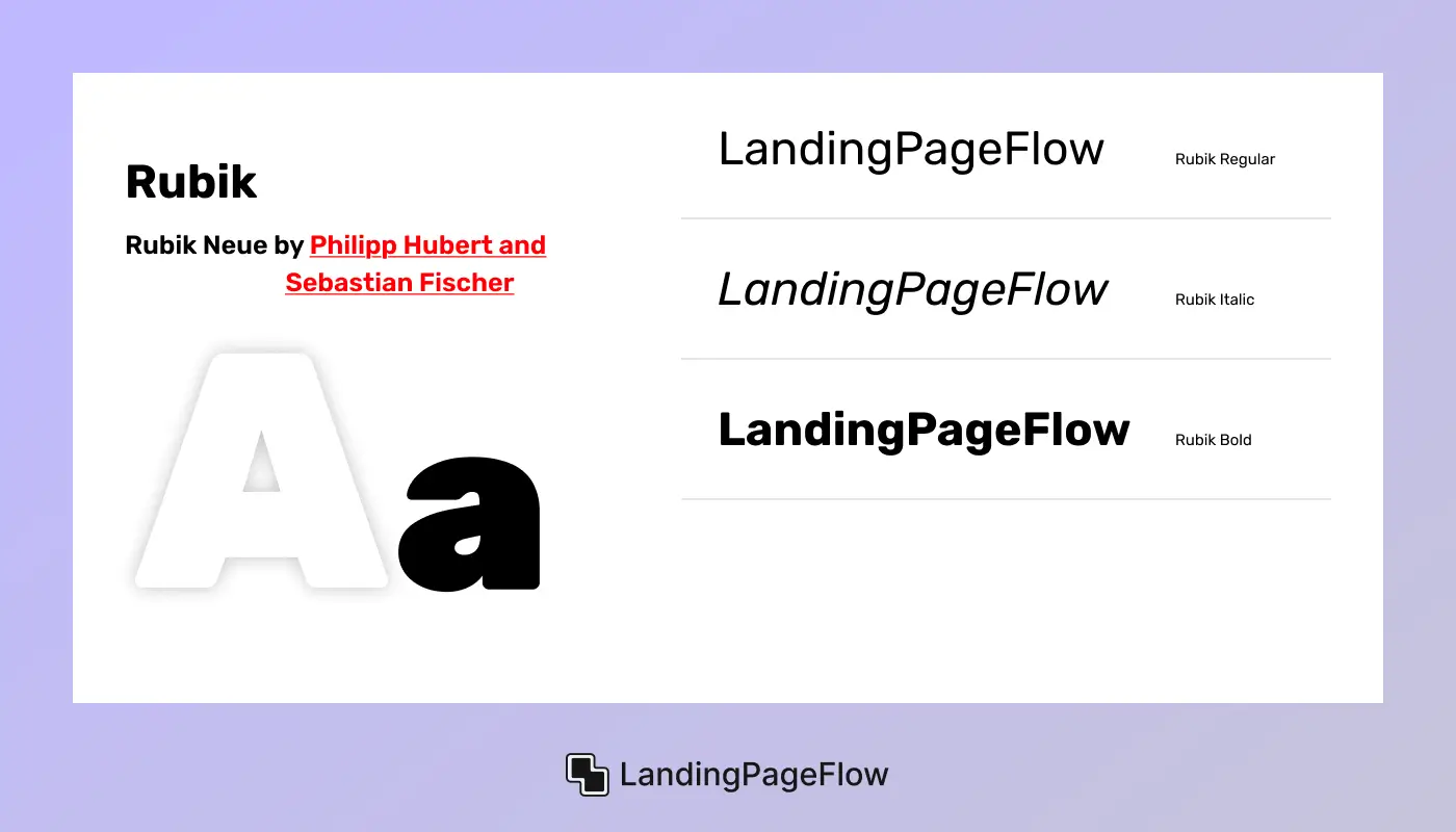
Rubik is a slightly rounded sans-serif font that brings a touch of friendliness to modern, geometric type. Originally designed for interface use, it features clean lines and balanced proportions, making it a strong choice for landing pages, especially those targeting tech-savvy or consumer-focused audiences.
Its subtle curves soften the tone without losing structure, and it performs well across both headlines and body text. As a free Google Font, it’s accessible, fast-loading, and easy to integrate.
Ideal For
- Startup or app landing pages, Tech and product-focused brands
- Friendly, approachable UI/UX
- Button text, CTAs, and navigation labels
- Clean digital experiences across devices
Not Ideal For
- Luxury or high-fashion design
- Editorial or print-heavy layouts
- Ultra-minimalist or hyper-corporate branding
Designed By
Philipp Hubert and Sebastian Fischer (for Hubert & Fischer)
13. Mulish

Mulish is a versatile, minimalist sans-serif font designed for clarity, lightness, and modern web usage. Originally created as a display font, it was later extended to support both headlines and body text, making it a strong all-purpose choice for clean, content-driven landing pages.
Its sleek form, soft curves, and excellent readability make it a popular option for mobile-first and user-focused interfaces. Available on Google Fonts, it ensures smooth performance across devices.
Ideal For
- Mobile-first landing pages
- Tech and SaaS websites
- Light, spacious page layouts
- Body copy and feature highlights
- Clean UI/UX components
Not Ideal For
- Loud, high-impact headings
- Artistic or heavily branded designs
- Editorial or print-heavy projects
Designed By
Vernon Adams, then refined by Cyreal and Google
14. Plus Jakarta Sans

Plus Jakarta Sans is a modern, geometric sans-serif font designed with a focus on legibility, simplicity, and digital clarity. It features clean curves, consistent proportions, and wide letter spacing, making it ideal for user interfaces, landing pages, and tech-focused branding.
The typeface offers a friendly yet professional tone, fitting for startups that want a clean, forward-looking aesthetic. Available for free on Google Fonts, it performs smoothly across all devices and resolutions.
Ideal For
- SaaS and tech startup websites
- App landing pages
- Clean UI and navigation systems
- Headings and feature sections
- Mobile-first product design
Not Ideal For
- Luxury or high-fashion branding
- Dense editorial or print-focused layouts
- Highly expressive or experimental design
Designed By
Tokotype (Gumpita Rahayu)
15. Raleway

Raleway is an elegant, high-contrast sans-serif font known for its sleek lines and stylish presence. Originally intended for headlines and large display text, it brings sophistication to modern landing pages without feeling overly decorative.
Raleway’s tall x-height and thin strokes give it a graceful, upscale feel, perfect for brands aiming to convey elegance, innovation, or premium positioning. It’s widely available on Google Fonts, making it easy to implement across digital platforms.
Ideal For
- Fashion, beauty, or lifestyle landing pages
- Elegant hero sections and titles
- High-end product showcases
- Creative portfolio websites
- Minimalist editorial layouts
Not Ideal For
- Long-form body copy
- Utility-first or data-heavy sites
- Tech or SaaS interfaces requiring high legibility
Designed By
Matt McInerney (with updates by Pablo Impallari & Rodrigo Fuenzalida)
16. Be Vietnam Pro

Be Vietnam Pro is a clean, modern sans-serif typeface optimized for readability in both Vietnamese and Latin scripts. Designed with clarity, structure, and digital adaptability in mind, it excels on responsive landing pages, especially those with multilingual or global audiences.
Its balanced letterforms and generous spacing make it ideal for body text, while bolder weights hold up well in UI elements and headlines. As a free Google Font, it’s lightweight, accessible, and performance-ready.
Ideal For
- Global SaaS or tech landing pages
- Multilingual product websites
- Clear body text and feature sections
- Clean UI/UX layouts
- Scalable mobile-first design
Not Ideal For
- Highly stylized or expressive branding
- Editorial-heavy formats
- Luxury or fashion-focused visual identities
Designed By
Giap Nguyen (for Be Group)
17. Epilogue

Epilogue is a modern, geometric sans-serif font designed with simplicity, rhythm, and digital usability in mind. It features clean, minimalist shapes and wide letter spacing, making it ideal for clean, content-forward landing pages.
With a full range of weights and refined curves, Epilogue adapts well across both headlines and body text, offering excellent readability on desktop and mobile. As a free Google Font, it's lightweight and performance-optimized for fast web delivery.
Ideal For
- Startup and portfolio landing pages
- Product showcase websites
- Clean, modern user interfaces
- Body text and minimal layouts
- Mobile-optimized digital experiences
Not Ideal For
- Loud, expressive branding
- Editorial-style websites
- Traditional or serif-based brand aesthetics
Designed Bby
Tyler Finck (on behalf of Google Fonts)
18. Chivo

Chivo is a strong, versatile sans-serif font designed to command attention while maintaining clarity. With its bold weights and sturdy geometric shapes, Chivo is perfect for hero sections, CTAs, and landing page headlines that need to make an impact.
It also includes lighter weights for body content, making it a flexible option for full-page typography. As a free Google Font, it’s fast, accessible, and optimized for digital performance.
Ideal For
- Bold headline sections
- Tech product or startup landing pages
- High-impact CTAs
- Visual hierarchy in feature sections
- Mobile-friendly, responsive layouts
Not Ideal For
- Luxury or fashion branding
- Editorial-heavy designs
Brands seeking a soft or rounded tone
Designed By
Omnibus-Type
19. Asap

Asap is a modern, slightly rounded sans-serif font built for speed, clarity, and screen readability. Designed with a compact width and soft curves, it delivers a friendly yet professional tone that fits perfectly in landing pages, especially on mobile devices.
Asap stands out for its minimal visual noise and consistent rhythm, helping users scan content quickly without distraction. Available on Google Fonts, it's a lightweight, flexible option ideal for responsive design.
Ideal For
- Mobile-first landing pages
- Tech startups and SaaS brands
- User-friendly onboarding flows
- Body text and short-form UI copy
- Accessible and clean visual layouts
Not Ideal For
- Luxury or editorial-style branding
- Highly expressive or decorative headings
- Print-heavy designs
Designed By
Omnibus-Type
20. Barlow
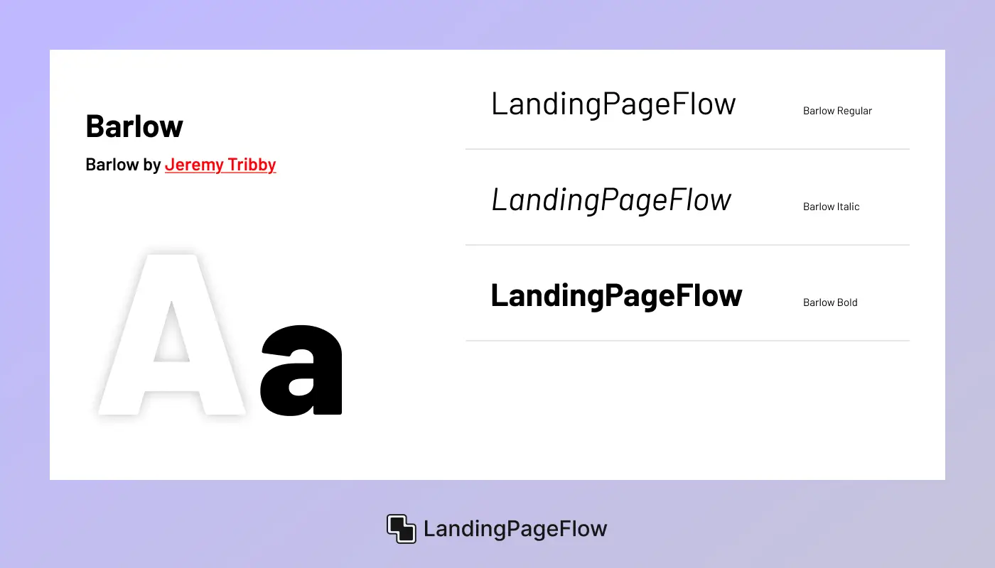
Barlow is a low-contrast, slightly rounded sans-serif font designed for clarity and utility across screen sizes. With its wide letterforms and consistent stroke weight, Barlow delivers excellent readability for both headlines and body text, making it a reliable choice for clean, structured landing pages.
The typeface was designed to feel slightly technical yet approachable - perfect for modern web and app interfaces. As a free Google Font, it’s lightweight, responsive, and easy to implement.
Ideal For
- Tech and startup landing pages
- Government or educational websites
- Mobile-friendly layouts
- UI labels, nav links, and feature blocks
- Content-focused product pages
Not Ideal For
- Luxury or high-fashion brands
- Creative or highly artistic branding
- Editorial layouts with a serif preference
Designed By
Jeremy Tribby
Conclusion
Choosing the right font plays a crucial role in building trust, guiding attention, and creating a seamless landing page experience. Your typography directly influences how users perceive your brand and how easily they consume your content.
A clean, modern sans-serif like Manrope or Inter offers strong readability, while fonts like Asap or Raleway introduce creative flair for standout headlines.
Each font on this list brings unique advantages - some enhance clarity for mobile users, others add sophistication for premium branding. The key is to align your font choice with your brand’s personality, your content style, and the structure of your page layout.
By thoughtfully selecting and applying typography, you not only improve user experience but also support stronger conversion rates and longer engagement time. Great design begins with great text, and great text begins with the right font.

FAQ
1. What makes a font good for landing pages?
A good landing page font is readable, clean, and loads quickly across devices. It should match your brand’s tone and support a strong visual hierarchy.
2. Should I use the same font for headings and body text?
You can, but using two well-paired fonts - one for headings and one for body text - often creates better contrast and flow. Avoid using more than two to maintain consistency.
3. Are Google Fonts reliable for performance?
Yes, Google Fonts are optimized for speed, accessibility, and global support. They’re easy to integrate and ideal for most modern websites.
4. How do I choose the right font pair?
Look for fonts with complementary styles, like a bold display font with a neutral sans-serif. Tools like Google Fonts’ pairing suggestions or real-time previews in builders can help.
5. What font size should I use on landing pages?
Use at least 16px for body text and scale up headings based on importance. Keep spacing and contrast in mind to ensure readability, especially on mobile.
6. Are serif fonts bad for landing pages?
Not at all. While sans-serif fonts dominate digital design, a clean serif can work well for editorial brands or premium positioning if used sparingly.

Ansif


.webp)


