A strong contact form landing page can be the difference between a curious visitor and a valuable lead. Businesses that refine this single page often see dramatic boosts in conversions.
Engaging layouts and clear messaging guide users toward ta1king action while minimizing friction. Every design choice, from form length to button color, influences the outcome.
Smart marketers understand that trust indicators like testimonials and security badges reassure visitors and encourage them to submit details confidently.
Consistency in design, language, and offer keeps visitors focused and prevents distractions. Crafting a page that aligns intent with simplicity gives your brand a professional edge and builds lasting connections.
A well-structured contact form landing page doesn’t just collect data, it nurtures relationships and sets the foundation for long-term growth.
"Drive measurable growth through smarter landing page strategies.
Speak to our experts & transform your contact form into a lead generation."
Table of Contents
- Understand the Role of a Contact Form Landing Page
- Choose a Simple and Clean Design
- Create a Compelling Headline and Intro Text
- Design a User-Friendly Contact Form
- Use Clear and Actionable CTAs
- Showcase Trust Signals For Credibility
- Optimize For Mobile Devices
- Leverage Analytics to Improve Performance
- Test and Refine Your Landing Page
1. Understand the Role of a Contact Form Landing Page

A contact form landing page is much more than a simple webpage where visitors leave their information. It acts as a bridge between your brand and your audience.
- Purpose-Driven Design: A contact form landing page should have a clear purpose. Whether it’s capturing leads, scheduling consultations, or resolving customer inquiries, the form must align with your goals.
- Minimized Friction: By reducing barriers like complex forms or unnecessary steps, you make it easier for visitors to take the desired action.
- Value Proposition: Ensure your page communicates what the user gets in return for submitting their details, such as quick responses or personalized assistance.
When visitors understand the value of connecting with you, they’re more likely to engage with your form.
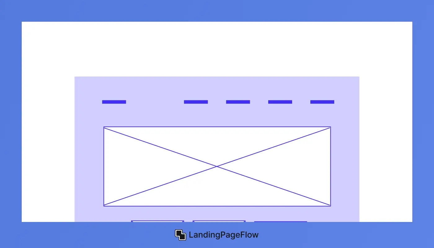
2. Choose a Simple and Clean Design
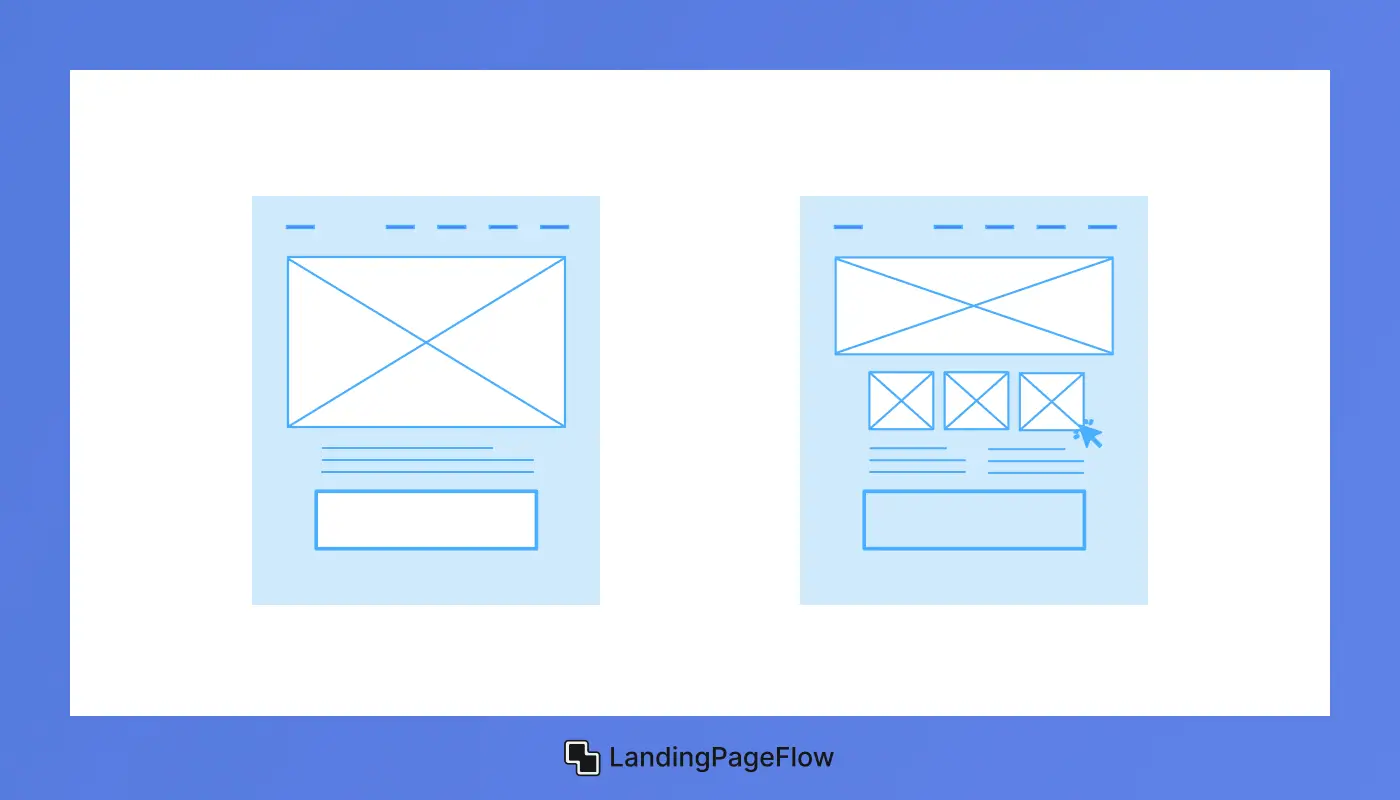
A cluttered design can overwhelm visitors and distract them from filling out your form. A clean, minimalistic layout keeps the focus on your form and key messaging.
- Whitespace: Use ample whitespace around your form to create a balanced, organized look. This helps draw attention to the form without unnecessary distractions.
- Consistent Branding: Incorporate your brand’s colors, fonts, and logo to create a cohesive experience and build trust.
- Visual Hierarchy: Use size, color, and placement to prioritize elements like the headline, form, and CTA buttons.
A visually appealing and straightforward design sets the stage for higher engagement and conversions.
3. Create a Compelling Headline and Intro Text
Your headline is the first thing visitors notice, and it sets the tone for their experience. A strong headline and supporting text can convince users to stay on the page and take action.
- Catchy and Clear Headlines:
- “Reach Out to Us – We’re Just a Click Away”
- “Let’s Connect – Fill Out the Form Below”
- Subheadings That Add Value: Include a short line below the headline explaining what users can expect. For instance:
- “We’ll respond within 24 hours.”
- “Have questions? We have answers!”
These elements not only inform users about the page’s purpose but also encourage them to take the next step.
4. Design a User-Friendly Contact Form
The contact form is the centerpiece of your landing page. Its design and functionality can make or break your conversion rate.
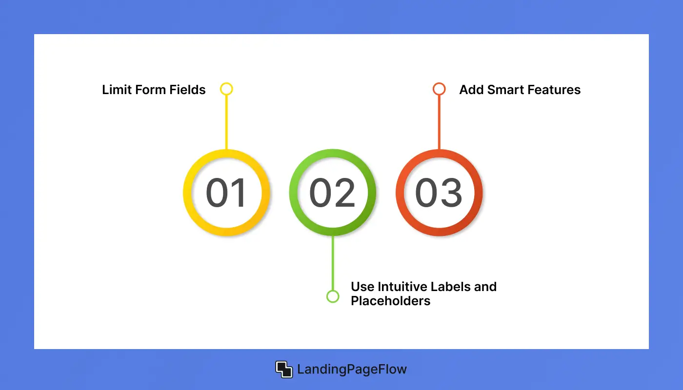
- Limit Form Fields:
- Stick to the essentials. Overloading the form with unnecessary fields can frustrate users and increase abandonment rates. Typical fields include:
- Name
- Email Address
- Phone Number (optional)
- Message or Inquiry
- Stick to the essentials. Overloading the form with unnecessary fields can frustrate users and increase abandonment rates. Typical fields include:
- Use Intuitive Labels and Placeholders: Clearly label each field and provide example text to guide users. For instance, in an email field, use “Enter your email address” as a placeholder.
- Add Smart Features:
- Use dropdown menus for predefined options.
- Include auto-complete for faster inputs.
A simple, functional form ensures users complete it without hesitation.
5. Use Clear and Actionable CTAs
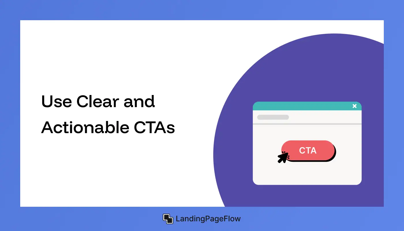
Your call-to-action (CTA) is the final step in guiding users toward conversion. A clear and persuasive CTA can make a significant difference.
- Examples of Effective CTA Text:
- “Submit Your Query”
- “Request a Free Quote”
- “Get Started Today”
- Design Best Practices:
- Use a bold, contrasting color for the button.
- Ensure the text is easy to read, even at a glance.
- Place the button prominently below the form for easy access.
A strong CTA eliminates ambiguity and motivates users to complete the form.
6. Showcase Trust Signals For Credibility

Visitors need assurance that their information will be handled securely and responsibly. Trust signals help eliminate doubts and build confidence.
- Privacy Statements: Include a line like, “We value your privacy and will never share your information.”
- Testimonials and Reviews: Add quotes from satisfied clients or users to demonstrate your credibility.
- Awards and Certifications: If applicable, display badges or awards to reinforce trust.
These elements create a sense of security, making users more likely to engage with your brand.
7. Optimize For Mobile Devices
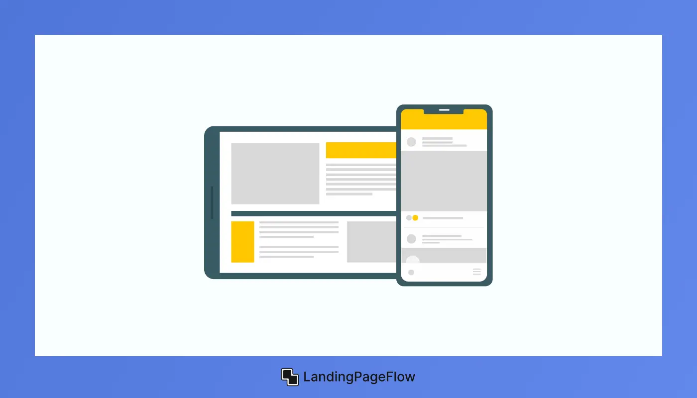
With a significant percentage of users accessing websites via mobile devices, your contact form landing page must be mobile-friendly.
- Responsive Design: Ensure the page automatically adjusts to fit different screen sizes and orientations.
- Simplified Layout: Keep the form and content concise to avoid excessive scrolling.
- Clickable Elements: Make buttons and form fields large enough to tap easily.
A mobile-optimized page ensures a seamless experience for all users, regardless of their device.
8. Leverage Analytics to Improve Performance

Tracking user behavior on your landing page provides valuable insights that can help you improve its effectiveness.
- Metrics to Monitor:
- Conversion rate (form submissions vs. visitors).
- Bounce rate (percentage of visitors leaving without action).
- Time on page (how long users stay engaged).
- Use Analytics Tools: Platforms like Google Analytics and Hotjar can show user interactions and highlight areas for improvement.
Regularly reviewing performance data ensures your landing page evolves to meet user needs.
9. Test and Refine Your Landing Page
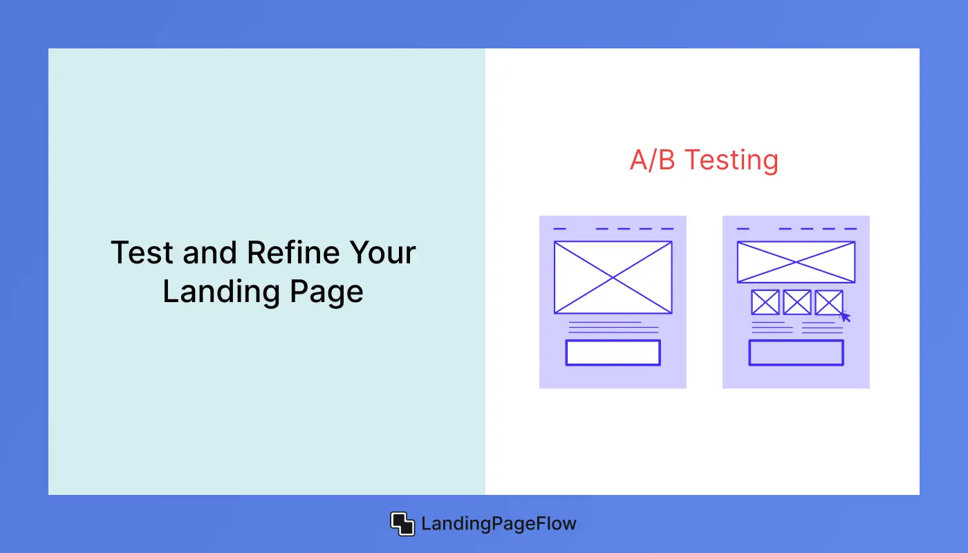
Continuous improvement is key to maintaining high conversion rates.
- A/B Testing: Experiment with different headlines, form lengths, or button colors to see what resonates most with users.
- Gather Feedback: Ask visitors for feedback about their experience with the page.
- Iterate Based on Data: Use insights from testing and feedback to implement changes that enhance usability.
An iterative approach keeps your landing page relevant and effective.
Conclusion
Building the perfect contact form landing page requires strategy, not guesswork. Each detail plays a role in creating an experience that feels smooth and inviting.
Attention to usability and relevance helps visitors feel confident in engaging with your brand. Strategic use of visuals and copy further strengthens trust.
Strong CTAs work best when paired with clarity and an authentic value proposition. Small tweaks often make a significant difference in results.
Testing and optimization ensure your page adapts to changing audience needs. Brands that invest in this process consistently outperform their competitors.
Improving conversion isn’t a one-time task but an ongoing cycle of learning and refining. A landing page designed with precision will always stand out and remain an asset for capturing leads effectively.

FAQ
1. What makes a contact form landing page effective?
Clarity, simplicity, and trust signals make a contact form landing page effective. Reducing form fields and providing a clear CTA helps maximize conversions.
2. How many fields should a contact form include?
Ideally, 3–5 fields are best. Shorter forms boost completion rates, but balance is key to collecting meaningful information without overwhelming visitors.
3. Should I use a single-column or multi-column form layout?
A single-column layout works best for user flow and readability. Multi-column forms often create confusion and reduce the likelihood of completion.
4. How can I increase trust on my landing page?
Adding testimonials, privacy assurances, SSL certification, and professional branding builds trust and reassures users that their data is safe.
5. Is mobile optimization necessary for contact form landing pages?
Yes, mobile responsiveness is crucial since most traffic comes from smartphones. Optimized layouts prevent form abandonment and increase usability.
6. How often should I test my contact form landing page?
Testing should be continuous. Regular A/B testing of design, copy, and CTAs helps refine performance and keeps your landing page effective over time.

Altaf Rahman


.webp)


