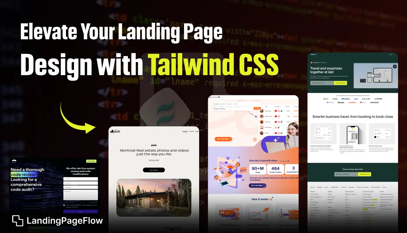
Creating a landing page that stands out requires both design clarity and performance precision. Tailwind CSS offers developers and designers a utility-first framework that makes styling fast and intuitive.
The beauty of Tailwind lies in its flexibility, letting you build responsive layouts without writing endless custom CSS. Every element can be refined to match the brand identity you want to portray.
By reducing the time spent on repetitive styling, Tailwind allows more focus on user experience and strategic design choices. Its ready-to-use classes bring efficiency without sacrificing creativity.
Consistency across layouts becomes easier to achieve, ensuring your landing pages look cohesive across all devices. Developers benefit from speed, while marketers enjoy design freedom.
Adopting Tailwind CSS gives you a head start on building modern, functional, and highly converting landing pages that elevate your digital presence.
"Struggling to design pages that convert?
Unlock your free strategy guide."
Table of Contents
- What is Tailwind CSS?
- Benefits of Using Tailwind CSS for Landing Pages
- Core Tailwind CSS Concepts to Know
- How to Structure Your Landing Page Using Tailwind CSS?
- Best Practices For Creating Responsive Designs
- Tailwind CSS Components for Landing Pages
- Tailwind CSS Integrations for Animations and Interactivity
- Optimizing For Speed and SEO with Tailwind CSS
- Examples of Beautiful Landing Pages Built with Tailwind CSS
1. What is Tailwind CSS?

Tailwind CSS is a utility-first CSS framework that enables developers to design web pages directly in their HTML by applying predefined utility classes.
Instead of writing traditional CSS code, Tailwind allows you to use short, descriptive class names to style elements on the fly.
This approach helps streamline the design process and encourages a component-based mindset, which is ideal for creating modern landing pages.
- Example: Instead of writing custom CSS for margin, padding, font sizes, and colors, you can apply Tailwind classes like,
mt-4p-6text-xl, andbg-blue-500directly to your HTML elements.
2. Benefits of Using Tailwind CSS For Landing Pages

Speed and Efficiency: Tailwind's utility-first design makes it easier to quickly style your landing page without needing to write extensive custom CSS. This results in faster development time and cleaner code.
Customization: Tailwind is highly customizable, allowing you to define your own colors, spacing, typography, and breakpoints. This makes it easy to create landing pages that are consistent with your brand’s design.
Responsive Design: Tailwind comes with built-in responsiveness, enabling you to easily create mobile-friendly landing pages by using responsive utility classes.
Performance: Tailwind automatically removes unused CSS classes during the build process, which reduces the size of your CSS files and improves page load speeds.
3. Core Tailwind CSS Concepts to Know

Before diving into your landing page design, it’s important to familiarize yourself with some of the core concepts that make Tailwind unique:
- Utility Classes: Tailwind provides small, reusable classes that apply specific styles, such as
flex,grid,text-center, androunded-lg. These can be combined to create complex layouts and designs. - Customization: Tailwind's configuration file (
tailwind.config.js) lets you extend the default theme by adding custom color palettes, font sizes, spacing, and more. - Responsive Design: Tailwind makes responsive design simple with its mobile-first approach. Use breakpoint prefixes (
sm:,md:,lg:,xl:) to apply styles at specific screen sizes. - Hover, Focus, and State Variants: Tailwind also supports pseudo-classes like hover (
hover:bg-blue-500), focus, and active states for creating interactive elements.
4. How to Structure Your Landing Page Using Tailwind CSS?

Creating a well-structured and visually engaging landing page involves breaking down the layout into key sections, such as:
- Hero Section: The hero section is the first thing visitors see when they land on your page. Use large, attention-grabbing typography (
text-4xl,font-bold) and high-quality background images or illustrations (bg-cover,bg-center). - Features Section: Showcase the benefits of your product or service using a clean, organized layout. Use Tailwind’s grid or flexbox utilities (
grid grid-cols-3 gap-4,flex justify-between) to arrange your content evenly. - Testimonials: Use Tailwind's text utilities (
text-lg,text-gray-600) to highlight customer testimonials in a visually appealing way. Add rounded card components (bg-white shadow-lg p-6 rounded-lg) to separate testimonials from the rest of the page. - Call to Action (CTA): A strong CTA is crucial for conversions. Use Tailwind’s button utilities (
bg-blue-500 hover:bg-blue-700 text-white py-2 px-4 rounded) to create a bold, clickable button that stands out.
5. Best Practices For Creating Responsive Designs

One of the standout features of Tailwind CSS is its responsiveness. Here are some best practices for ensuring your landing page looks great on all devices:
- Mobile-First Approach: Start by designing for smaller screens and progressively enhance the design for larger devices.
- Use Responsive Breakpoints: Apply responsive classes like
sm:,md:, andlg:to modify the design based on screen size. For example,text-base md:text-lg lg:text-xlensures your font sizes scale well across devices. - Fluid Grids and Layouts: Use Tailwind’s grid and flexbox utilities to create responsive layouts that adapt to different screen sizes without breaking.
6. Tailwind CSS Components For Landing Pages

Tailwind CSS offers a wide range of pre-designed components and UI kits that can help you speed up the design process. You can find several free and premium component libraries tailored for different use cases, such as:
- Navigation Bars: Create responsive navigation menus with Tailwind’s flex utilities (
flex justify-between items-center). - Buttons: Tailwind offers a variety of button styles that you can easily customize with classes like
bg-indigo-600,hover:bg-indigo-700, androunded-full. - Cards and Modals: Create visually appealing cards and modal windows using Tailwind's shadow and border utilities (
shadow-md,border-gray-300).
7. Tailwind CSS Integrations For Animations and Interactivity

While Tailwind CSS does not include built-in animations, it integrates seamlessly with libraries like Animate.css or custom CSS animations. You can also use Tailwind’s transition and transform utilities to add interactivity to your elements.
- Transitions: Use classes like
transition-all,duration-300, andease-in-outto create smooth animations when users hover or interact with elements. - Transforms: Add
hover:scale-105to create a zoom effect orrotate-90to add rotation.
8. Optimizing For Speed and SEO with Tailwind CSS

Page speed and SEO are critical factors in landing page success. Tailwind CSS helps you optimize both by minimizing CSS file size and improving load times.
- PurgeCSS: Tailwind automatically purges unused CSS classes during production builds, ensuring your CSS file is as small as possible.
- SEO Optimized Markup: Ensure your HTML structure is SEO-friendly by using semantic tags (e.g.,
<header>,<section>,<footer>) and optimizing image alt attributes. - Minimizing Load Time: Lazy load images and minimize JavaScript to further optimize page load times, improving the user experience and conversion rates.
9. Examples of Beautiful Landing Pages Built with Tailwind CSS

Here are a few inspiring examples of landing pages built with Tailwind CSS that showcase its potential:
- Landing Page 1: Clean and minimal design with a bold hero section, product features grid, and clear CTA buttons. Ideal for tech startups.
- Landing Page 2: Vibrant and modern layout with rounded card components, gradient backgrounds, and smooth animations. Perfect for creative portfolios.
- Landing Page 3: A responsive and mobile-first design with a strong focus on typography and user-friendly navigation. Great for e-commerce sites.
Conclusion
Tailwind CSS reshapes how landing pages are designed, making every detail both functional and visually compelling.
Its streamlined approach saves hours of development time while ensuring the end result feels professional and polished.
For businesses, this means being able to launch campaigns faster without compromising design quality. Developers enjoy the flexibility, while brands see measurable impact in user engagement and conversions.
The design consistency ensures that every element supports the message of the page, leading to better storytelling and stronger call-to-action alignment.
Investing in Tailwind CSS means choosing a smarter, faster way to craft landing pages that inspire users and drive results.

FAQ
1. Why should I use Tailwind CSS for landing page design?
Tailwind CSS makes design faster and more consistent by offering utility classes that streamline development while keeping full creative control.
2. Can Tailwind CSS improve conversion rates on landing pages?
Yes, by ensuring responsiveness, faster loading times, and polished design, Tailwind CSS can directly enhance user experience and boost conversions.
3. Is Tailwind CSS suitable for beginners?
Absolutely. Its utility-first approach is beginner-friendly, letting you apply styles quickly without needing advanced CSS knowledge.
4. How does Tailwind CSS impact website performance?
Tailwind helps reduce unnecessary CSS, resulting in smaller file sizes and faster load times, which improves both SEO and user retention.
5. Can I customize Tailwind CSS for brand-specific styles?
Yes, Tailwind is highly customizable. You can configure themes, extend utilities, and create consistent brand identities across pages.
6. Is Tailwind CSS better than traditional CSS frameworks for landing pages?
For many projects, yes. Unlike bulky frameworks, Tailwind provides precision styling, flexibility, and performance benefits that make it ideal for landing pages.

Ansif


.webp)

