Creating a landing page that converts on a single scroll requires precision in both design and strategy. Every element must serve a purpose and guide visitors toward action.
Strong calls-to-action positioned at the right moments encourage visitors to act instead of bouncing away. Small tweaks in structure can create big results.
Design is more than visuals here; it’s about crafting a flow that feels natural and easy to follow. Visitors should never feel lost or overwhelmed.
A mobile-first approach ensures that your page delivers the same smooth experience regardless of screen size, which is essential for higher conversions today.
Psychological triggers such as urgency, social proof, and clear benefits play a major role in persuading your audience. Subtle details shape major outcomes.
Understanding how each block of your page contributes to the final decision helps you refine and optimize. One-page design is powerful when done with intent.
"Curious how to increase signups from a 1-page layout?
Grab your complimentary expert guide & optimize your design right now."
Table of Contents
- Understanding the Purpose of a 1-Page Landing Page
- Elements of a High-Converting Landing Page
- Headline
- Subheadline
- Call to Action (CTA)
- Visuals
- Social Proof
- Benefits and Features
- Form Design
- Best Practices For Creating a 1-Page Landing Page
- Keep it Simple
- Design for Clarity
- Use Action-Oriented Language
- Mobile-First Design
- How to Write Compelling Copy?
- Crafting the Headline
- Writing Persuasive Body Copy
- Using Emotional Triggers
- Design and Layout Tips
- Visual Hierarchy
- Clean, Minimalistic Design
- Use of Color
- Consistency in Design
- Optimize Your Landing Page For Conversions
- Speed and Performance
- A/B Testing
- Using Analytics
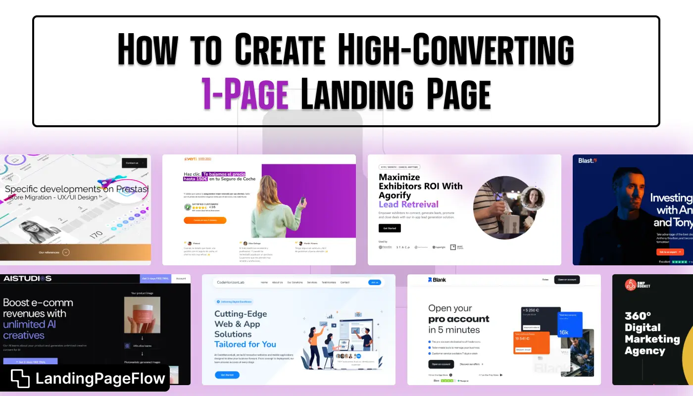
- Examples of High-Converting Landing Pages
1. Understanding the Purpose of a 1-Page Landing Page
A 1-page landing page is a focused, single-page website designed with one main objective: conversion.
Whether the goal is to collect leads, sell a product, or increase sign-ups, every element on the page should encourage the visitor to take that action.
The key to a high-converting page lies in minimizing distractions, delivering the message clearly, and guiding users toward the call to action.
2. Elements of a High-Converting Landing Page
Headline
The headline is the first thing visitors see when they land on your page, so it needs to grab their attention immediately.
It should clearly state what the visitor will gain or what problem will be solved by taking the action you're encouraging. Keep it concise, impactful, and relevant to the visitor’s needs.
Tip: Make sure your headline answers the "What’s in it for me?" question.
Subheadline
A subheadline should support the headline and provide additional context. It can help clarify any confusion and further explain the value proposition. Keep it short, impactful, and aligned with the goal of your page.
Example: "Join 10,000+ happy customers who’ve improved their workflow with our tool."
Call to Action (CTA)
The CTA is arguably the most important element of your landing page. This is where you ask visitors to take action, whether it’s to download a resource, sign up, or make a purchase. The key is to make the CTA button clear and compelling.
Tip: Use action-oriented language that tells the user exactly what will happen when they click the button.
Examples:
- "Start Your Free Trial"
- "Get Started"
- "Download Now"
Visuals
High-quality images or videos can greatly improve the effectiveness of your landing page.
They should visually communicate the benefits of your product or service and align with the overall theme.
For instance, if you’re offering a tool, use a demo video or a screenshot of the tool in action.
Tip: Avoid stock images that look generic or overused. Real, authentic visuals build trust and create a personal connection.
Social Proof
Social proof is the idea that people are more likely to trust a product or service if others have used it successfully.
Testimonials, reviews, case studies, or user-generated content (like social media posts) are great ways to add credibility and encourage conversions.
Tip: Displaying logos of well-known brands that use your service or product can also enhance trust.
Benefits and Features
List the key benefits of your product or service. Focus on how it solves the visitor's problems rather than just listing features. Use bullet points to make it easy to skim.
Tip: Keep the benefits front and center so visitors can quickly understand why they should care about your product or service.
Form Design
If you’re collecting leads, such as emails or other contact information, make sure your form is simple and only asks for essential details.
The fewer fields you require, the higher your conversion rate will be.
Tip: Offer an incentive (like a free e-book or discount) for their information.
3. Best Practices For Creating a 1-Page Landing Page
Keep It Simple
Don’t overwhelm visitors with too much information. Stick to one goal and focus on delivering just enough information to persuade visitors to take action. Too many choices can lead to decision fatigue.
Design for Clarity
The layout should be intuitive, making it easy for visitors to understand where to look next. Use a logical flow of information with clear headings and sections. The CTA button should be highly visible.
Use Action-Oriented Language
Incorporate action-oriented words throughout the page. Instead of saying “Learn More,” use phrases like “Start Now,” “Get Your Free Trial,” or “See How It Works.” This creates a sense of urgency and motivates the visitor to act.
Mobile-First Design
More than half of web traffic comes from mobile devices. Make sure your landing page looks great on all screen sizes.
A mobile-first design ensures that your page is easy to navigate, with buttons that are the right size and content that is legible without zooming.
4. How to Write Compelling Copy?
Crafting the Headline
Your headline should capture your attention immediately. It should clearly communicate the value of your offer. Keep it short and relevant to the visitor’s needs.
Example Headline: "Transform Your Workflow in Just 5 Minutes a Day."
Writing Persuasive Body Copy
The body copy should explain the benefits and features of your product or service, providing details about how it solves the visitor’s problem. Use bullet points, short paragraphs, and simple language to make it easy to read and digest.
Using Emotional Triggers
Emotion plays a large role in decision-making. Use words that appeal to your visitor's desires, fears, and motivations. For instance, instead of simply saying “Save time,” you could say, “Say goodbye to long, tedious tasks and reclaim your time.”
5. Design and Layout Tips
Visual Hierarchy
Arrange your content in a way that guides visitors’ attention to the most important sections first.
The headline, subheadline, and CTA should be the most prominent elements, followed by social proof, benefits, and supporting information.
Clean, Minimalistic Design
A cluttered page can overwhelm visitors. Use plenty of white space, concise text, and clear fonts to create a clean, professional look.
Your design should be functional and aesthetically pleasing, without unnecessary distractions.
Use of Color
Color is an important part of design. Use contrasting colors for the CTA to make it stand out.
Stick to a color palette that aligns with your branding, and ensure the colors are easy on the eyes.
Consistency in Design
Make sure the design is consistent throughout the page. This includes fonts, color schemes, button styles, and imagery. A unified design enhances professionalism and credibility.
6. Optimize Your Landing Page For Conversions
Speed and Performance
Page load speed is a crucial factor for conversions. If your landing page takes too long to load, visitors will leave before they even see your offer.
Optimize images, remove unnecessary scripts, and use fast web hosting to ensure quick load times.
A/B Testing
Testing is vital to understanding what works and what doesn’t. Test different headlines, CTAs, visuals, and copy to see which version of your landing page performs best.
Using Analytics
Set up Google Analytics or another analytics tool to track user behavior on your landing page. Look for bounce rates, conversion rates, and where visitors drop off to identify areas for improvement.
7. Examples of High-Converting Landing Pages
- Airbnb: Clear value proposition, compelling images, and simple design.
- Dropbox: Minimalist design with a strong CTA and clear benefits.
- Shopify: Clean, effective, and conversion-focused layout with testimonials.
Conclusion
Converting visitors on a 1-page landing page means crafting an experience that feels seamless, engaging, and persuasive. Every detail counts in this format.
Clear headlines, visual hierarchy, and focused content reduce distractions and keep your audience moving toward action. Strong storytelling makes this easier.
Testing variations of copy, colors, and CTA placements allows you to find the combination that resonates best with your visitors. Small changes can unlock growth.
Psychology, design, and usability must align. Trust-building elements such as testimonials, case studies, or guarantees reinforce credibility at the right moment.
Embracing simplicity and focus ensures your landing page doesn’t overwhelm. The more direct the journey, the more likely visitors are to complete the action.

FAQ
1. What is the most important element of a 1-page landing page?
A clear, benefit-driven headline is the core. It sets user expectations and determines whether they scroll or leave.
2. How many sections should a 1-page landing page include?
Most high-converting pages use 5–7 sections: hero, benefits, features, social proof, CTA, and a closing offer.
3. Do I need visuals for a 1-page landing page?
Yes. Simple product mockups, icons, or illustrations help users understand your offer faster and increase engagement.
4. Should I include multiple CTAs?
A single primary CTA repeated 2–4 times works best. It reduces confusion and reinforces your main goal.
5. Can a 1-page landing page rank on Google?
Absolutely. Strong copy, speed optimization, mobile-first design, and a focused keyword strategy can help it rank well.
6. How do I know if my landing page is converting?
Use analytics and heatmaps to track scroll depth, click-throughs, button interactions, and conversion rates, then optimize accordingly.

Altaf Rahman


.webp)


