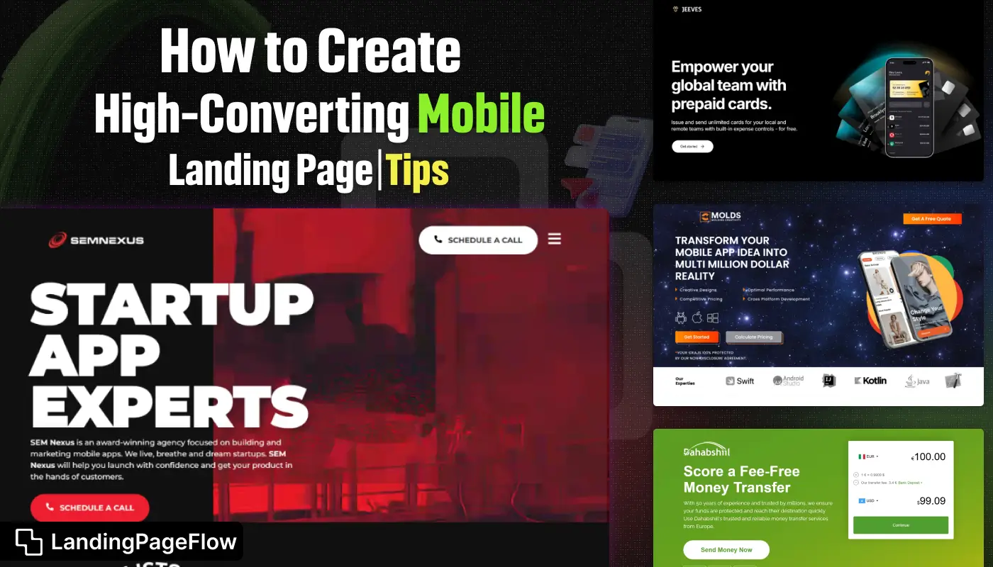
A mobile landing page is often the first touchpoint between your brand and a potential customer, making its impact critical. Strong visuals, concise messaging, and a clear call to action can transform a casual visitor into a loyal buyer.
Businesses that understand how to blend creativity with usability see higher engagement and stronger returns.
Strategic design choices, like fast load speeds and thumb-friendly navigation, make users stay longer and interact more. The layout should guide the visitor’s eyes toward the goal a be it a download link, a purchase button, or a sign-up form.
Cluttered designs typically perform worse than simple, distraction-free pages.
In today’s mobile-first world, small tweaks can deliver big improvements in conversion rates. Every second counts, so speed, clarity, and purpose must work in harmony.
A high-converting landing page is not just about aesthetics; it’s about creating a seamless path to action.
"Wondering what it takes to create a mobile page that truly converts?
Grab your free pro-designed strategy pack."
Table of Contents
- Why Mobile Optimization is Essential?
- Tip 1: Prioritize Page Speed and Performance
- Tip 2: Simplify Your Design and Content
- Streamlined Layouts
- Concise and Clear Messaging
- Tip 3: Optimize For Touchscreen Navigation
- Large, Tap-Friendly Buttons
- Intuitive Navigation Menus
- Tip 4: Focus on a Single Call-to-Action (CTA)
- Tip 5: Implement Responsive and Adaptive Design
- Best Practices For Testing and Optimizing Mobile Landing Pages
1. Why Mobile Optimization is Essential?

With over 50% of global website traffic coming from mobile devices, creating mobile-optimized landing pages is no longer optional—it's a necessity.
Mobile users have different behaviors, expectations, and limitations compared to desktop users.
They often seek quick, easily digestible information and are more likely to bounce from a page if it doesn’t load quickly or isn’t easy to navigate.
By optimizing your landing page for mobile, you ensure that your visitors have a positive experience, leading to higher engagement and conversion rates.
2. Tip 1: Prioritize Page Speed and Performance

Page speed is a critical factor in mobile user experience. Slow-loading pages frustrate users and increase bounce rates, which can significantly impact your conversion rates. To ensure your mobile landing page loads quickly:
- Compress images and minimize file sizes.
- Use a Content Delivery Network (CDN) to reduce server response times.
- Enable browser caching and minify CSS, JavaScript, and HTML files.
- Consider using Accelerated Mobile Pages (AMP) to improve load times on mobile.
3. Tip 2: Simplify Your Design and Content

Streamlined Layouts
Mobile screens are smaller, so it’s essential to streamline your design. Avoid cluttered layouts and focus on a clean, minimalist design that highlights the most critical elements of your landing page.
Use plenty of white space to make the page feel less crowded and easier to navigate.
Concise and Clear Messaging
Mobile users typically skim through content rather than read every word. Your messaging should be concise, clear, and to the point.
Use bullet points, short paragraphs, and headlines to break up text and make it easier for users to quickly understand the value proposition of your landing page.
4. Tip 3: Optimize For Touchscreen Navigation

Large, Tap-Friendly Buttons
Ensure that all interactive elements, such as buttons and links, are large enough to be easily tapped on a mobile device.
Small buttons or closely spaced links can frustrate users and lead to accidental clicks, which can decrease conversions.
Intuitive Navigation Menus
Navigation should be simple and intuitive on mobile devices. Use a hamburger menu for navigation links to keep the page clean and allow users to access more information without overwhelming them with too many options up front.
Additionally, consider using sticky navigation to keep important links visible as users scroll down the page.
5. Tip 4: Focus on a Single Call-to-Action (CTA)

A high-converting mobile landing page should have a clear, singular focus. Avoid overwhelming users with multiple CTAs, which can dilute your message and confuse the user.
Instead, direct attention to one primary CTA that aligns with your conversion goal, such as “Sign Up Now,” “Download,” or “Get Started.” The CTA should be prominently displayed and easily accessible without requiring users to scroll excessively.
6. Tip 5: Implement Responsive and Adaptive Design
Responsive design ensures that your landing page automatically adjusts to fit the screen size of any device, providing a consistent experience across desktops, tablets, and smartphones.
However, mobile optimization goes beyond just responsiveness. Adaptive design techniques allow you to customize your landing page for different devices, ensuring that mobile users get a tailored experience that’s optimized for their specific needs. For example:
- Adjust font sizes for readability on smaller screens.
- Display different images or videos that load faster on mobile.
- Simplify forms and input fields to make them easier to complete on touchscreens.
7. Best Practices For Testing and Optimizing Mobile Landing Pages

To ensure your mobile landing page is truly optimized for conversions, continuous testing and optimization are key.
Use A/B testing to compare different versions of your landing page and identify what works best for your audience. Focus on testing:
- Headlines and copy variations.
- CTA button colors, sizes, and placement.
- Form lengths and input fields.
- Visual elements like images, videos, and background colors.
Additionally, monitor key performance indicators (KPIs) such as bounce rates, time on page, and conversion rates to assess the effectiveness of your mobile landing page and make data-driven decisions for further optimization.
Conclusion
A well-crafted mobile landing page can be the difference between a missed opportunity and a new customer. Thoughtful design choices ensure that every element supports the conversion goal.
From the headline to the final call to action, each detail shapes how the visitor experiences your offer. Testing variations regularly allows you to refine the page for maximum performance.
Businesses that commit to continual improvement often outperform competitors. Clear messaging, intuitive navigation, and engaging visuals together build trust and drive action.
The journey to a high-performing mobile landing page is ongoing, but every step brings measurable benefits. Investing in design and strategy today sets the stage for tomorrow’s success.

FAQ
1. What is the main purpose of a mobile landing page?
A mobile landing page is designed to guide visitors toward a specific action, such as signing up, purchasing, or downloading, in the fastest and clearest way possible.
2. How important is loading speed for conversions?
Loading speed is critical, slow pages lose visitors quickly. A delay of even a second can lower conversions and hurt your overall user experience.
3. Should I use long or short copy on a mobile landing page?
Short, impactful copy works best for mobile audiences. It keeps attention focused and helps users make quick decisions without scrolling endlessly.
4. How can I make my mobile landing page more engaging?
Use strong visuals, clear headlines, and interactive elements like buttons or sliders. Keep the design clean to guide attention to your main offer.
5. Do I need separate designs for desktop and mobile?
Yes, mobile users interact differently. A dedicated mobile design ensures easier navigation, faster load times, and a better overall experience.
6. How often should I update my landing page?
Review and test your page at least once every quarter. Regular updates ensure it stays relevant, optimized, and aligned with your marketing goals.

Ansif


.webp)


