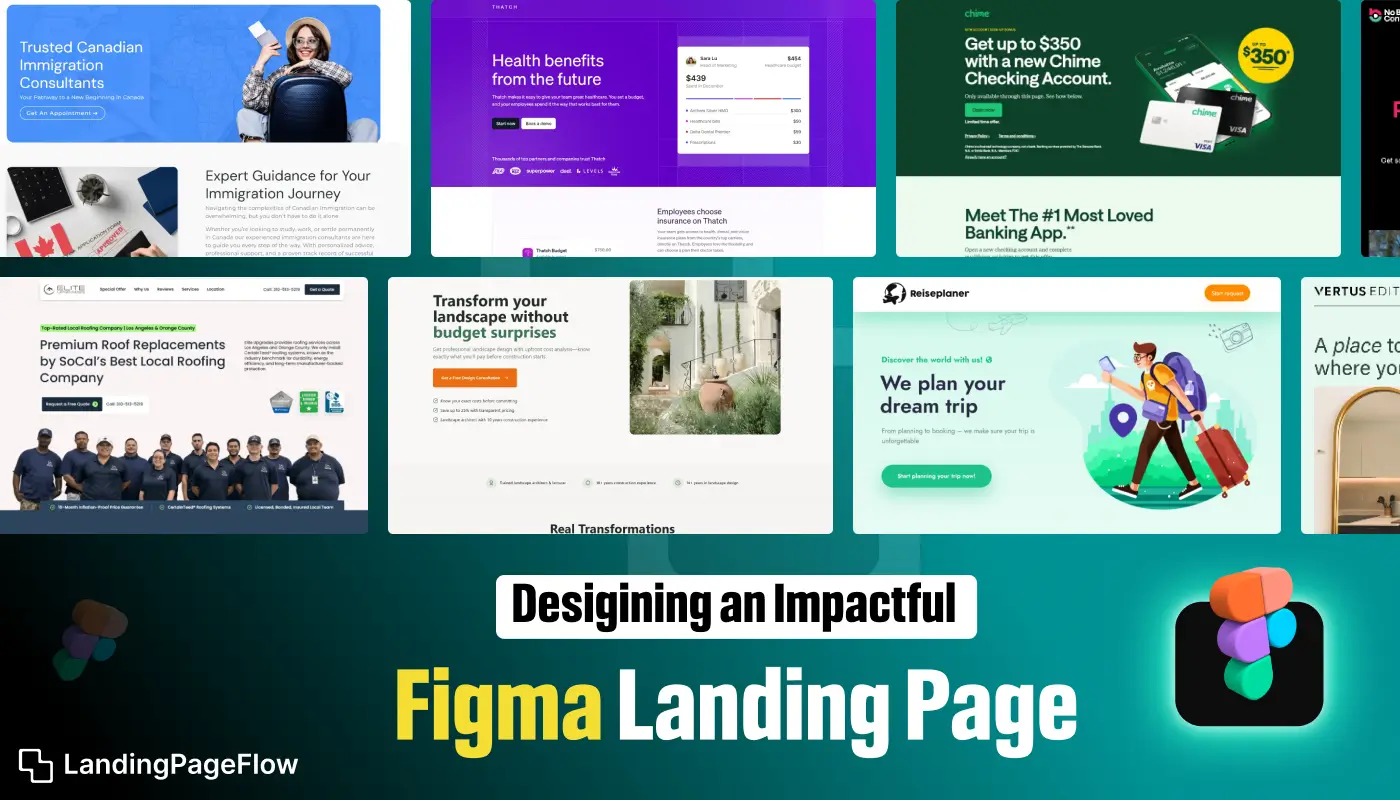
A well-designed Figma landing page can transform casual visitors into loyal customers. Understanding user behavior is essential to guiding attention toward key elements.
Visual hierarchy ensures the most important information stands out and drives decisions. Clean layouts prevent distractions while emphasizing value propositions.
Headlines must be clear and persuasive to immediately capture interest. Interactive elements or prototypes help demonstrate features effectively.
Consistent branding reinforces recognition and trust across the page. Optimized typography and color contrast enhance readability and engagement.
Testing different layouts and messaging helps refine performance and maximize conversion potential.
"Unsure how to design a Figma landing page that converts?
Claim your free expert review - for higher engagement today."
Table of Contents
- Why Figma is Ideal For Landing Page Design?
- Step 1: Define Your Landing Page Goals
- Step 2: Structuring Your Landing Page for Success
- The Hero Section
- Value Proposition
- Call to Action (CTA)
- Step 3: Leveraging Figma’s Design Features
- Collaborative Design
- Prototyping
- Step 4: Incorporating Visual Hierarchy and Consistency
- Step 5: Optimizing For User Experience (UX)
1. Why Figma is Ideal For Landing Page Design?

Figma is a versatile design tool that stands out for its collaborative features, making it an excellent choice for landing page design.
It allows designers to work in real time with team members, ensuring a seamless design process.
Figma’s robust set of tools for creating prototypes, wireframes, and high-fidelity designs make it a go-to solution for crafting landing pages that convert.
2. Step 1: Define Your Landing Page Goals

Before diving into the design process, it’s essential to clearly define your landing page goals.
Ask yourself what action you want users to take. Is the objective to generate leads, increase product sales, or promote an event? Understanding your goals will guide your design decisions and ensure that every element on the page serves a purpose.
3. Step 2: Structuring Your Landing Page For Success

The Hero Section
The hero section is the first thing visitors see when they land on your page, making it one of the most critical elements.
It should be visually compelling and convey the core message of your landing page.
Use a strong headline that immediately grabs attention, paired with a subheadline that offers additional context or value.
Value Proposition
Your value proposition should communicate the benefits of your product or service.
Use concise, persuasive language to explain why your offer is the best solution to your visitor’s problem.
This section should be prominently displayed and easy to understand at a glance.
Call to Action (CTA)
The CTA is where conversions happen. It should be bold, direct, and strategically placed on the landing page.
Use action-oriented language like “Get Started,” “Sign Up Now,” or “Buy Today.”
The CTA button should stand out with contrasting colors and be repeated throughout the page to guide users toward conversion.
4. Step 3: Leveraging Figma’s Design Features
.webp)
Collaborative Design
One of Figma’s standout features is its ability to facilitate collaboration among team members.
Whether you’re working with designers, developers, or stakeholders, Figma allows everyone to contribute and make real-time changes.
This collaborative approach ensures that the final design aligns with the overall project goals and incorporates valuable input from all parties.
Prototyping
Figma’s prototyping tools allow you to create interactive landing pages that mimic the final user experience.
Use these features to test different design elements, such as button placements, color schemes, and navigation flows.
Prototyping helps identify potential issues early in the design process, ensuring a smoother development phase.
5. Step 4: Incorporating Visual Hierarchy and Consistency

Visual hierarchy is key to guiding users through your landing page. Use size, color, and spacing to draw attention to the most important elements, such as headlines, CTAs, and key benefits.
Consistency in fonts, colors, and design elements across the page will create a cohesive and professional look, making it easier for users to navigate and understand your message.
6. Step 5: Optimizing For User Experience (UX)
.webp)
A great landing page isn’t just about looking good—it’s about providing an exceptional user experience.
Ensure that your Figma landing page design is intuitive, with a logical flow from one section to the next.
Consider the mobile experience as well; your design should be fully responsive, offering the same level of usability on smartphones and tablets as on desktops.
Conclusion
An impactful Figma landing page relies on clarity, consistency, and strategic design decisions. Each section should focus on communicating value and prompting action.
User-friendly navigation keeps visitors engaged and encourages exploration. Visuals and interactive elements increase retention and demonstrate product benefits.
Regular testing ensures each element contributes to overall conversion goals. Maintaining alignment between brand identity and page aesthetics builds trust.
Data-driven improvements allow ongoing refinement and better performance. Effective design empowers your page to capture attention, nurture interest, and drive meaningful results.

FAQ
1. Can I design a fully functional landing page in Figma?
Figma allows prototyping and layout design, which can then be handed off to developers or integrated into page builders for functionality.
2. How do I make my Figma landing page mobile-friendly?
Use responsive frames, scalable elements, and preview designs in different screen sizes to ensure an optimal mobile experience.
3. Should I include interactive elements in Figma designs?
Yes, interactive components help demonstrate features and provide a realistic experience for stakeholders before development.
4. How important is color and typography in Figma landing pages?
They play a critical role in readability, brand consistency, and highlighting important calls-to-action for better conversions.
5. Can Figma designs directly improve conversion rates?
Effective visual hierarchy, clear messaging, and user-centric layouts in Figma prototypes help improve engagement once implemented.
6. Is it possible to test landing page ideas in Figma?
Yes, you can create multiple prototypes to test layouts, flows, and visuals before finalizing for development or live deployment.

Altaf Rahman


.webp)


