Designing a landing page that captures attention and motivates action requires a blend of creativity and strategy. A visually striking page ensures visitors stay engaged long enough to explore your offer.
Strong copywriting paired with effective layouts can guide users seamlessly toward the desired action. Visual hierarchy, color psychology, and whitespace play crucial roles in keeping the design user-friendly.
Each landing page must align with your brand identity while speaking directly to your target audience’s needs. Elements like headlines, images, and CTAs work best when crafted with intent.
Mobile responsiveness is no longer optional, as most users browse and buy through their phones. A mobile-optimized design guarantees accessibility and smoother user journeys.
Testing and iteration allow you to refine layouts and messaging, boosting overall performance. Marketers who treat landing pages as living assets achieve greater returns.
"Curious if your design truly maximizes results?
Get your expert action plan at no cost."
Table of Contents
- Introduction
- Understanding the Basics of Landing Pages
- Key Elements of a High-Converting Landing Page
- Clear and Compelling Headline
- Engaging Visuals
- Concise and Persuasive Copy
- Strong Call-to-Action (CTA)
- Trust Signals and Social Proof
- Design Best Practices for Eye-Catching Landing Pages
- Simplify and Focus on One Goal
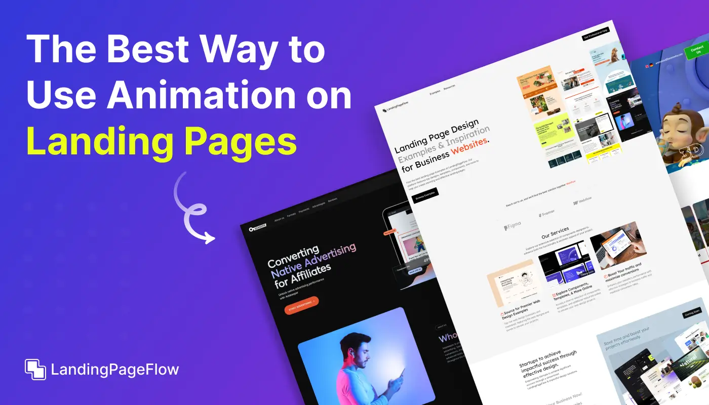
- Visual Hierarchy and Layout
- Mobile Optimization
- Fast Loading Times
- How to Use A/B Testing to Improve Your Landing Page Design?
1. Introduction
In digital marketing, your landing page is often the first interaction a potential customer has with your business.
Whether offering a product, service, or downloadable resource, a landing page is a gateway for visitors to take action.
An eye-catching landing page grabs attention and converts visitors into leads or customers.
But how do you design a landing page that accomplishes both? The answer lies in combining compelling visuals, clear messaging, and a strong call to action, all while providing an intuitive user experience.
2. Understanding the Basics of Landing Pages
A landing page is a standalone web page designed for a specific marketing goal.
It is often the destination for traffic generated by paid ads, email campaigns, or social media promotions.
Unlike other pages on your website, which may have multiple objectives, a landing page typically focuses on one specific action—making a purchase, signing up for a newsletter, or downloading a resource.
The goal of any landing page is to increase conversions by guiding visitors through a seamless, clear, and focused experience. To do this, your landing page must include the right elements in the right places.
3. Key Elements of a High-Converting Landing Page
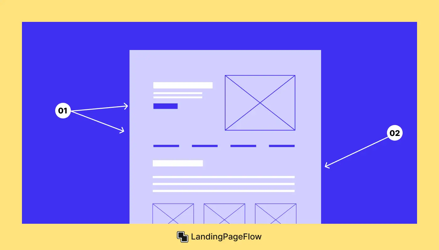
To create an eye-catching landing page that encourages conversions, make sure to incorporate the following key elements:
Clear and Compelling Headline
Your headline is the first thing visitors will see when they land on your page. It needs to quickly communicate what the page is about and why it matters to the visitor. A great headline should be:
- Clear: Avoid jargon or overly complex language. Make sure your visitors know exactly what you’re offering.
- Benefit-Oriented: Explain the value visitors will get from taking action on your landing page. Focus on the "what’s in it for me" aspect.
- Concise: Aim for a headline that’s short and to the point, ideally under 10 words.
Example:
"Boost Your Sales with Proven Digital Marketing Strategies"
Engaging Visuals
Humans are visual creatures, so high-quality images, videos, and graphics play an important role in capturing attention. Visuals should:
- Reinforce Your Message: Choose images or videos that support your offer. For example, if you’re offering a product, show people using it. If you’re promoting a service, consider showing testimonials or before-and-after results.
- Draw Attention to Key Elements: Use visuals to direct focus to important components like your call-to-action (CTA) or a special offer.
- Be High Quality: Blurry or low-resolution images can make your page look unprofessional and may reduce trust. Always use high-quality visuals that align with your branding.
Concise and Persuasive Copy
Effective copy is essential for guiding your visitors through the landing page and encouraging them to take action. Here’s how to craft persuasive copy:
- Keep it Short: Avoid long paragraphs. Your visitors are likely skimming, so make your copy easy to scan.
- Use Benefit-Oriented Language: Focus on the benefits of your offer, not just the features. Explain how your product or service solves a problem or improves the user’s life.
- Create Urgency: Use time-sensitive language, like “Limited Time Offer” or “Sign Up Today for Exclusive Access,” to prompt visitors to act quickly.
Strong Call-to-Action (CTA)
The call-to-action is the most important element of any landing page. Without a clear CTA, visitors won’t know what to do next. Here’s how to make your CTA more effective:
- Be Clear and Direct: Use action-oriented words like “Buy Now,” “Download Free Guide,” or “Get Started.”
- Make It Stand Out: Use a contrasting color for your CTA button to make it pop. Ensure it’s easy to find above the fold and at the end of your page.
- Use Persuasive Language: Phrases like "Get Started Today" or "Claim Your Spot" make the CTA feel more urgent and appealing.
Trust Signals and Social Proof
Visitors are more likely to take action if they feel that they are making a safe choice. Trust signals such as social proof, testimonials, and security badges can build credibility and establish trust. Consider including:
- Customer Testimonials: Real feedback from satisfied clients can reassure potential customers that your offer is legitimate and valuable.
- Client Logos: If you’ve worked with recognizable brands or businesses, display their logos as social proof.
- Security Badges: If you're collecting payment information, include trust badges (e.g., "Secure Checkout," SSL encryption symbols) to reassure visitors that their information is safe.
4. Design Best Practices For Eye-Catching Landing Pages
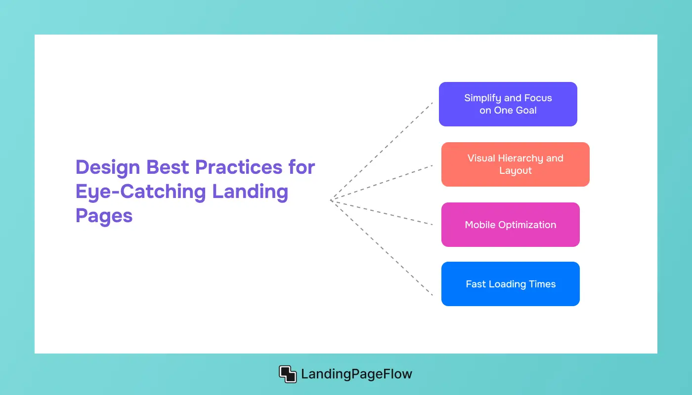
Design plays a major role in how visitors perceive your landing page and influences whether they stay to explore further or leave. Here are some design best practices to follow:
Simplify and Focus on One Goal
Avoid cluttering your landing page with too many elements. The goal is to keep the visitor focused on taking a single action.
Every element on the page should contribute to this goal. If your landing page includes multiple actions (e.g., social media links, and links to other pages), it can distract from the main objective.
Visual Hierarchy and Layout
Your landing page should have a clear structure that guides the visitor’s eye from top to bottom. Use:
- Headings and Subheadings: Break up text and create a clear visual hierarchy with headlines, subheadings, and bullet points.
- Whitespace: Don’t be afraid of space—this allows your design to breathe and helps focus attention on key elements like your headline and CTA.
Mobile Optimization
More people are browsing the web on mobile devices than ever before. Ensure that your landing page is fully optimized for mobile users by:
- Using Responsive Design: Your page should adapt to all screen sizes, whether on a smartphone, tablet, or desktop.
- Optimizing Load Time: Mobile users are often impatient with slow loading times. Compress images and keep file sizes as small as possible to ensure a fast, smooth experience.
Fast Loading Times
Page speed is crucial to user experience and conversion rates. A slow page can drive potential customers away. To improve your page speed:
- Compress Images: Large image files can drastically slow down your page. Use image compression tools to reduce file sizes without losing quality.
- Minimize Scripts: Avoid unnecessary scripts that can bloat your landing page. The faster your page loads, the better your chances of converting visitors.
5. How to Use A/B Testing to Improve Your Landing Page Design?
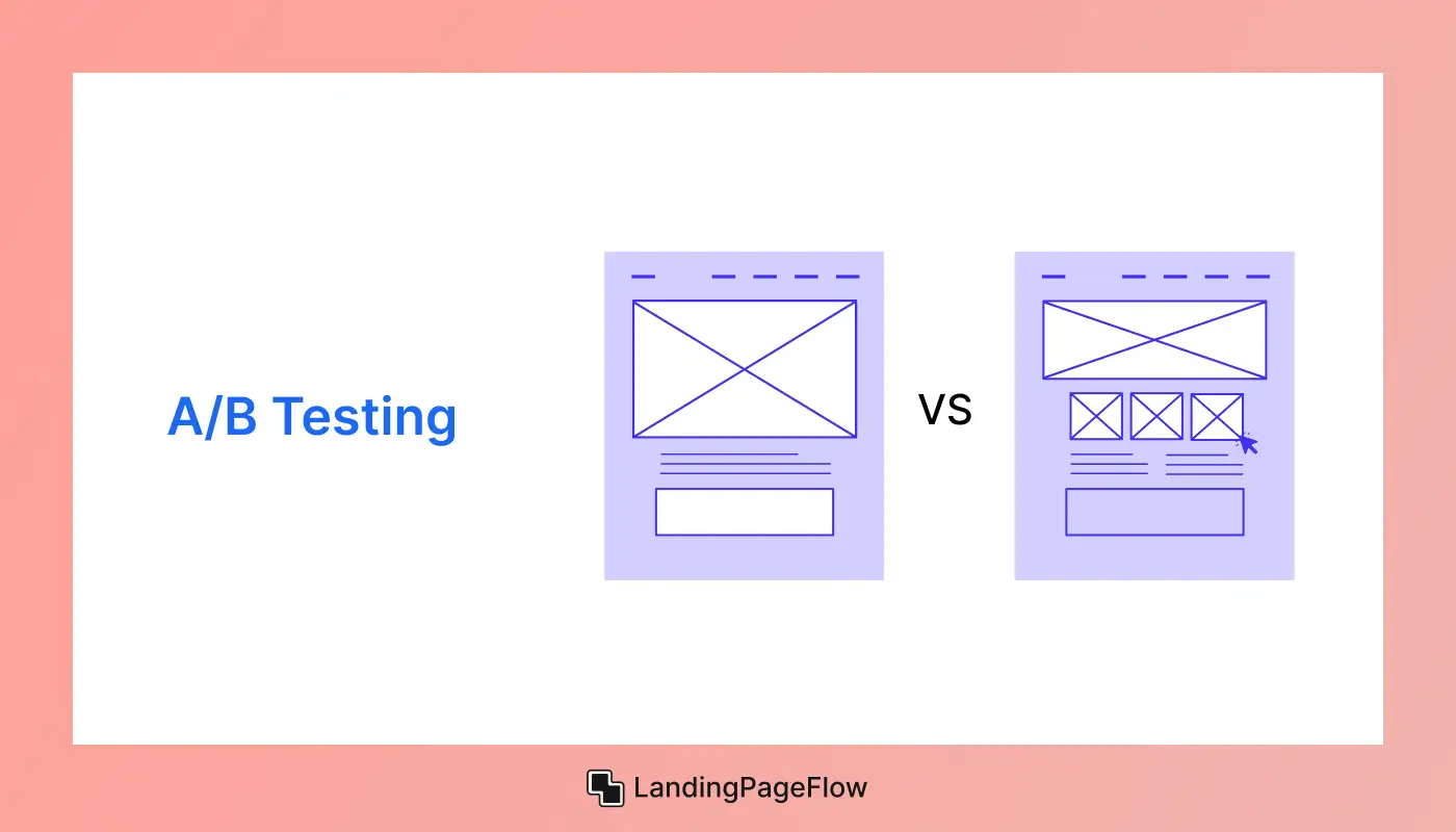
Once your landing page is live, it's essential to test and optimize its performance continuously. A/B testing (also known as split testing) is a process where you test two versions of a landing page to see which one performs better. Here’s how to implement A/B testing:
- Test One Element at a Time: Focus on one element, such as the CTA button color, headline, or image. Testing multiple changes at once can lead to confusing results.
- Track Key Metrics: Measure metrics like conversion rates, bounce rates, and time on the page to determine which version of the page is more successful.
- Make Iterative Improvements: Keep testing and refining your landing page over time. Small tweaks can lead to significant increases in conversions.
Conclusion
Creating a landing page that truly converts takes more than attractive visuals; it demands careful planning and smart execution. Each element must have a clear purpose, from headlines to final CTAs.
Attention spans are short, making simplicity and clarity essential for success. A streamlined experience ensures visitors stay focused on taking action.
Every design choice should be guided by your business goals and your audience’s expectations. By aligning these factors, your landing page becomes a strong sales driver.
Continuous A/B testing allows you to discover what resonates best with your audience. Small tweaks can result in significant improvements over time. Mobile-first thinking is critical as traffic increasingly comes from handheld devices.
Ensuring responsiveness means no opportunity is lost to poor user experience. When executed correctly, your landing page becomes a growth engine that boosts credibility, increases engagement, and maximizes conversions consistently.

FAQ
1. What makes a landing page eye-catching?
A landing page becomes eye-catching through strong visuals, clear messaging, balanced whitespace, and a defined call-to-action that immediately captures user interest.
2. How many CTAs should a landing page have?
Most high-converting landing pages feature one primary CTA repeated throughout, avoiding distractions that can reduce focus and conversions.
3. Do images or videos work better on landing pages?
Both can work effectively depending on the audience and offer. Videos often improve engagement, while images maintain speed and clarity.
4. How important is mobile responsiveness?
Mobile responsiveness is essential, as the majority of visitors use mobile devices. A responsive design ensures consistent experience across screens.
5. Should I use long or short landing page content?
It depends on your goal. Short content works well for simple offers, while longer pages allow room for storytelling and complex product explanations.
6. How often should I test and update my landing page?
Regular testing is vital. Running A/B tests monthly and updating content quarterly ensures performance stays aligned with evolving audience needs.



.webp)
