Strong digital conversions often begin with a clear and seamless contact form landing page. Businesses that prioritize user experience see better engagement and higher lead capture.
Careful structuring of form fields can remove friction and encourage visitors to complete the process confidently. An intuitive layout, paired with compelling copy, can drastically improve results.
Smart use of colors, contrast, and call-to-action buttons ensures that visitors know exactly where to focus and how to proceed. Mobile responsiveness further strengthens conversion potential.
Personalization also plays a key role in building trust. Forms that align with user intent help reduce drop-offs and foster stronger brand connections.
Security measures such as data protection assurances and privacy statements can instill confidence, making visitors more likely to submit their details.
A seamless design is not just about looks but about strategy. Combining clarity, usability, and trust elements transforms an ordinary contact form into a powerful conversion tool.
"Book your free expert consultation
Optimize your contact form landing page for higher conversions"
Table of Contents
- Understand the Purpose of Your Contact Form
- Keep the Design Simple and Clean
- Use a Clear and Compelling Headline
- Optimize Your Contact Form Fields
- Incorporate Persuasive Copy and Value Proposition
- Use Visual Cues and Call-to-Action (CTA) Buttons
- Provide Trust Signals and Social Proof
- Optimize For Mobile Users
- Test and Optimize For Maximum Conversions
1. Understand the Purpose of Your Contact Form
Before you start designing, it’s crucial to understand the specific goal of your contact form landing page. Typically, contact forms are used to:
- Generate Leads: For businesses that want to capture potential clients, your contact form should gather information such as name, email, and specific queries.
- Customer Support: If your goal is to provide customer service, your form should allow visitors to submit inquiries, ask for help, or report an issue.
- Request a Quote or Demo: For SaaS businesses or service providers, your form may serve to schedule a consultation or demo.
Each of these objectives will shape your form’s content and design. Define your objective clearly so that the page and form reflect it properly.
2. Keep the Design Simple and Clean

Simplicity is key when it comes to a contact form landing page. A clean, minimalistic design ensures that visitors are not overwhelmed and can focus solely on completing the form.
- White Space: Use plenty of white space around the form to avoid clutter. This creates a clear visual path and draws attention to the form itself.
- Readable Fonts: Choose clear, legible fonts with a large enough size to ensure readability. Avoid overly ornate fonts that might confuse the visitor.
- Contrasting Colors: Use contrasting colors for buttons and form fields to make them stand out. However, keep the color scheme aligned with your brand’s design for consistency.
The layout should ensure the visitor’s attention is directed toward filling out the form and not distracted by unnecessary elements.
3. Use a Clear and Compelling Headline
The headline on your landing page serves as the first impression, so make it compelling and to the point. Your headline should quickly communicate the value the visitor will receive by filling out the form. For example:
- “Get a Free Consultation”
- “Request a Quote Today”
- “Have Questions? We’re Here to Help”
- “Start Your Journey With Us – Contact Us Now”
Make sure your headline is action-driven and motivates the visitor to take the next step. It should align with the purpose of the form and convey the benefits of submitting an inquiry.
4. Optimize Your Contact Form Fields
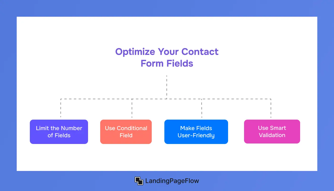
While the form itself is crucial to conversion, how you design it can make all the difference.
- Limit the Number of Fields: Only ask for essential information. For example, just a name, email, and a message box can suffice for general inquiries. Asking for too much information upfront can discourage users from filling out the form.
- Use Conditional Fields: If you need more information but don’t want to overwhelm users, consider using conditional fields that only appear based on prior selections.
- Make Fields User-Friendly: Use placeholders and descriptive labels for each field to make them intuitive. Make sure the button labels are clear, such as “Send Message” or “Get Your Quote.”
- Use Smart Validation: Implement real-time form validation (e.g., showing a message when a user forgets to fill out a field or types an incorrect email). This provides immediate feedback and reduces errors.
The key is to keep the form short and simple, ensuring the visitor doesn’t feel bogged down by an overwhelming process.
5. Incorporate Persuasive Copy and Value Proposition

Visitors need to know why they should fill out the form. Highlight the value and benefits they will get by submitting their contact information.
- Short and Persuasive Paragraphs: Use short, concise copy to explain what the visitor will gain. For instance, “Submit your details, and our team will get back to you with a personalized quote within 24 hours.”
- Benefits: If you’re offering something free, like a consultation or a quote, make sure to mention it prominently. For example, “Receive a customized solution for your needs” or “Get expert advice on how to improve your business.”
The content should reassure visitors that filling out the form is a low-risk, high-reward action.
6. Use Visual Cues and Call-to-Action (CTA) Buttons
%20Buttons.webp)
The form should have clear, action-oriented CTA buttons. The design of your CTA buttons can make a huge difference in conversion rates.
- CTA Button Placement: Place CTA buttons at strategic points, especially directly after the value proposition. Use multiple CTA buttons if the page is long, but ensure they don’t overwhelm the user.
- CTA Text: The button text should convey the desired action. Phrases like “Get Started,” “Send Message,” or “Request a Quote” work well.
- Colors and Design: Make sure your CTA buttons stand out by using contrasting colors. They should be big enough to be noticeable, but not so large that they overshadow the form.
By using these visual cues, you guide the visitor's attention and make it easy for them to take action.
7. Provide Trust Signals and Social Proof

To build trust with visitors, consider incorporating trust signals throughout your contact form landing page. Trust signals reassure users that their information will be safe and that they’re engaging with a credible company.
- SSL Certificates: Display a secure SSL certificate badge on your page, especially if you are asking for sensitive information (e.g., credit card details).
- Customer Testimonials: Include a brief testimonial or review from satisfied clients to increase trust.
- Privacy Policy Link: Include a link to your privacy policy next to the form to assure users their information is protected.
- Social Proof: Display logos of recognized clients, certifications, or partners that validate your authority in your industry.
These trust signals help visitors feel comfortable filling out the form, especially when personal details are involved.
8. Optimize For Mobile Users

A significant portion of your visitors will access your landing page via mobile devices, so it’s critical to optimize the design for mobile users.
- Responsive Design: Ensure your landing page and contact form are fully responsive across different devices (smartphones, tablets, desktops).
- Easy-to-Use Form: On mobile devices, form fields should be large enough to tap on. Ensure there are no obstacles to submission, such as dropdown menus that are hard to interact with.
- Button Size: Make your CTA buttons large enough for easy clicking, without overcrowding the page.
- Page Load Speed: Optimize images and reduce unnecessary code to ensure the page loads quickly on mobile.
Mobile optimization ensures that your form is accessible and user-friendly, leading to higher conversion rates across devices.
9. Test and Optimize For Maximum Conversions

Even if your landing page is designed with best practices in mind, it’s important to test and optimize it regularly. A/B testing is a great way to improve conversions by comparing two different versions of a landing page.
- A/B Test Different Elements: Test different headlines, CTA button text, form lengths, and layouts. For example, you could test two versions of the CTA button—one saying “Submit” and another saying “Get Your Free Quote.”
- Analyze Analytics: Use analytics tools like Google Analytics or Hotjar to track how visitors interact with your form. Identify where visitors drop off and optimize accordingly.
- Check Loading Speed: Slow page loads lead to high bounce rates. Ensure that your page is optimized for fast loading times to maintain user engagement.
Constantly monitor and tweak your page to improve performance and conversion rates over time.
Conclusion
An effective contact form landing page works as a bridge between visitor interest and business opportunity. The smallest details helps to make the procedure clear and convincing.
Finding the ideal mix between simplicity and high-quality information is crucial, although short forms frequently perform better.
Design that inspires trust encourages more users to take action, while mobile responsiveness ensures no lead is lost on smaller screens. Adding social proof and clear assurances also helps ease hesitation.
By refining the details and keeping users in mind, businesses can transform a simple landing page into a conversion powerhouse. Strong results come from strategy, testing, and consistent improvements over time.

FAQ
1. Why is a contact form landing page important for conversions?
A contact form landing page provides a direct way for visitors to connect, making it easier to capture leads and move them further into the sales funnel.
2. How many fields should my contact form have?
Fewer fields generally perform better. Limit to essential details like name, email, and message, then expand only if necessary.
3. What design elements make a form more effective?
Clear headlines, contrasting call-to-action buttons, minimal distractions, and responsive layouts ensure higher form completion rates.
4. How can I make my contact form mobile-friendly?
Use responsive design, larger touch-friendly buttons, and easy-to-read fonts to provide a smooth mobile user experience.
5. Should I add trust signals on my landing page?
Yes, testimonials, security badges, or privacy assurances help reduce hesitation and build user confidence in submitting their details.
6. How often should I test and optimize my form?
Continuous testing is best. Regular A/B testing of layouts, CTA wording, and field numbers ensures steady improvements in conversion rates.

Ansif


.webp)


