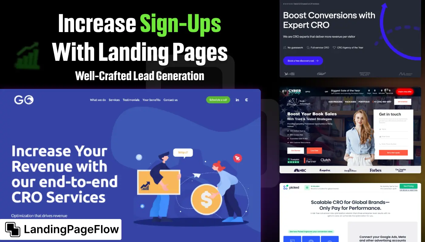
Driving consistent sign-ups requires more than a visually appealing page. Businesses need a focused lead generation landing page that speaks directly to user needs.
Strong headlines capture attention immediately, while clear subheadings guide visitors smoothly toward the call-to-action without distractions.
Trust signals such as testimonials, case studies, or recognizable logos can reduce hesitation and create a sense of reliability.
Calls-to-action should be short, actionable, and persuasive, leading users to act in the moment instead of delaying the decision.
Testing different variations through A/B experiments reveals what truly resonates and delivers higher conversion rates. A strategic approach ensures your lead generation landing page becomes an engine for growth and consistent sign-ups.
"Need better results from your landing pages?
Secure your free guide & unlock strategies that drive conversions."
Table of Contents
- What Makes a Good Lead Generation Landing Page?
- Essential Elements For High Sign-Ups
- Design Best Practices For Better Conversion Rates
- Lead Magnets: Offering Value to Your Visitors
- Optimizing For Mobile and User Experience
- Examples of Effective Lead Generation Pages
1. What Makes a Good Lead Generation Landing Page?

A successful lead generation page focuses on one goal - encouraging visitors to submit their information.
Unlike regular web pages, these pages are streamlined to remove distractions and focus on a single call to action (CTA).
Key characteristics of a good lead generation landing page include:
- A clear value proposition that explains what users gain.
- A strong CTA guides the visitor to take action.
- An intuitive layout that simplifies the user journey.
2. Essential Elements For High Sign-Ups

Strong Headline and Subheadline
- Headline: Quickly convey the primary benefit (e.g., "Boost Your Productivity with Our Free Guide").
- Subheadline: Offer a short explanation that supports the headline and encourages action.
Clear and Compelling CTA
- Make sure the CTA is action-oriented (e.g., “Get My Free Copy” or “Join the Webinar”).
- Use contrasting colors to make the CTA button stand out.
Minimal Form Fields
- Ask only for essential information to reduce friction.
- For most lead forms, just asking for a name and email works well.
Engaging Visuals
- Use relevant images, videos, or illustrations to support the offer.
- Product mockups or demo videos can help users visualize what they’re signing up for.
Social Proof
- Add customer reviews, testimonials, or trust badges to build credibility.
- Mention the number of subscribers or users if applicable (e.g., “Join 10,000+ Subscribers”).
3. Design Best Practices For Better Conversion Rates

Focus on Simplicity
- Keep the design minimal with plenty of white space.
- Remove unnecessary navigation links to avoid distractions.
Use Mobile-Responsive Layouts
- Ensure the landing page looks great on all devices.
- Test buttons, forms, and text on both desktop and mobile.
Visual Hierarchy
- Use larger fonts and bold colors for your CTA and headline.
- Arrange sections logically to guide users toward the form submission.
4. Lead Magnets: Offering Value to Your Visitors
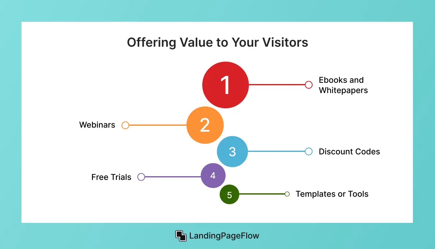
A lead magnet is something you offer in return for the visitor’s information. The more valuable your offer, the more likely users are to sign up. Popular lead magnets include:
- Ebooks and Whitepapers: Useful for B2B audiences seeking in-depth knowledge.
- Webinars: Great for showcasing expertise and building trust.
- Discount Codes: Perfect for eCommerce landing pages.
- Free Trials: Encourage users to experience your product firsthand.
- Templates or Tools: Offer downloadable resources like calendars, checklists, or spreadsheets.
5. Optimizing for Mobile and User Experience
Fast Loading Times
- Compress images and avoid large media files to ensure the page loads quickly.
- Pages that load in under 3 seconds tend to perform better in conversions.
Easy-to-Fill Forms
- Use large input fields and clear labels to simplify form submission on mobile devices.
- Enable autofill options to make the process faster.
A/B Testing for Performance
- Test different headlines, CTA placements, and form lengths to find what works best.
- Tools like Google Optimize or Unbounce allow you to experiment with multiple versions.
6. Examples of Effective Lead Generation Pages

1. HubSpot’s Free CRM Landing Page
- Uses a compelling headline and clear CTA.
- Provides social proof with customer testimonials.
2. Shopify’s Free Trial Page
- Minimal design with a prominent CTA button.
- The form requires only an email, encouraging quick sign-ups.
3. Trello’s Demo Access Page
- Uses a product screenshot and demo video to highlight the platform.
- Includes a simple form with a straightforward CTA.
Conclusion
High-performing lead generation landing pages are built around clarity, trust, and a strong value proposition. Businesses that prioritize these principles see better conversion results.
Creating a sense of urgency encourages visitors to act now rather than later, leading to more consistent sign-ups over time.
Integrating trust signals into the design reassures hesitant prospects and removes common barriers to engagement. Persuasive copy aligned with visual hierarchy allows the audience to understand the offer without confusion or unnecessary details.
A well-structured approach transforms sign-up rates and creates stronger relationships with potential customers. By committing to these practices, companies can scale growth and build a more reliable lead funnel for the future.

FAQ
1. What is a lead generation landing page?
A lead generation landing page is a standalone page designed to capture visitor information, such as email addresses, in exchange for valuable content or offers.
2. Why do sign-ups increase with dedicated landing pages?
Dedicated pages eliminate distractions, focus on one action, and use targeted copy and visuals that encourage users to complete the sign-up form.
3. How many fields should a lead form include?
Fewer fields usually result in higher conversions. Start with essentials like name and email, and test additional fields only if necessary for your funnel.
4. What design elements improve conversions?
Strong headlines, persuasive calls-to-action, trust signals, and mobile-friendly layouts play key roles in boosting conversions on landing pages.
5. Should I use A/B testing for my landing page?
Yes, A/B testing allows you to compare variations of copy, layout, and visuals to see which version delivers the best sign-up performance.
6. How can I build trust on a landing page?
Adding testimonials, client logos, security badges, and clear value explanations builds trust and reduces hesitation, encouraging more sign-ups.

Ansif


.webp)


