Marketers often underestimate the power of simplicity when it comes to conversions. Instead of spreading efforts across multiple touchpoints, a single landing page creates a clear pathway for action.
Focused design and messaging allow visitors to instantly understand what is being offered. Instead of bouncing between distractions, they are guided toward one decision that matters most.
This approach eliminates confusion and builds trust faster by reducing clutter. Strong visuals, compelling copy, and a single call-to-action give clarity that drives higher response rates.
Simplicity also means campaigns are easier to optimize. Testing variations of headlines, visuals, or calls-to-action becomes faster and more efficient without multiple scattered assets.
Businesses gain a central hub for campaigns while creating a predictable and repeatable path to growth.
"Need clarity in your marketing?
Secure your free expert landing page guide today."
Table of Contents
- What is a Single Landing Page?
- Why a Single Landing Page Works For Conversions?
- Essential Elements of a High-Converting Single Landing Page
- Best Practices For Single Landing Page Design
- Examples of High-Converting Single Landing Pages
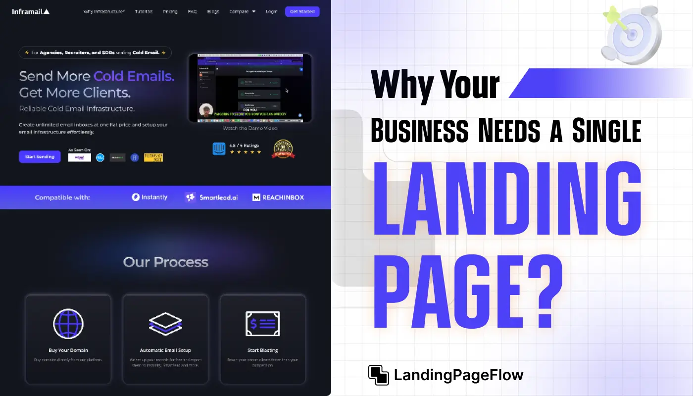
1. What is a Single Landing Page?

A single landing page is a standalone webpage designed to promote a product, capture leads, or encourage sign-ups.
Unlike multi-page websites, a single landing page removes distractions by focusing on one primary call-to-action (CTA) and delivering visitors a seamless, targeted experience.
This approach is particularly effective for businesses launching campaigns, special promotions, or targeted offers, as it focuses entirely on converting visitors without unnecessary navigation or multiple CTAs.
2. Why a Single Landing Page Works For Conversions?

Single landing pages simplify the user journey, which can significantly impact conversion rates. Here’s why they work so effectively:
- Eliminates Distractions: A single landing page removes elements that could lead a visitor away, such as excessive links or unrelated sections. With fewer distractions, visitors can focus on the CTA.
- Improves Load Speed: Less content and a simple design mean faster loading times, which is crucial as users are less likely to wait for a slow page to load. Faster pages lead to lower bounce rates and higher conversions.
- Strengthens Brand Messaging: By focusing on one specific offer or message, businesses can maintain clarity and strengthen their brand message, helping visitors understand the value more quickly.
- Enhances User Experience: Single landing pages are mobile-friendly, concise, and visually engaging. The simplicity ensures visitors know exactly what to do, whether it’s signing up, buying a product, or subscribing to a newsletter.
- Data-Driven Optimization: A single landing page is easy to track and optimize with A/B testing and analytics. With only one page to monitor, businesses can easily adjust elements like headlines, CTA buttons, and visuals to maximize performance and boost conversions.
3. Essential Elements of a High-Converting Single Landing Page

For a single landing page to be successful, it needs to include several key components designed to engage and persuade visitors effectively. Here’s what to focus on:
- Compelling Headline: Your headline is the first thing visitors see, so make it attention-grabbing and clear. It should convey the unique value of your offer and set the stage for what follows.
- Subheadline: Directly supporting the main headline, the subheadline provides a little more detail about your product or service, making it clear why visitors should continue reading.
- Strong Visuals: A picture is worth a thousand words. Use high-quality images or short videos that demonstrate your product or service in action and resonate with your target audience.
- Clear Call-to-Action (CTA): Your CTA is the conversion point. Make it stand out with contrasting colors, clear language, and strategic placement. Use persuasive action words like “Get Started,” “Try for Free,” or “Join Now” to guide users toward conversion.
- Social Proof: Testimonials, reviews, ratings, or logos of well-known clients can build trust with your audience and reinforce the credibility of your offer.
- Benefits & Features: Briefly outline the primary benefits of your product or service, making it easy for visitors to understand why they should take action. Break this information into bullet points to enhance readability.
- Lead Capture Form: If your goal is to collect leads, keep your form short and simple, asking only for essential information like name and email. The fewer fields, the higher the likelihood of completion.
- Trust Signals: Security badges, privacy assurances, or certifications help reassure users, especially if you’re asking for personal information or payment.
4. Best Practices For Single Landing Page Design

Design plays a crucial role in how users engage with your landing page. Here are some top design tips to make your page as effective as possible:
- Optimize for Mobile: A large percentage of traffic comes from mobile devices, so make sure your page looks and functions well on smaller screens.
- Use White Space Effectively: White space helps keep the design clean and draws attention to key elements, such as the headline, visuals, and CTA.
- Prioritize Above-the-Fold Content: Place the most important information, including the headline, CTA, and a supporting image, at the top of the page to ensure visitors see it immediately.
- Maintain Visual Consistency: Stick to a cohesive color scheme, typography, and style that aligns with your brand. A consistent visual aesthetic reinforces brand recognition and professionalism.
- Leverage Contrasting Colors for CTAs: Using a color that stands out from the rest of the page makes your CTA button more noticeable, increasing the likelihood of clicks.
- Avoid Clutter: Don’t overload your page with text, images, or buttons. Focus on the essentials that lead to your goal.
5. Examples of High-Converting Single Landing Pages

Here are some examples of single landing pages that have successfully used the elements and strategies above to drive conversions:
- Slack: Their landing page is clean and simple, with a prominent CTA and a clear explanation of how their service simplifies communication for teams.
- Spotify: Using a bright color contrast and simple messaging, Spotify’s single landing page quickly conveys its value proposition, with a clear CTA encouraging users to sign up for free.
- Dropbox: Dropbox’s landing page includes minimal text, a strong CTA, and social proof, building trust while making it easy for users to sign up or log in.
For more inspiration, platforms like Land-Book and One Page Love showcase a variety of high-quality single landing pages across industries.
Conclusion
High-converting campaigns thrive on clarity, and a single landing page provides exactly that. Instead of overwhelming visitors, it offers a clean and persuasive journey.
Businesses can present their strongest message without competing distractions. The simplicity helps visitors make decisions quickly, resulting in measurable lifts in performance.
Marketing efforts also become more cost-effective. Optimization, testing, and adjustments can be made swiftly while producing a higher return on investment. A streamlined strategy supports consistent branding.
Visitors experience a unified message every time they arrive, which strengthens trust and builds recognition. Conversions improve naturally when confusion is removed from the funnel.
Companies that embrace this method often report not just higher conversion rates but also stronger customer loyalty. The directness keeps people engaged and motivated to act.

FAQ
1. Why is a single landing page more effective than multiple pages?
A single landing page focuses attention on one clear message, reducing distractions. This increases clarity, which often leads to higher conversion rates.
2. Can one landing page work for different campaigns?
Yes, a single landing page can be tailored with dynamic content or variations, allowing it to serve multiple campaigns while staying consistent in design.
3. How does a dedicated landing page improve user experience?
It eliminates clutter and presents one goal, making navigation simple. Visitors know exactly what action to take, improving satisfaction and reducing drop-offs.
4. What elements should a high-converting landing page include?
A strong headline, compelling visuals, persuasive copy, social proof, and one clear call-to-action are essential to encourage conversions effectively.
5. Is a single landing page suitable for all businesses?
Most businesses benefit from having at least one focused landing page. It’s especially effective for campaigns targeting a specific product, service, or offer.
6. How can I track the performance of my landing page?
Analytics tools like Google Analytics or heatmaps measure visitor behavior, click-through rates, and conversions. This data helps optimize the page over time.

Ansif


.webp)


