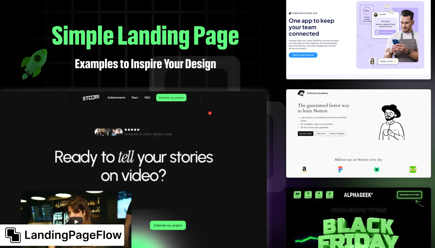
Creating a high-impact landing page doesn’t always require complex design choices or cluttered visuals. Simplicity often captures user attention in the most effective way.
Minimal layouts guide visitors directly toward the main goal without unnecessary distractions. Clean typography and focused visuals ensure every message lands with clarity.
Strong examples of simple pages demonstrate how reduced elements can enhance conversion rates while keeping users focused on one clear call-to-action.
Designers often find that cutting back on excess detail improves loading speed, accessibility, and overall mobile experience, which matters greatly for conversions.
Drawing inspiration from successful examples provides valuable insight into what makes simplicity effective. Let’s uncover what makes these designs so powerful.
"Not certain how to apply simplicity without losing creativity?
Get your free expert insights & build streamlined pages."
Table of Contents
- Why Simplicity Works in Landing Page Design?
- Inspiring Simple Landing Page Examples
- Example 1: Dropbox’s Minimalist Approach
- Example 2: Airbnb’s Clean and Focused Design
- Example 3: Google’s Product-Specific Landing Pages
- Key Takeaways from These Examples
1. Why Simplicity Works in Landing Page Design?

Simplicity is more than just an aesthetic choice; it's a strategic approach that enhances the effectiveness of your landing page. Here’s why a minimalist design often yields better results:
- Clear Focus: A simple design helps visitors immediately understand the purpose of the page. By eliminating unnecessary elements, you can focus on a single, compelling message. This clarity prevents visitors from becoming overwhelmed or confused, which can lead to higher conversion rates.
- Faster Load Times: Fewer design elements and optimized content contribute to quicker load times. A page that loads swiftly improves user experience and reduces bounce rates. Visitors are more likely to stay on a page that responds quickly to their actions.
- Improved User Experience: A streamlined design simplifies navigation and helps users find the information they need more efficiently. By minimizing distractions, users can focus on taking the desired action, whether it's filling out a form, making a purchase, or signing up for a service.
- Increased Conversion Rates: Simple landing pages often lead to higher conversion rates because they direct visitors' attention to a single call-to-action (CTA). This focused approach reduces the chances of visitors getting sidetracked and increases the likelihood of them completing the desired action.
2. Inspiring Simple Landing Page Examples

To illustrate the power of simplicity in landing page design, let's look at three successful examples from well-known companies. Each example demonstrates how a minimalist approach can effectively capture attention and drive conversions.
Example 1: Dropbox’s Minimalist Approach
Dropbox is renowned for its clean, minimalist design that effectively communicates its core value proposition. The landing page is characterized by:
- Concise Headline: The headline “Dropbox helps you keep all your files in one place” immediately tells visitors what the service is about.
- Minimal Text: The page uses very little text, focusing on essential information only.
- Prominent CTA: The “Sign Up for Free” button stands out, making it easy for visitors to take action.
Dropbox’s landing page here
The simplicity of Dropbox’s design ensures that visitors quickly understand the benefits of the service and are guided effortlessly toward signing up.
By keeping the design uncluttered, Dropbox reduces cognitive load and increases the likelihood of conversion.
Example 2: Airbnb’s Clean and Focused Design
Airbnb’s host sign-up landing page is another excellent example of effective simplicity. Key features include:
- Clear Headline: The headline “Earn money as an Airbnb host” clearly communicates the primary benefit.
- Straightforward Copy: The page provides a brief, focused description of the benefits of hosting.
- Single CTA: The “Get Started” button is prominently displayed, making it easy for potential hosts to begin the sign-up process.
Check out Airbnb’s landing page here
The clean design of Airbnb’s page ensures that visitors can quickly grasp the value of hosting and are encouraged to take the next step without any distractions.
This focused approach helps convert visitors into hosts by emphasizing the most compelling aspects of the opportunity.
Example 3: Google’s Product-Specific Landing Pages
Google’s product-specific landing pages, such as those for Google Workspace, showcase a minimalist design that highlights the key benefits of the product. Features include:
- Compelling Headline: The headline “Get Google Workspace” clearly communicates the product offering.
- Brief Description: The page includes a succinct description of the benefits and features.
- Clear CTA: The “Get Started” button is prominently placed, guiding users to begin using the product.
View Google Workspace’s landing page here
Google’s approach to landing page design emphasizes simplicity and clarity.
By focusing on essential information and providing a clear path to conversion, Google effectively engages visitors and encourages them to take action.
3. Key Takeaways from These Examples

Examining these examples reveals several key principles for designing effective simple landing pages:
- Focus on Core Elements: A successful landing page highlights essential components such as a clear headline, minimal text, high-quality visuals, and a prominent CTA. Avoid cluttering the page with unnecessary information or design elements.
- Utilize White Space: White space is a critical element in minimalist design. It helps to eliminate visual clutter, making the core message and CTA stand out. Effective use of white space improves readability and enhances user experience.
- Ensure Fast Load Times: A minimalist design contributes to faster load times by reducing the number of elements that need to be loaded. Faster load times improve user experience and reduce bounce rates.
- Prioritize User Action: The design should streamline the process for visitors to take the desired action. Simplify navigation and eliminate distractions to guide users smoothly toward conversion.
- Test and Optimize: Continuously test and optimize your landing page to improve performance. Use A/B testing to compare different versions of your page and analyze metrics such as conversion rates and user engagement to determine which design is most effective.
Conclusion
Design simplicity has repeatedly shown itself to be more than just a style preference; it is a tactic that encourages consumers to take action without hesitation.
Clear messaging, bold visuals, and a focused call-to-action transform even the most minimal layout into a high-converting page.
Marketers who strip away distractions often discover higher engagement levels and reduced bounce rates. Visitors respond better when their journey feels seamless and intentional.
The strongest takeaway from studying these examples is that less really can achieve more. Simple designs not only resonate but also build stronger trust with audiences.
Future-focused design trends already lean toward minimalism, ensuring that simplicity will remain a cornerstone of impactful digital strategies.
For anyone building a new landing page, these examples serve as a guide to align design choices with user expectations.

FAQ
1. Why are simple landing pages effective?
They eliminate distractions, focus on a single goal, and guide visitors directly toward the call-to-action, boosting conversions.
2. Do simple landing pages perform better than detailed ones?
In many cases, yes - clear designs improve user focus, speed, and accessibility, which often translates into higher engagement and conversions.
3. What should a simple landing page always include?
A clear headline, concise value proposition, supporting visuals, and one strong call-to-action are the essentials of a simple landing page.
4. Can simple landing pages work for any industry?
Absolutely. From SaaS to e-commerce, minimal layouts can be adapted to highlight offers effectively across different industries.
5. How do I balance simplicity and creativity in design?
Use strong typography, strategic color choices, and clean visuals to ensure the design feels intentional, engaging, and unique while staying minimal.
6. Are simple landing pages mobile-friendly by default?
Most are, since reduced design elements make it easier to create responsive layouts, but testing across devices remains essential.


.webp)


