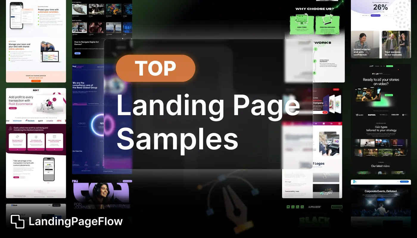
Browsing real-world landing page samples is one of the fastest ways to spark creative ideas. Instead of starting from scratch, you can borrow proven patterns and design elements that are already working.
This guide showcases some of the most impactful landing page examples used by startups, SaaS brands, and creators in 2025. To determine what best suits your brand voice, you will experiment with various styles, such as content-driven, bold, animated, and minimalist.
From hero sections to testimonial placements, every sample highlights a key principle of conversion-focused design. These examples are perfect for your next project because they are geared for speed, engagement, and mobile devices.
Let these design samples be your roadmap to creating a landing page that doesn’t just look good, but performs.
"Not sure how to apply these examples to your funnel?
Get expert advice in a free call - customized to your goals."
Table of Contents
- Overview of Landing Pages
- Key Elements of Effective Landing Pages
- Top Landing Page Samples
- Sample 1: Dropbox
- Sample 2: Slack
- Sample 3: Airbnb
- Sample 4: HubSpot
- Detailed Analysis of Each Sample
- Dropbox: Simplicity and Clarity
- Slack: Emphasis on User Experience
- Airbnb: Inspiring Travel and Exploration
- HubSpot: Data-Driven Lead Generation
- Design Tips from Top Samples
1. Overview of Landing Pages

Landing pages are standalone web pages designed with a specific goal in mind, such as generating leads, promoting products, or encouraging sign-ups.
Unlike typical web pages, landing pages focus on a single call-to-action (CTA) and are optimized to maximize conversions.
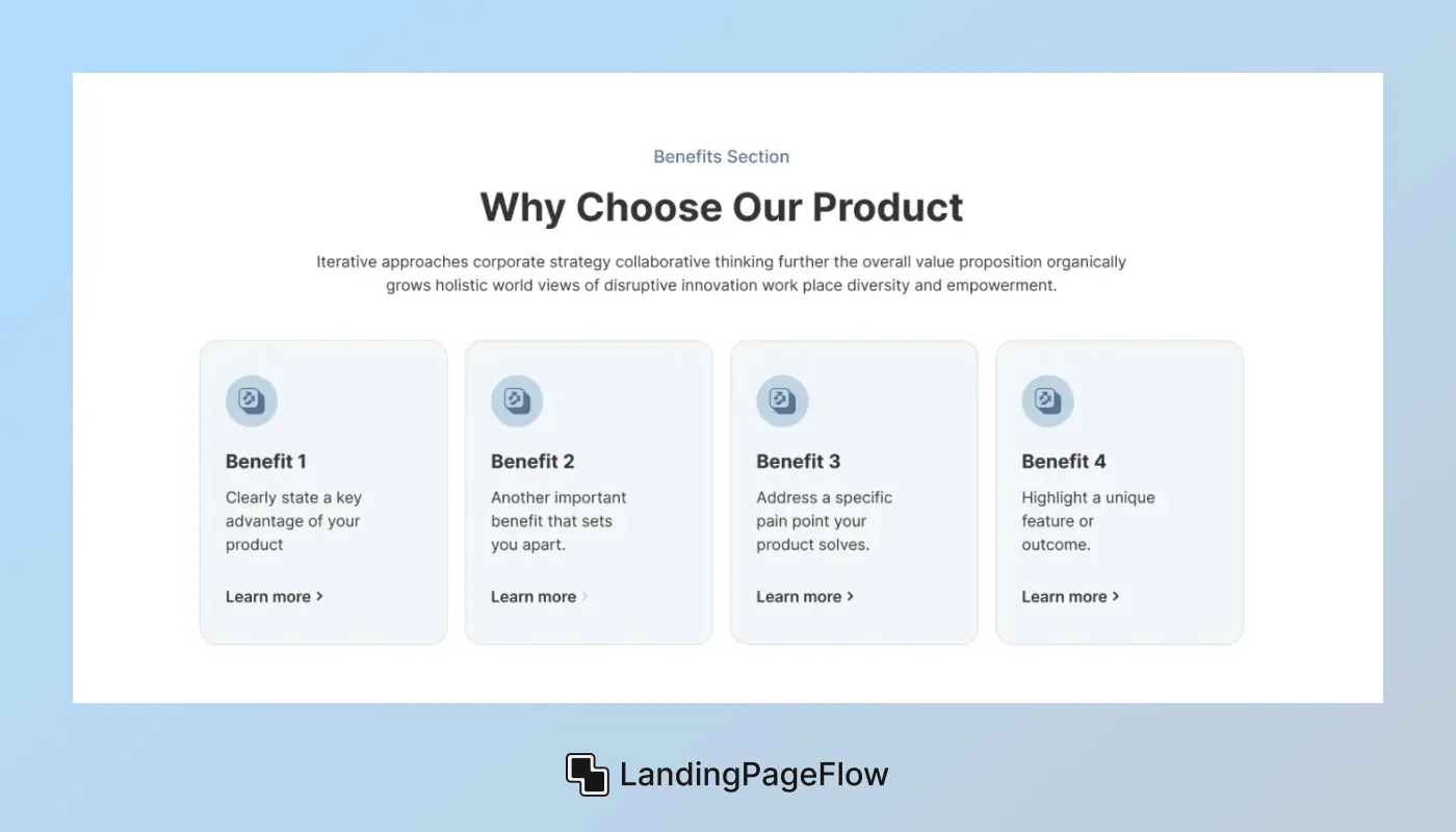
2. Key Elements of Effective Landing Pages
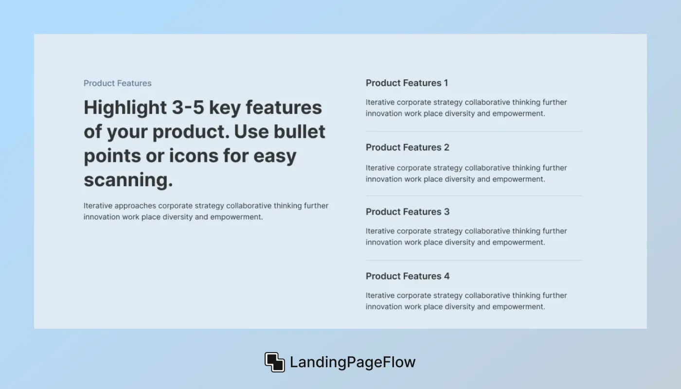
Before diving into examples, it's essential to understand the key elements that make a landing page effective:
- Clear Value Proposition: Communicate the benefits of your offer clearly and concisely.
- Compelling Headline: Grab attention with a headline that addresses visitor needs or pain points.
- Engaging Visuals: Use high-quality images, videos, or graphics that resonate with your audience.
- Strong Call-to-Action (CTA): Encourage immediate action with a prominent and persuasive CTA button.
- Social Proof: Build trust with testimonials, case studies, or customer reviews.
- Mobile Optimization: Ensure your landing page is fully responsive and loads quickly on all devices.
3. Top Landing Page Samples

Sample 1: Dropbox
Dropbox’s landing page is a classic example of simplicity and clarity. It prominently features a concise headline that focuses on the main benefit (“Work Smarter with Dropbox”) and a straightforward CTA button (“Try Dropbox Business”).
The page uses clean design and minimal text to guide visitors towards signing up or learning more about their business solutions.
Sample 2: Slack
Slack’s landing page emphasizes simplicity and user experience. It showcases a strong headline (“Where Work Happens”) that highlights the platform’s purpose, supported by visuals and customer testimonials that reinforce its benefits.
The CTA buttons are strategically placed and use compelling language to encourage immediate sign-up or exploration.
Sample 3: Airbnb
Airbnb’s landing page is designed to inspire travel and exploration. It features stunning visuals of destinations and experiences, paired with personalized recommendations based on user preferences.
The page effectively uses social proof through guest reviews and endorsements from trusted sources to build credibility and trust.
Sample 4: HubSpot
HubSpot’s landing pages are known for their data-driven approach and effective lead generation strategies.
They utilize targeted messaging and personalized content to address specific audience segments.
Each landing page is optimized for SEO and integrates seamlessly with HubSpot’s marketing automation tools, making it easy to capture leads and nurture relationships.
4. Detailed Analysis of Each Sample
Dropbox: Simplicity and Clarity
Dropbox’s landing page leverages simplicity to convey its message effectively. The headline “Work Smarter with Dropbox” immediately communicates the value proposition, addressing the need for efficient file management.
The use of a single, prominent CTA button (“Try Dropbox Business”) encourages users to take action without distraction.
Visuals are minimal but impactful, supporting the overall clean design that enhances user experience and conversion rates.
Slack: Emphasis on User Experience
Slack’s landing page is designed with a focus on user experience and functionality. The headline “Where Work Happens” not only defines Slack’s purpose but also resonates with professionals seeking efficient communication tools.
Visual elements include screenshots and user testimonials that illustrate Slack’s benefits in real-world scenarios.
Multiple CTAs are strategically placed throughout the page, catering to different stages of user intent and guiding them towards sign-up or exploration.
Airbnb: Inspiring Travel and Exploration
Airbnb’s landing page captures the essence of travel and exploration through immersive visuals and personalized content. High-quality images of scenic destinations and diverse accommodations evoke wanderlust, enticing visitors to explore further.
Personalized recommendations based on user preferences create a tailored experience, enhancing engagement and conversion potential.
Social proof in the form of guest reviews and endorsements from reputable sources reinforces trust and credibility, compelling users to consider Airbnb for their travel needs.
HubSpot: Data-Driven Lead Generation
HubSpot’s landing pages excel in data-driven lead generation tactics. Each page is meticulously crafted to appeal to specific audience segments, offering tailored content and solutions.
Clear and concise messaging addresses pain points and business needs, supported by data-backed insights and case studies. CTAs are strategically positioned within the content flow, facilitating seamless navigation and encouraging users to take the next step in their buyer journey.
Integration with HubSpot’s marketing tools ensures smooth lead capture and nurturing processes, maximizing conversion rates.
5. Design Tips from Top Samples
Based on the analyzed samples, here are some actionable design tips to enhance your own landing page:
- Simplify Navigation: Keep the focus on your CTA and minimize distractions.
- Use Contrasting Colors: Make your CTA button stand out with a contrasting color that draws attention.
- A/B Testing: Experiment with different headlines, images, and CTAs to optimize performance.
- Visual Hierarchy: Arrange content logically with clear headings and subheadings to guide users through the page.
- Loading Speed: Optimize images and minimize scripts to ensure fast loading times, enhancing the user experience.
Conclusion
Using the right landing page sample as a reference can shortcut your design process and improve performance instantly. You don’t need to reinvent layout or content structure, is just adapt what’s working for others in your niche.
These examples prove that success comes from clarity, not complexity. Focus on one message, one CTA, and make every scroll valuable to the user.
From sleek minimalist designs to bold, visual-driven pages, these samples offer actionable takeaways. Keep your users engaged by building with purpose and reducing anything that doesn’t support the goal.
Now it’s your turn, and use these top-performing examples to build a landing page that turns browsers into buyers.

FAQ
1. Why should I study landing page samples before designing my own?
It saves time, reveals best practices, and helps you understand what works visually and structurally for conversions.
2. Where can I find high-quality landing page examples?
You can explore showcases on Dribbble, Behance, One Page Love, or brand sites in your own industry.
3. How do I know if a landing page sample is high-converting?
Look for clarity in message, focused CTAs, fast load times, mobile responsiveness, and trust elements like testimonials.
4. Can I legally copy a landing page design?
You can draw inspiration from layout or structure, but you should never copy content, branding, or imagery directly.
5. What types of samples work best for SaaS products?
Clean, benefit-driven pages with demos, pricing previews, and social proof usually work best in SaaS.
6. How many sections should my landing page include?
Most effective pages have 5–7 sections: hero, benefits, proof, features, CTA, FAQs, and a closing statement or offer.

Ansif


.webp)


