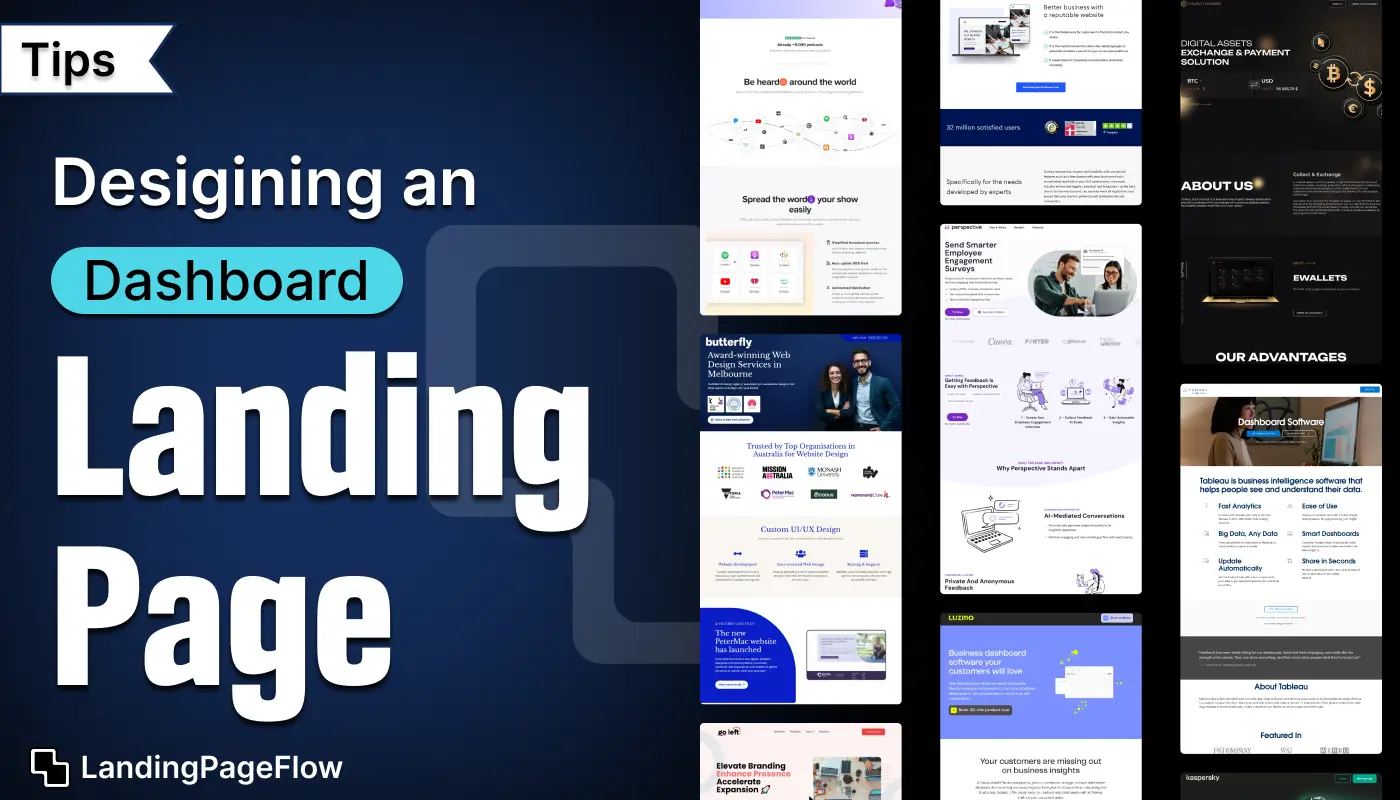
An effective dashboard landing page presents complex information in a clear and digestible format. Visual hierarchy ensures the most important metrics stand out for easy comprehension.
Interactive elements allow users to explore data points without feeling overwhelmed. Consistent color schemes and typography make the page aesthetically appealing and professional.
Simplified layouts reduce cognitive load and guide visitors toward actionable insights. Responsive design guarantees accessibility across desktops, tablets, and mobile devices.
Fast-loading elements maintain engagement and prevent users from abandoning the page. Incorporating these tips helps transform data-heavy dashboards into intuitive, user-friendly landing pages.
"Seeking higher dashboard interaction?
Get your free step-by-step design blueprint today."
Table of Contents
- Understand Your Audience
- Prioritize Information Architecture
- Use Clear Visual Hierarchy
- Implement Intuitive Navigation
- Focus on Data Visualization Best Practices
- Optimize For Responsiveness
- Include Customization Options
- Test For Usability and Functionality
- Keep Visual Design Simple and Clean
1. Understand Your Audience

Before starting the design process, it's crucial to know who your users are and what they need.
Are they data analysts, managers, or casual users looking for insights? Understanding their pain points and expectations will help you design a dashboard that meets their specific needs.
Key Considerations:
- Define user personas.
- Identify user goals and how they interact with the dashboard.
- Consider their technical expertise to determine the complexity level.
2. Prioritize Information Architecture

The information architecture (IA) of your dashboard landing page should be well-thought-out. Users should find it easy to understand the structure, navigate between different sections, and locate the information they need.
Best Practices:
- Group related content and features together.
- Use clear categories and labeling for different sections.
- Keep the most critical data or metrics at the forefront.
3. Use Clear Visual Hierarchy

A clear visual hierarchy ensures that users can quickly scan and process the most important information.
It organizes content based on its importance and guides users' attention from the most critical data to less essential details.
Tips for Visual Hierarchy:
- Use font sizes, colors, and spacing to emphasize key elements.
- Highlight primary KPIs or metrics with larger fonts and contrasting colors.
- Make use of white space to avoid clutter and confusion.
4. Implement Intuitive Navigation

Your dashboard landing page should have an intuitive and user-friendly navigation system. Users should be able to quickly move between different sections or pages without friction.
Navigation Design Tips:
- Use a sticky navigation bar to ensure users can access key features easily.
- Group similar functions together and organize them logically (e.g., reports, settings, analytics).
- Implement search functionality to help users find specific data points or actions quickly.
5. Focus on Data Visualization Best Practices

Since dashboards often display a large amount of data, data visualization plays a crucial role in making it understandable and actionable.
The goal is to present complex data in a way that is easily digestible and actionable.
Data Visualization Tips:
- Choose the right type of chart or graph (e.g., bar charts for comparisons, line graphs for trends).
- Avoid cluttered visuals by keeping graphs simple and clear.
- Use colors wisely to highlight important data without overwhelming the user.
- Provide context, such as labels, tooltips, and legends, for a better understanding of the data.
6. Optimize For Responsiveness

In today’s multi-device world, your dashboard landing page must look and function well across different screen sizes and devices, especially since users might access dashboards from desktops, tablets, or smartphones.
Responsive Design Tips:
- Use a flexible grid system for responsive layouts.
- Ensure data visualizations adapt to different screen sizes without losing clarity.
- Test the design on multiple devices to make sure it maintains functionality and usability.
7. Include Customization Options

Every user might have slightly different needs when it comes to the data they want to see or how they interact with the dashboard. Offering customization options can significantly enhance the user experience.
Customization Features to Consider:
- Allow users to customize the layout of their dashboard by dragging and dropping widgets.
- Provide filtering options to refine the data displayed.
- Let users save their preferred dashboard views or configurations for easy access.
8. Test For Usability and Functionality

Even the best-designed dashboard can fail if it isn’t tested for usability and functionality.
Ensure you conduct multiple rounds of testing to identify any bugs, navigation issues, or design flaws that could negatively impact the user experience.
Testing Tips:
- Run usability tests with real users to get feedback on the design and functionality.
- Ensure that all interactive elements (e.g., buttons, filters) are working correctly.
- Test the dashboard’s performance to ensure it loads quickly, especially when dealing with large datasets.
9. Keep Visual Design Simple and Clean

A simple and clean design ensures that the dashboard isn’t overwhelming or confusing for users. The goal is to create a seamless experience where users can focus on the data, rather than being distracted by complex design elements.
Visual Design Tips:
- Use a minimal color palette to avoid visual clutter.
- Opt for a flat or semi-flat design style for a modern, sleek look.
- Limit the use of excessive animations, icons, or graphics that can slow down the user experience.
Conclusion
Designing an effective dashboard landing page improves user engagement and facilitates decision-making. Clean visuals combined with intuitive layouts make complex data understandable at a glance.
Interactive charts and metrics encourage users to explore insights actively. Consistent design patterns build trust and reinforce your brand identity.
Responsive and fast-loading pages ensure a smooth experience for all visitors. Regular updates and usability testing optimize performance and maintain clarity over time.
Implementing these strategies helps users achieve goals efficiently while boosting overall satisfaction.

FAQ
1. Why is dashboard landing page design important?
Clear design enhances data comprehension, engagement, and decision-making efficiency.
2. What layout works best for dashboards?
Grid-based or card layouts help organize metrics clearly and maintain visual hierarchy.
3. Should dashboards be interactive?
Yes, interactivity allows users to explore data points and gain deeper insights easily.
4. How can I make dashboards mobile-friendly?
Use responsive design so charts, tables, and metrics scale correctly across all devices.
5. What colors work best for dashboards?
Neutral backgrounds with accent colors for key metrics improve readability and highlight important data.
6. How often should dashboard content be updated?
Frequent updates ensure metrics remain accurate, relevant, and actionable for users.

Ansif


.webp)


