Minimalism in web design is more than just a visual trend, it’s a strategy that shapes how users interact and make decisions. A clutter-free landing page helps brands highlight the essentials without unnecessary noise.
Clean layouts and simplified navigation allow visitors to focus on the message that matters most. Instead of distracting graphics or endless elements, the page guides users directly to the call to action.
Strategic use of whitespace, typography, and carefully chosen visuals ensure that every element has a purpose. Each decision in a minimalist design helps build trust and clarity.
Engagement increases when audiences are presented with straightforward paths to conversion. A minimalist design is not about less effort but about greater precision in communication.
Modern businesses use minimalism to improve performance across devices, making experiences fast, accessible, and responsive. The approach creates consistency for mobile and desktop alike.
Adopting minimalism also benefits SEO, as faster page load times and streamlined code improve visibility in search results. A refined user experience contributes to both conversions and ranking.
"Achieve clarity in your design and growth in your numbers.
Book a tailored strategy session & discover how minimalism transforms."
Table of Contents
- What Is a Minimalist Landing Page?
- Why Minimalism Works for Conversions?
- Key Elements of a High-Converting Minimalist Landing Page
- How to Craft a Simple Yet Effective Headline?
- Using Visual Hierarchy to Guide Visitors
- Writing Concise and Persuasive Copy
- The Importance of White Space and Clean Design
- Common Mistakes to Avoid in Minimalist Landing Pages
1. What is a Minimalist Landing Page?
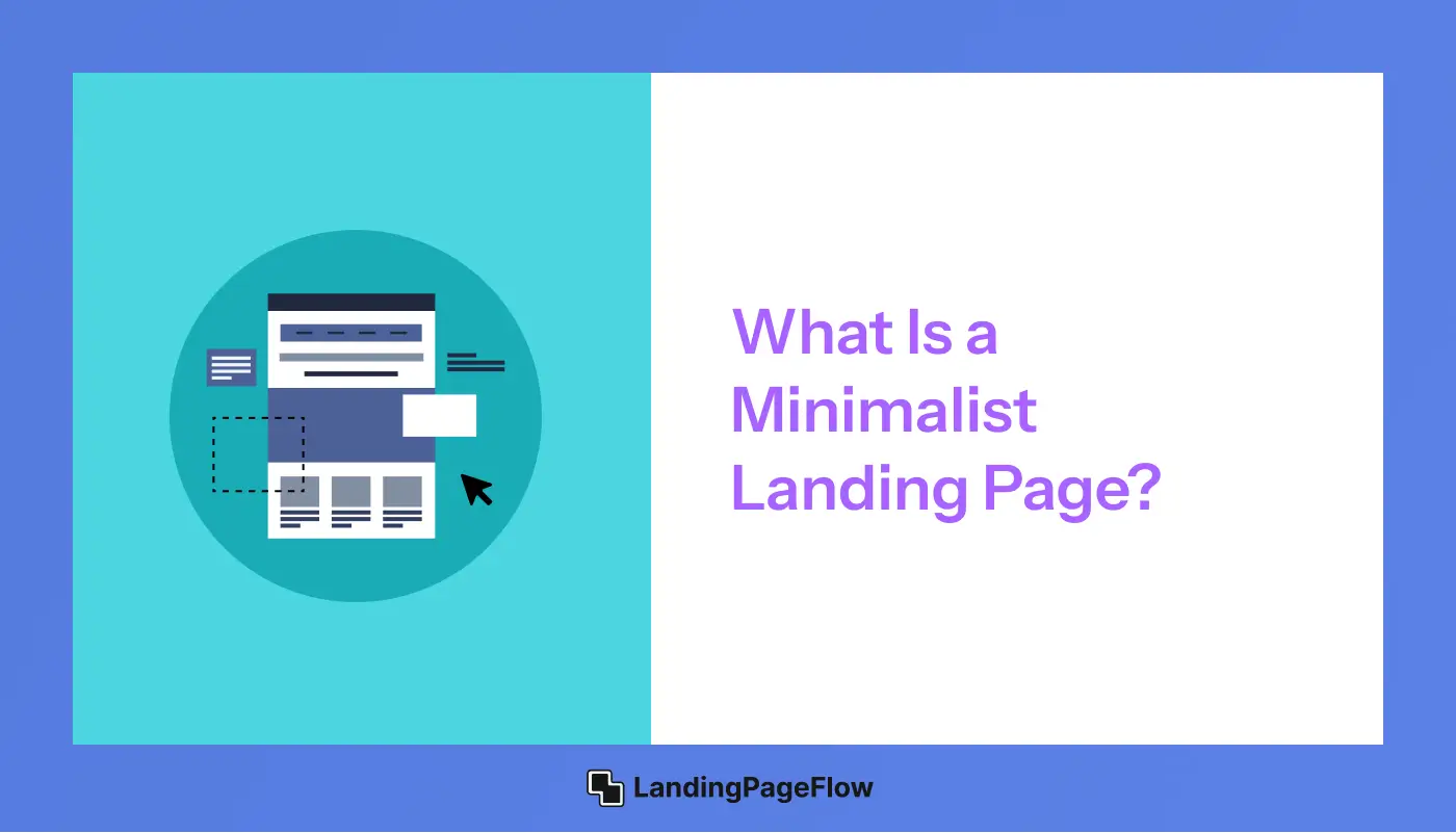
A minimalist landing page is designed with simplicity, clarity, and efficiency in mind. It eliminates unnecessary elements and distractions, allowing visitors to focus on the core message and CTA.
The goal is to create an intuitive and visually appealing page that drives action with minimal friction.
Minimalism is not about removing essential elements but rather refining the design so that every component serves a clear purpose.
A well-executed minimalist landing page conveys trust and professionalism, making it easier for users to engage with the content and take the next step.
2. Why Minimalism Works For Conversions?
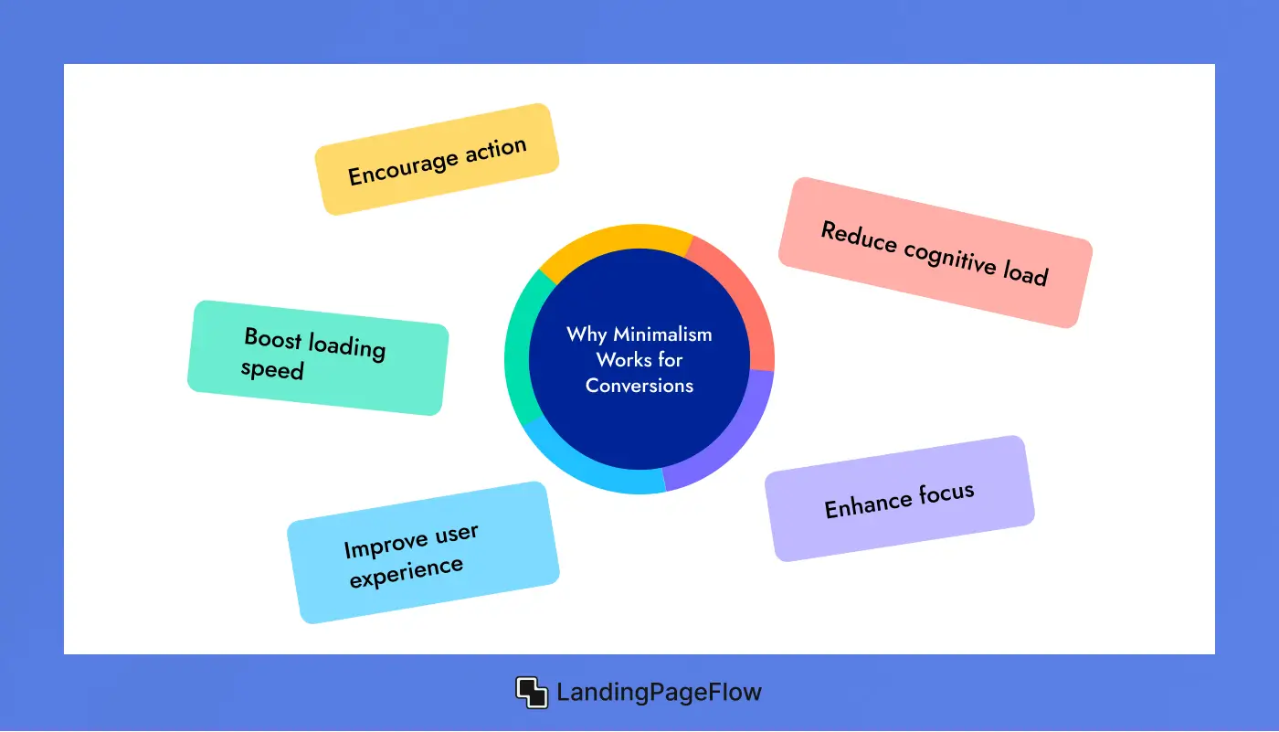
Minimalist landing pages work because they:
- Reduce cognitive load – Visitors process information faster and make decisions quickly.
- Enhance focus – The primary message and CTA stand out without distractions.
- Improve user experience – A clean layout creates a seamless navigation experience.
- Boost loading speed – Fewer elements mean faster performance, leading to better engagement.
- Encourage action – With fewer distractions, users are more likely to follow the desired path.
By keeping your page focused, you encourage visitors to take the desired action without hesitation.
3. Key Elements of a High-Converting Minimalist Landing Page
For a minimalist landing page to be effective, it must include:
- A strong, clear headline that conveys value immediately.
- A compelling subheadline that supports the main message.
- A high-quality hero image or background that enhances the brand’s aesthetic.
- Concise and persuasive copy that highlights key benefits.
- A single, focused call-to-action (CTA) that stands out.
- Trust elements like testimonials, badges, or media mentions.
- A simple yet visually appealing design that directs users toward conversion.
Every element should have a clear purpose and contribute to conversions.
4. How to Craft a Simple Yet Effective Headline?
Your headline should instantly grab attention and communicate the core benefit of your offer.
Best Practices for Headlines:
- Keep it under 10 words for clarity.
- Make it value-driven, such as “Boost Sales with Effortless Email Automation”.
- Address a pain point or solution, like “Say Goodbye to Slow Load Times”.
- Use power words that evoke curiosity and action.
A powerful headline sets the stage for engagement and conversions.
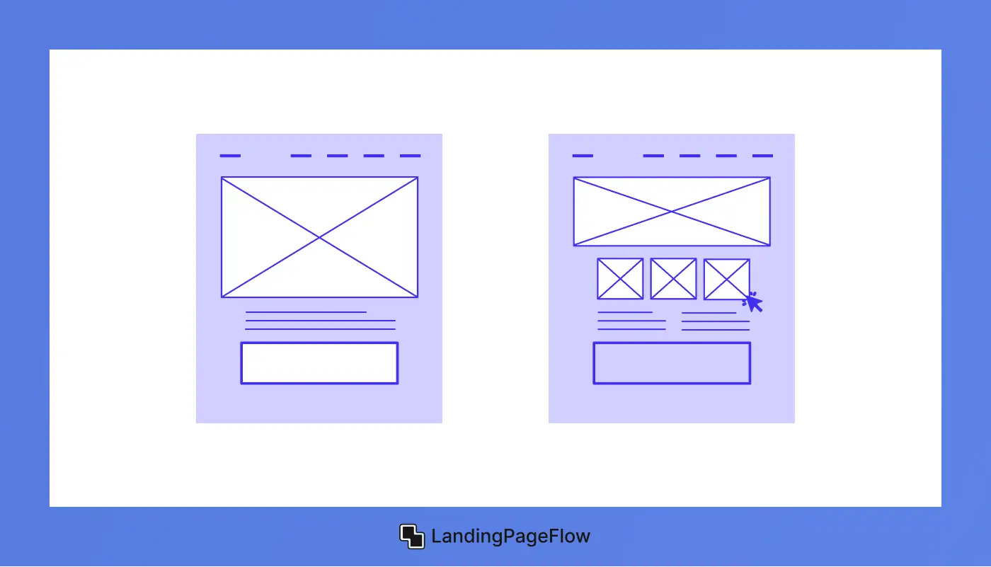
5. Using Visual Hierarchy to Guide Visitors

Visual hierarchy ensures that visitors naturally flow through your page toward the CTA.
How to Implement Visual Hierarchy:
- Use larger fonts for headlines and smaller fonts for supporting text.
- Highlight key information using bold or contrasting colors.
- Place the CTA above the fold so visitors see it immediately.
- Use directional cues, such as arrows or images pointing toward the CTA.
By structuring content effectively, you guide users toward conversion effortlessly.
6. Writing Concise and Persuasive Copy

Minimalist landing pages require short, impactful copy that delivers value quickly.
Tips for Writing Effective Copy:
- Use bullet points to highlight key benefits.
- Keep sentences short and easy to read.
- Focus on outcomes, not just features (e.g., “Save 10 Hours a Week with Automation”).
- Avoid unnecessary jargon and technical terms.
Less is more—clear and compelling copy encourages action.
7. The Importance of White Space and Clean Design
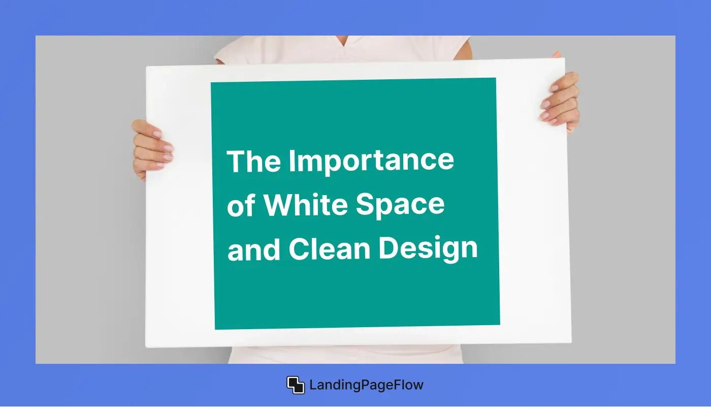
White space, or negative space, is crucial in minimalist design. It enhances readability and helps important elements stand out.
How to Use White Space Effectively:
- Increase line spacing for better readability.
- Avoid clutter by limiting unnecessary elements.
- Keep the layout simple and balanced.
- Ensure that key messages don’t get lost in overly dense text.
A clean design makes your landing page more engaging and user-friendly.
8. Common Mistakes to Avoid in Minimalist Landing Pages
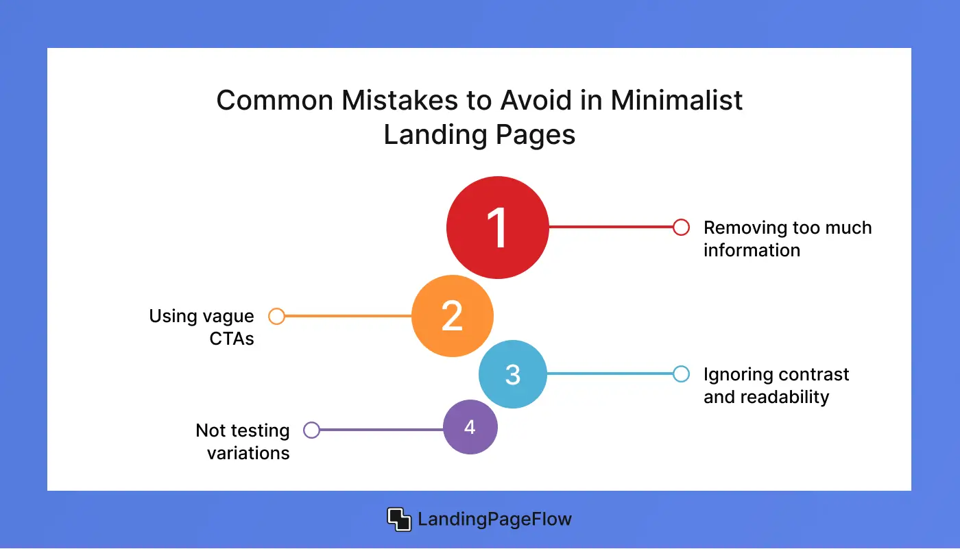
Even with the best intentions, minimalist landing pages can go wrong. Here are some common mistakes to avoid:
- Removing too much information – A minimalist design doesn’t mean eliminating crucial details.
- Using vague CTAs – Ensure your call-to-action is clear and action-oriented.
- Ignoring contrast and readability – Minimalist doesn’t mean low contrast; make sure text and buttons are easy to read.
- Not testing variations – A/B testing different elements is key to finding the best-performing design.
Avoiding these mistakes ensures that your minimalist landing page remains effective while maintaining its clean aesthetic.
Conclusion
Minimalist landing pages stand out because they give users clarity and confidence when making decisions. Every detail plays a role in keeping attention where it matters most.
Businesses that commit to simplicity often find stronger results in both conversions and long-term brand credibility. Clear design signals professionalism and reliability.
A seamless user journey depends on fewer distractions and more direct calls to action. Visitors are guided smoothly from first impression to final step.
Focusing on speed and responsiveness further ensures that users never abandon the page due to poor performance. This creates lasting engagement.
Success in digital growth often comes down to removing barriers. A minimalist landing page provides that streamlined path while keeping impact high.
The future of design favors clarity, speed, and focus. Minimalism will remain a powerful tool for businesses aiming to capture attention and drive measurable results.

FAQ
1. What makes a minimalist landing page effective?
A minimalist landing page works because it removes distractions, highlights the most important message, and guides users toward a clear call to action.
2. Can minimalism improve conversion rates?
Yes, simplified design helps users focus on taking action, increasing engagement and boosting conversion rates across different industries.
3. How do I balance minimalism with branding?
You can maintain brand identity by using consistent fonts, colors, and tone. Minimalism focuses on clarity, not removing personality.
4. Is minimalism suitable for all businesses?
Most industries benefit from minimalism, especially e-commerce, SaaS, and service-based brands. However, it may need adjustments for highly visual niches.
5. Does a minimalist landing page load faster?
Yes, fewer design elements and clean coding reduce load times, making pages perform better on both mobile and desktop.
6. What elements should every minimalist landing page include?
Key elements include a strong headline, concise copy, clear visuals, and a single compelling call to action to maximize conversions.

Altaf Rahman


.webp)


