Many landing pages fail to perform not because of poor design, but due to simple mistakes that push visitors away before they take action. Marketers often overlook details that can make or break a conversion journey.
A cluttered layout, unclear call-to-action, or slow-loading page can easily drive potential leads elsewhere. Visitors form opinions within seconds, and first impressions directly affect their trust in your brand.
Even the strongest ad campaigns fall flat if the landing page doesn’t deliver on user expectations. Small design and messaging issues often result in wasted traffic.
Attention to structure, clarity, and usability is essential for turning visitors into customers. A high-converting page ensures that every element works toward a single goal.
Strong copy, clear visuals, and seamless navigation can boost confidence in your offer. Simple yet strategic improvements often yield dramatic increases in conversions.
By avoiding common pitfalls and focusing on the user journey, businesses can significantly increase results. Each tweak has the potential to improve revenue and customer trust.
"Losing visitors before they buy?
Download your free expert tips & learn how to create landing pages."
Table of Contents
- Introduction
- Weak or Vague Call-to-Action (CTA)
- Cluttered Design
- Slow Page Loading Speed
- Lack of Mobile Optimization
- Overwhelming Forms
- Poor Headline Clarity
- Lack of Social Proof
- Ignoring SEO Fundamentals
- Using Stock Photos Instead of Authentic Images
- Missing or Confusing Value Proposition
1. Introduction
A well-designed landing page is essential for converting visitors into leads or customers.
Yet, even minor mistakes can significantly reduce conversion rates. By recognizing and addressing these common pitfalls, you can enhance your landing page’s effectiveness and achieve better results.
Let's dive into the most frequent landing page mistakes and how you can correct them.
2. Weak or Vague Call-to-Action (CTA)
.webp)
Mistake:
The CTA is the focal point of any landing page. When the CTA is vague or weak—like “Submit” or “Click Here”—it fails to drive visitors toward the intended action.
How to Fix It:
Use clear, action-oriented language that communicates the benefit or value, like "Get Your Free Guide" or "Start Your Trial Today."
Ensure your CTA stands out with a contrasting color, large font, and central positioning. Testing various CTA options can also reveal what works best for your audience.
3. Cluttered Design

Mistake:
An overloaded landing page with too much information, several CTAs, or numerous visuals can confuse and overwhelm visitors, making it hard for them to focus on the primary message.
How to Fix It:
Simplify your design by focusing on one primary CTA and a clean layout. Use white space to highlight important elements and only include necessary text and images.
A/B testing different layouts can help find the balance that captures attention and maintains clarity.
4. Slow Page Loading Speed
Mistake:
If a landing page takes too long to load, visitors are likely to abandon it. Research shows that even a one-second delay in loading time can impact conversions.
How to Fix It:
Compress images, use optimized code, and leverage a content delivery network (CDN) to speed up your page.
Google PageSpeed Insights is a useful tool for diagnosing and resolving speed issues.
5. Lack of Mobile Optimization
Mistake:
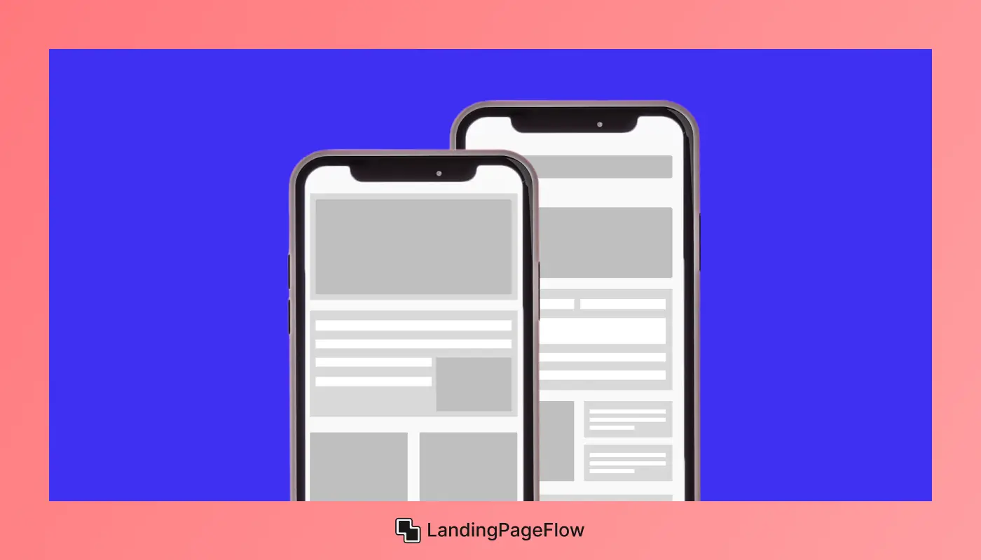
With more users accessing websites on mobile devices, failing to optimize for mobile can lead to a poor user experience and missed conversions.
How to Fix It:
Design your landing page to be responsive and ensure all elements—including text, images, and CTAs—are mobile-friendly.
Testing the page on various devices can help you see what users will experience and make adjustments as needed.
6. Overwhelming Forms
Mistake:
Long, complicated forms are one of the quickest ways to turn visitors away. People don’t want to spend excessive time providing unnecessary information.
How to Fix It:
Only ask for essential information, typically just a name and email for lead generation purposes.
For more detailed forms, consider multi-step forms to make the process less daunting and more engaging.
7. Poor Headline Clarity
Mistake:
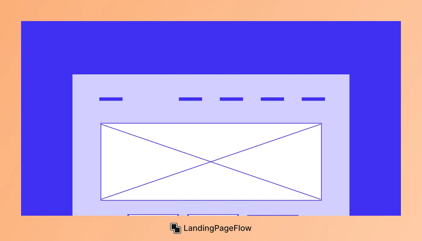
The headline is the first element visitors read. If it’s unclear or doesn’t align with the visitor’s intent, they may leave without exploring the page further.
How to Fix It:
Create a headline that directly addresses the visitor’s pain point or offers a benefit. Keep it concise, engaging, and relevant to the CTA.
Testing variations can help you identify what resonates best with your audience.
8. Lack of Social Proof
Mistake:
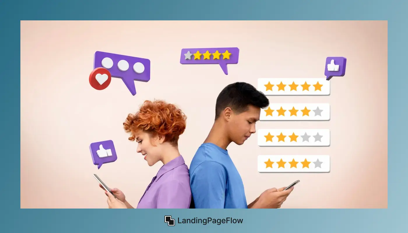
Visitors often look for validation from others before making decisions. A lack of social proof (like testimonials, reviews, or case studies) can make them hesitant to convert.
How to Fix It:
Incorporate testimonials, ratings, case studies, or client logos to show credibility.
Displaying metrics, like “Trusted by 10,000+ users,” can also reassure visitors of your product’s or service’s quality.
9. Ignoring SEO Fundamentals
Mistake:
Landing pages often focus heavily on conversions and ignore SEO, which can limit their reach and visibility.
How to Fix It:
Optimize your page’s title, meta descriptions, and content with relevant keywords. Use H1 and H2 headers for better readability and SEO impact.
High-quality content paired with SEO best practices can help the page rank higher, attracting more organic traffic.
10. Using Stock Photos Instead of Authentic Images
Mistake:
Generic stock photos can make your page feel impersonal and fail to engage visitors meaningfully.
How to Fix It:
Use authentic images of your product, team, or actual customers to create a sense of trust and relatability.
High-quality, unique images resonate better and can enhance your brand’s credibility.
11. Missing or Confusing Value Proposition
Mistake:
When your landing page doesn’t clearly communicate what you’re offering and why it’s valuable, visitors may lose interest or be unsure about the next step.
How to Fix It:
Clearly state your value proposition near the headline and elaborate on it briefly in the body text. Describe how your product or service can solve the visitor’s problem or benefit them.
Keeping this message clear and easy to find will make it easier for visitors to understand your offer and feel compelled to convert.
Conclusion
Landing page mistakes can be costly, but the good news is they are easy to fix once identified. A thoughtful redesign often brings measurable improvements.
Improving clarity and keeping the layout simple makes a direct impact on conversions. Visitors feel more confident when the page matches their expectations.
Performance also matters, as a page that loads quickly reduces bounce rates. Small delays can push customers toward competitors without you realizing it.
Every page should have one clear action goal and eliminate distractions that confuse the visitor. A focused message encourages commitment. Brands that prioritize landing page quality often see long-term growth in trust and sales.
The effort to refine each element pays off significantly. By addressing mistakes step by step, you create a smoother, more persuasive user journey. Strong landing pages set the foundation for consistent business success.

FAQ
1. What are the most common landing page mistakes businesses make?
The most common issues include unclear calls-to-action, slow load times, cluttered designs, and failing to match ad messaging to page content.
2. How can I tell if my landing page design is hurting conversions?
High bounce rates, low engagement, or poor lead generation results often signal that something on your landing page is discouraging action.
3. Why does a slow landing page hurt conversion rates so much?
Online visitors expect instant access. Even a few seconds of delay can cause frustration and lead users to abandon your page.
4. Should I focus more on visuals or text for better conversions?
Both matter, but balance is key. Strong visuals grab attention, while persuasive copy drives action. Neither should overpower the other.
5. How many CTAs should a high-performing landing page have?
Ideally, one main CTA per page to avoid confusion. Multiple CTAs often dilute the user’s focus and reduce overall conversion rates.
6. Do small design changes really improve conversions?
Yes, even minor changes like button placement, headline clarity, or simplifying form fields can dramatically increase sign-ups and sales.

.webp)


.webp)
