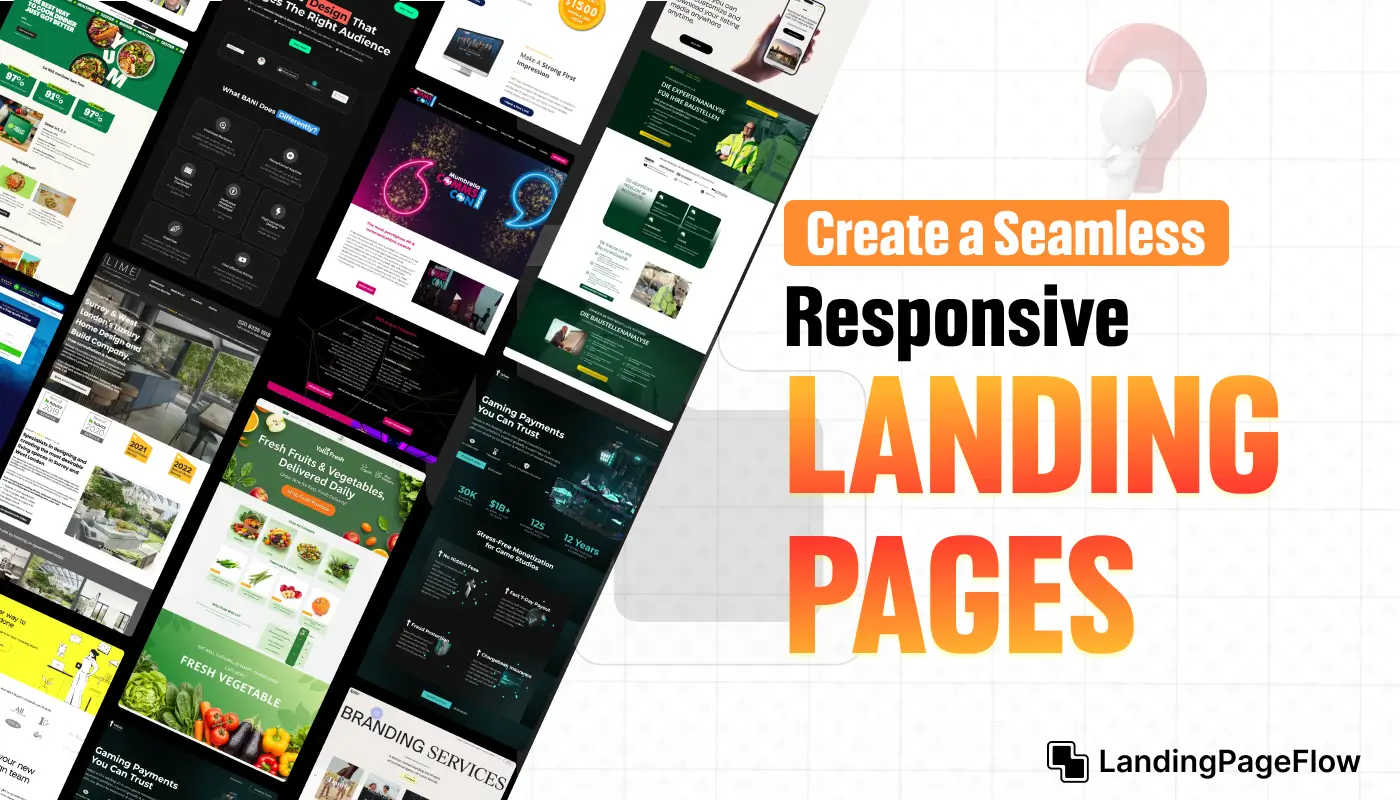
A seamless online experience can be the deciding factor between a visitor staying or leaving your page. Responsive landing pages make sure your design feels natural across all devices.
Every scroll, tap, and click should feel effortless, giving users a clear path to action without unnecessary hurdles. This approach builds confidence and keeps potential customers engaged. Optimized responsive designs solve this by adapting layouts to every environment.
Smart brands understand that users expect consistency, whether they’re on a desktop at work or browsing casually on mobile. Consistency creates a professional impression and trust. User expectations are higher than ever, and a single design glitch can reduce credibility.
A flexible landing page is no longer optional but essential. Modern businesses recognize that smooth experiences directly translate into stronger results. Making responsive landing pages your priority ensures you remain competitive.
The right design choices can set the tone for lasting relationships. Investing in responsive pages means investing in customer satisfaction and growth.
"Struggling with bounce rates on mobile?
Access your free responsive landing page guide."
Table of Contents
- What is a Responsive Landing Page?
- Benefits of a Responsive Landing Page
- Elements of a High-Quality Responsive Landing Page
- Steps to Design a Responsive Landing Page
- Common Mistakes to Avoid
1. What is a Responsive Landing Page?

A responsive landing page is designed to adapt and deliver an optimal user experience across different devices and screen sizes. Whether a visitor is browsing from a smartphone, tablet, or desktop, the page adjusts its layout, design, and functionality dynamically.
Responsive design ensures your landing page:
- Looks professional on all devices.
- Loads quickly regardless of screen size.
- Provides a seamless experience, reducing bounce rates.
2. Benefits of a Responsive Landing Page

a. Improved User Experience
A responsive landing page enhances usability. Visitors can easily navigate and interact with your content without zooming in or scrolling sideways.
b. Higher Conversion Rates
When visitors have a smooth browsing experience, they are more likely to take action, such as signing up, purchasing, or contacting you.
c. SEO Advantages
Search engines prioritize mobile-friendly and responsive pages, helping you rank higher in search results and driving more organic traffic.
d. Cost Efficiency
Instead of maintaining separate desktop and mobile versions, a single responsive design works across all devices, saving time and resources.
e. Future-Proofing
As new devices emerge, a responsive design ensures your landing page remains compatible.
3. Elements of a High-Quality Responsive Landing Page

To create a landing page that stands out, focus on the following elements:
a. Clear and Compelling Headline
Your headline should grab attention immediately, regardless of the device size. Use concise, engaging language that highlights your value proposition.
b. Flexible Grid Layout
A grid layout enables content to resize and reorganize seamlessly, ensuring your page looks polished on all screens.
c. Mobile-Optimized Navigation
Simplify navigation with collapsible menus or hamburger icons that make browsing intuitive on smaller screens.
d. High-Quality Visuals
Images and videos should be responsive, resizing automatically to fit the screen while maintaining clarity.
e. Fast Loading Speed
Responsive pages should load quickly, especially on mobile networks. Optimize images, reduce code bloat, and use caching techniques.
f. Strong Call-to-Action (CTA)
Ensure CTAs are prominent and easy to tap on mobile devices. Use action-oriented phrases like:
- “Start Your Free Trial Now”
- “Shop the Collection Today”
g. Consistent Branding
Maintain consistent fonts, colors, and design elements across devices to build trust and recognition.
4. Steps to Design a Responsive Landing Page

Follow these actionable steps to craft a responsive landing page that converts:
Step 1: Define Your Goals
What do you want visitors to do on your landing page? Whether it’s subscribing, purchasing, or downloading, tailor your design to drive that specific action.
Step 2: Choose a Responsive Framework
Use frameworks like Bootstrap or Tailwind CSS to simplify responsive design. These tools provide pre-designed grids and components that adapt to various screen sizes.
Step 3: Focus on Mobile-First Design
Design for mobile users first, then scale up for larger screens. This ensures that the most critical elements are prioritized for smaller devices.
Step 4: Use Scalable Visuals
Optimize images and videos for quick loading and clarity. Tools like responsive image tags (<picture>) ensure the best version of visuals is displayed based on the device.
Step 5: Test Across Devices
Regularly test your landing page on different devices and browsers to identify issues. Tools like BrowserStack or Google’s Mobile-Friendly Test can help.
Step 6: Implement A/B Testing
Experiment with different layouts, CTAs, and design elements to see what works best. Testing and optimizing your pages over time ensures maximum performance.
Step 7: Monitor Performance
Use analytics tools to track metrics like bounce rate, time on page, and conversion rates. Adjust your design based on user behavior and feedback.
5. Common Mistakes to Avoid

a. Overloading the Page
Avoid including too many elements, which can overwhelm visitors and slow down the page.
b. Ignoring Mobile Users
A page that only looks good on desktops will alienate mobile users, who make up a significant portion of web traffic.
c. Unclear CTAs
If your call-to-action is not visible or lacks clarity, visitors may leave the page without taking any action.
d. Poor Image Optimization
Large, unoptimized images can significantly slow down your page, leading to higher bounce rates.
e. Neglecting Testing
Failing to test your page on different devices can result in missed design flaws and lost conversions.
Conclusion
Strong engagement begins when users feel instantly comfortable on your landing page. Responsive layouts create that comfort by adjusting smoothly to their device.
Conversions grow when audiences aren’t distracted by poor alignment or awkward navigation. Streamlined responsiveness allows them to focus entirely on your offer.
Audiences remember digital experiences that feel seamless. By ensuring responsiveness, you give them a reason to return and interact with your brand again. User satisfaction is a direct result of design choices.
Responsive landing pages are proof that small design shifts can generate large business outcomes. Trust develops naturally when visitors encounter a frictionless flow. Providing that flow through responsiveness builds credibility faster than static designs ever could.
Businesses looking to strengthen their online presence must embrace responsive landing pages. This strategy doesn’t just future-proof websites but also drives lasting growth.

FAQ
1. Why is a responsive landing page important for conversions?
A responsive landing page ensures users have a smooth experience on any device, which reduces bounce rates and increases conversion opportunities.
2. How does responsiveness affect mobile users?
Mobile visitors often make quick decisions. A responsive page adapts to their screens, providing easy navigation and faster access to key actions.
3. Do responsive landing pages improve SEO rankings?
Yes, search engines prioritize mobile-friendly designs, meaning a responsive landing page can improve visibility and ranking in search results.
4. Is it expensive to build a responsive landing page?
Not necessarily. Many builders and tools now include responsive design options, making it affordable and accessible for most businesses.
5. What elements should always be optimized in a responsive design?
Key elements include navigation menus, call-to-action buttons, images, and form fields, all of which should adapt fluidly to various screen sizes.
6. How do I test if my landing page is responsive?
You can resize your browser window, use online responsive check tools, or test directly on different devices to ensure consistency.

Ansif


.webp)


