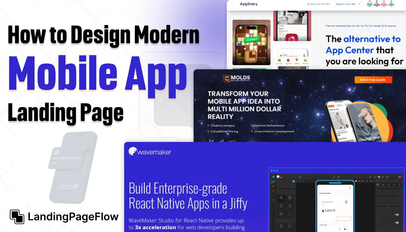
Designing a powerful mobile app landing page takes more than just good visuals, and it requires clarity, structure, and purpose. A modern layout should immediately communicate your app’s value while guiding users toward action.
This guide walks you through the essential components of building a clean and effective page. You’ll learn how to use whitespace, hierarchy, and iconography to enhance readability and impact.
Smart mobile-first design ensures every section scales properly and loads quickly on all devices. By focusing on functionality and flow, you’ll reduce bounce rates and improve conversions.
Use these principles to craft a landing experience that feels premium and performs reliably.
"Struggling to showcase your app clearly and effectively?
Claim your free 15-min call - we’ll help you craft a modern landing page."
Table of Contents
- Key Elements of a Mobile App Landing Page
- Best Design Practices For a Modern Look
- Structuring Your Landing Page For Maximum Conversions
- Essential Tools and Resources
- Examples of Clean and Modern Mobile App Landing Pages
1. Key Elements of a Mobile App Landing Page

Clear App Value Proposition
- Use a concise headline to immediately convey what your app does.
- Add a tagline to highlight your app’s main benefit (e.g., "Manage Your Day, All in One Place").
- A compelling subheader can elaborate on your unique value—this helps retain user attention.
Strong Call-to-Action (CTA)
- Include bold, easy-to-spot CTA buttons like “Download Now” or “Get Started Free.”
- Offer platform options for users (e.g., Apple App Store and Google Play Store buttons).
- Place secondary CTAs (like “Learn More”) to engage users who need more information.
Eye-Catching Visuals
- Use screenshots or videos to show the app’s interface and main features.
- 3D mockups can add a professional touch by presenting your app on devices (phones, tablets).
- Animated previews can engagingly demonstrate key functionality.
Feature Highlights
- Use bullet points or small sections with icons to list your app’s core features.
- Focus on user benefits like "Track Tasks Easily" or "Stay Connected Seamlessly."
Social Proof and Testimonials
- Display positive user reviews or testimonials to establish trust.
- Include media mentions or app store ratings to reinforce credibility.
- Add customer photos and names (where possible) to make testimonials more authentic.
Incentives and Offers
- Provide users with discounts or free trials to encourage downloads.
- Create urgency with limited-time offers like “Try for Free – Ends This Week.”
2. Best Design Practices For a Modern Look

Minimalist Design
- Use plenty of white space to avoid clutter and improve readability.
- Stick to two or three colors that align with your brand identity.
Mobile-First Approach
- Prioritize the mobile user experience by ensuring fast loading times.
- Use responsive design to ensure your page works across all devices and screen sizes.
Micro-Interactions and Animations
- Use subtle hover effects on buttons to improve engagement.
- Add smooth transitions between sections to create a seamless user journey.
Typography and Readability
- Use simple, legible fonts for all headings and body text.
- Ensure a contrast between text and background colors to enhance readability.
3. Structuring Your Landing Page For Maximum Conversions

Above-the-Fold Section
This is the first thing users see. It should contain:
- A strong headline and subheadline
- App mockup or preview
- Clear CTA buttons
Features Section
Explain key app functionalities with concise text and supporting visuals. Use icons for each feature to break the text and maintain a modern design.
Demo or Video Section
- Adding a video can increase conversions by visually showcasing the app’s benefits.
- Keep videos short (30-60 seconds) and to the point.
User Reviews and Testimonials
A section dedicated to feedback reassures users that others have had a positive experience with your app.
Pricing and Free Trial Section
- Display pricing options or availability of a free trial.
- Use comparison tables if your app has multiple subscription tiers.
FAQ Section
Answer common questions to reduce any hesitation users may have before downloading.
Footer Section
Include links to the app’s privacy policy, terms of use, and social media channels.
4. Essential Tools and Resources

- Figma – Great for creating wireframes and mockups.
- Canva – Ideal for designing banners, icons, and other visuals.
- Elementor – A drag-and-drop builder for WordPress, perfect for landing pages.
- Unbounce – A platform for creating, testing, and optimizing landing pages without coding.
5. Examples of Clean and Modern Mobile App Landing Pages

1. Duolingo
- A minimalist design with bold colors and straightforward CTAs.
- Features testimonials, download buttons, and a clear value proposition upfront.
2. Calm App
- Uses soothing colors and imagery to align with its meditation theme.
- Features a clean CTA and a video demonstration of the app experience.
3. Slack Mobile App
- Incorporates minimal text and engaging animations to demonstrate the app’s features.
- Highlights social proof with customer stories.
For more inspiration, explore Dribbble or Behance to see creative landing page designs.
Conclusion
A great mobile app landing page doesn’t just showcase your product, and it proves its value in every scroll. Focusing on clarity and user flow will elevate your design far beyond the average template.
Polished visuals combined with intuitive layout create trust and spark action. Make each section earn its place, guiding users through features, benefits, and calls to action.
Speed and mobile responsiveness must remain top priorities throughout the process. By applying modern design techniques, you’ll leave users with a lasting impression.
Start strong and finish with a landing page that matches your app’s quality and ambition.

FAQ
1. What should a mobile app landing page include?
It should highlight your app’s core benefit, show key features, include a CTA, and provide screenshots or demo visuals.
2. How important is responsive design for app pages?
It's critical. Mobile visitors expect smooth, fast-loading experiences that look great on any screen.
3. Should I include links to app stores?
Yes. Prominent App Store and Google Play buttons boost trust and drive installs directly from the page.
4. Can I use video or animation in the layout?
Absolutely. Short animations or app demos can help users quickly understand your product’s interface and value.
5. What tools are best for building these pages?
Webflow, Framer, and Carrd are great no-code options. Figma is useful for design before development.
6. How many CTAs should I use on the page?
Ideally, two or three, one above the fold, one mid-scroll, and one near the end, is are always focused on installs or signups.


.webp)


