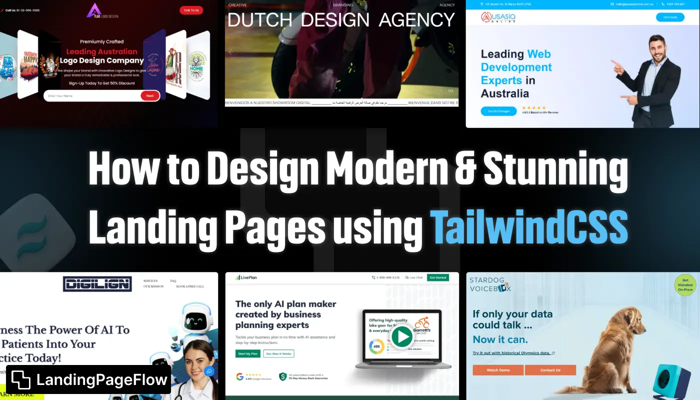
Landing pages have become the backbone of digital marketing, shaping how brands capture attention and drive conversions. A poorly designed page can cause visitors to bounce instantly, but a clean, modern design keeps them engaged longer.
TailwindCSS has emerged as a go-to tool for developers and marketers, offering both simplicity and flexibility in building layouts.
The framework provides a utility-first approach, enabling faster development without sacrificing design quality. Developers can easily craft responsive, mobile-friendly experiences that adjust smoothly across devices.
TailwindCSS not only reduces styling complexity but also enhances collaboration between designers and developers.
Businesses aiming to maximize impact online are increasingly relying on it to produce landing pages that stand out visually while remaining lightweight.
The combination of speed, customization, and efficiency makes TailwindCSS a reliable choice for any modern marketing strategy.
"Ready to design modern landing pages that sell?
Access your free TailwindCSS strategy guide & unlock proven techniques."
Table of Contents
- What is TailwindCSS?
- Why Use TailwindCSS For Landing Pages?
- Getting Started with TailwindCSS
- Key Principles of Landing Page Design
- Building a Basic Landing Page Using TailwindCSS
- Designing Key Sections For Your Landing Page
- Customizing Your Design with TailwindCSS
- Optimizing Your Landing Page
- Best Practices For Landing Page Conversion
1. What is TailwindCSS?
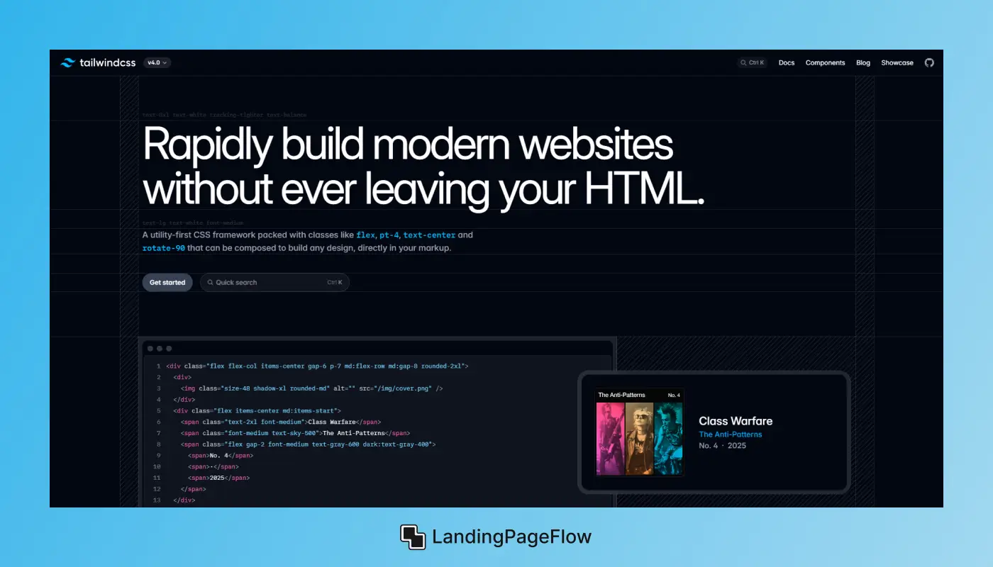
TailwindCSS is a utility-first CSS framework that provides a set of low-level utility classes designed to create custom designs without writing custom CSS.
It allows designers and developers to style their web pages by applying pre-made classes directly to the HTML elements.
Tailwind makes web design faster, more maintainable, and easier to scale, especially for modern web apps and landing pages.
Instead of defining your own styles from scratch or relying on other CSS frameworks, Tailwind offers an efficient way to create responsive and aesthetically pleasing web pages using ready-to-go utility classes.
2. Why Use TailwindCSS For Landing Pages?
Simplicity and Speed
With TailwindCSS, you don’t have to worry about custom styles for every element. Instead, you can apply pre-existing utility classes for spacing, typography, and other design properties.
This makes the design process faster and more efficient, especially for building landing pages that need to look professional in a short amount of time.
Flexibility and Customization
TailwindCSS provides a lot of flexibility, allowing you to quickly customize your design. You can easily tweak colors, fonts, spacing, and other design elements to match your brand’s look and feel, all without writing custom CSS.
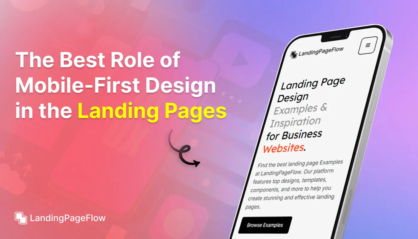
Mobile-First Design
TailwindCSS embraces the mobile-first philosophy, ensuring your landing pages look great on any device. By using utility classes like sm:, md:, and lg:, you can easily create responsive layouts for different screen sizes.
3. Getting Started with TailwindCSS

Before we dive into the specifics of landing page design, it’s important to get TailwindCSS up and running. Here’s a quick overview of how to do that.
Setting up TailwindCSS
To use TailwindCSS in your project, you can install it in one of two ways:
- Using CDN: For quick projects or prototypes, you can link to TailwindCSS directly from a CDN. This method is quick but less customizable.
- Using Node Package Manager (NPM): For more complex projects, it’s recommended to install TailwindCSS via NPM. This allows you to configure and customize Tailwind according to your needs.
For a thorough setup, you’ll need to install and configure TailwindCSS in your development environment, setting up a tailwind.config.js file for customizations.
4. Key Principles of Landing Page Design
Designing an effective landing page goes beyond just choosing the right framework. TailwindCSS makes the technical part easier, but the overall success of your landing page relies on strong design principles.
Simplicity
A landing page should have a clean design. Avoid cluttering your page with unnecessary content.
Keep your message clear, concise, and aligned with your goal. TailwindCSS’s utility classes allow you to structure content neatly and focus on what matters.
Clear Visual Hierarchy
A good landing page uses a visual hierarchy to guide visitors to take action. The most important elements (such as your call-to-action) should stand out with larger fonts, bold colors, or prominent placement. TailwindCSS helps you control every aspect of the design, from font sizes to colors and spacing, ensuring that the visual flow leads users toward conversion.
Responsive Design
A successful landing page is responsive and works well across all devices. With TailwindCSS, you can easily create responsive designs by using the mobile-first grid system and media queries.
It’s important to ensure that your page looks great on desktop, tablet, and mobile devices.
5. Building a Basic Landing Page Using TailwindCSS
Now let’s discuss how to start building your landing page using TailwindCSS. The framework is structured around a simple, mobile-first grid system that makes creating a responsive layout easy.
Layout and Grid System
TailwindCSS uses a flexible grid system that helps you design both simple and complex layouts. It comes with built-in classes to define columns and rows, allowing you to structure your landing page with ease.
Styling Elements (Typography, Buttons, Forms)
TailwindCSS also provides utility classes for styling elements such as buttons, forms, and typography.
You can quickly adjust padding, margin, font size, colors, and more, ensuring that every element fits perfectly into your design.
6. Designing Key Sections For Your Landing Page
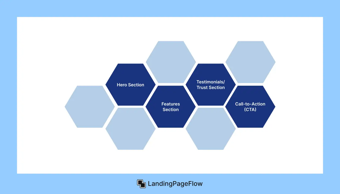
A successful landing page often includes several key sections. Here’s how you can design them with TailwindCSS:
Hero Section
The hero section is typically the first thing visitors see. It’s important to make it visually striking and clear. TailwindCSS allows you to control the typography, background, and layout of the hero section, ensuring it grabs attention immediately.
Features Section
Next, you’ll want to showcase the features or benefits of your product or service. Use Tailwind’s grid system to present your features in an organized and appealing way.
You can also add icons or images to make the features more engaging.
Testimonials/Trust Section
Social proof is essential for building trust with visitors. Create a testimonials section using TailwindCSS to present customer reviews or case studies in an organized and visually appealing format.
Call-to-Action (CTA)
A strong CTA is the heart of any landing page. With TailwindCSS, you can create buttons that stand out, whether through bold colors, large text, or clear wording. Tailwind’s utility classes make it easy to adjust the look and feel of your CTA.
7. Customizing Your Design with TailwindCSS

TailwindCSS offers extensive customization options. You can tailor colors, fonts, spacing, and more to match your brand.
Tailwind Config Customization
You can modify the tailwind.config.js file to change default settings, such as colors, spacing, and breakpoints.
This customization allows you to align the design with your brand’s specific style guide.
Utility-First Approach to Design
TailwindCSS works best when you embrace its utility-first approach. Instead of writing custom CSS for each element, apply utility classes directly to HTML tags.
This approach ensures a fast workflow and makes it easier to adjust the design.
Dark Mode and Themes
TailwindCSS supports dark mode and themes out of the box. You can design your landing page to automatically adjust based on the user’s preferences or provide a toggle to switch between light and dark modes.
8. Optimizing Your Landing Page
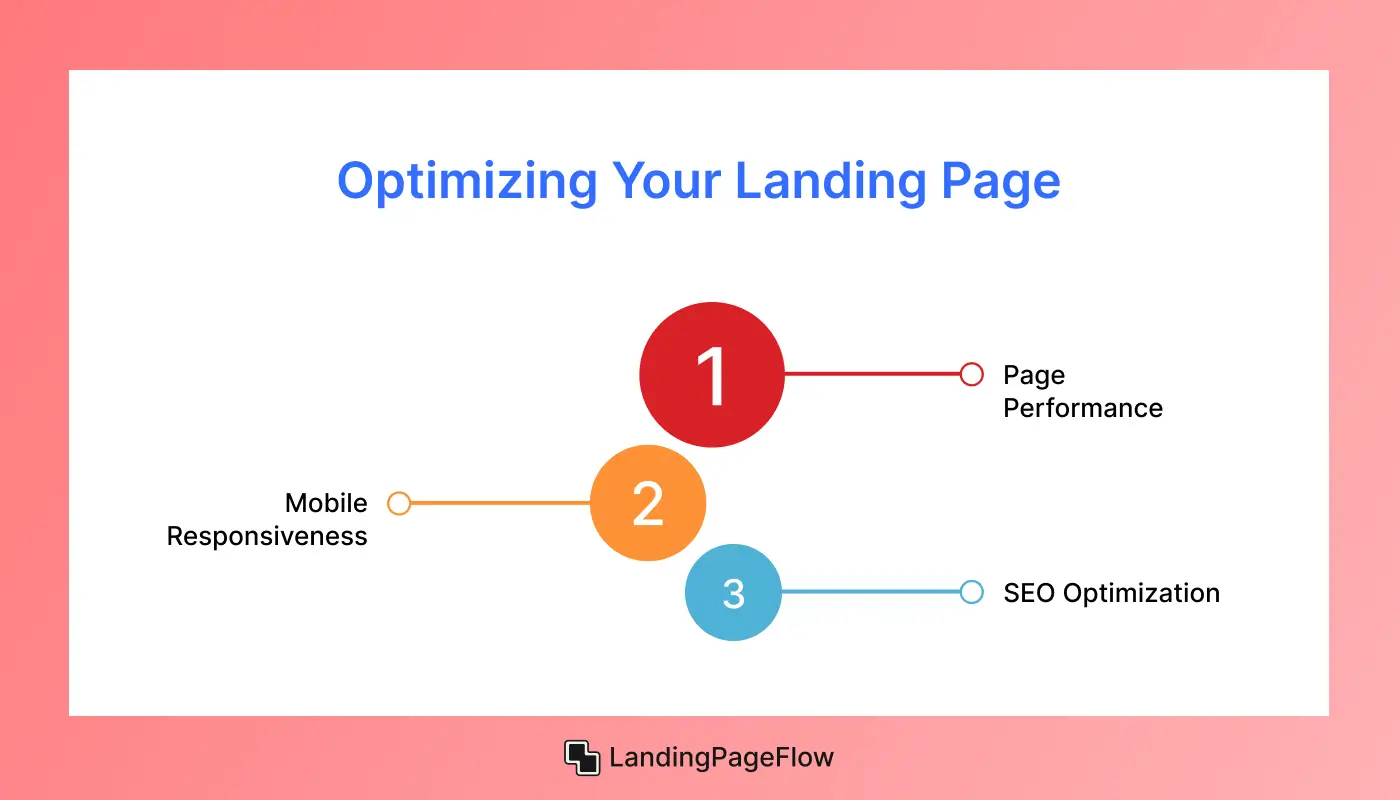
Once your landing page is designed, it’s crucial to optimize it for performance, mobile responsiveness, and SEO.
Page Performance
TailwindCSS is designed to keep your code minimal. However, using features like PurgeCSS can help eliminate unused CSS classes and reduce the file size, ensuring faster load times.
Mobile Responsiveness
Thanks to Tailwind’s mobile-first approach, your landing page will already be mobile-friendly. You can further fine-tune your design with responsive classes for different screen sizes.
SEO Optimization
Make sure your landing page is optimized for search engines. TailwindCSS doesn’t affect your SEO directly, but a clean, structured design will help improve accessibility, readability, and ranking.
9. Best Practices For Landing Page Conversion
To truly maximize conversions, you must follow the best practices in landing page design:
- Strong Headline: Make sure your headline communicates the value proposition.
- Visual Appeal: Use high-quality images and videos to grab attention.
- Minimal Distractions: Focus on one main goal with a clear CTA.
- Urgency and Scarcity: Use limited-time offers or countdown timers to encourage immediate action.
- A/B Testing: Continuously test different elements (like CTAs, headlines, and layouts) to find what works best for your audience.
Conclusion
Building trust and encouraging visitors to take action are two additional goals of an effective landing page beyond having eye-catching graphics.
TailwindCSS empowers creators to achieve this by simplifying the process while elevating design quality. Many businesses struggle to balance speed, responsiveness, and creativity, yet TailwindCSS delivers all three seamlessly.
The flexibility it offers ensures that landing pages are not only functional but also visually appealing. Choosing TailwindCSS means investing in a scalable framework that continues to evolve alongside digital design trends.
Brands that adopt it gain a distinct advantage, crafting pages that convert consistently. It’s time to transform your landing page design process into a streamlined, result-driven experience.

FAQ
1. Why use TailwindCSS for landing pages?
TailwindCSS speeds up the design process, ensures responsive layouts, and allows full customization while keeping code clean and efficient.
2. Can beginners use TailwindCSS effectively?
Yes, beginners can quickly grasp its utility-first approach. It simplifies styling and reduces complexity compared to writing custom CSS from scratch.
3. Is TailwindCSS better than frameworks like Bootstrap?
TailwindCSS offers greater flexibility and design freedom, whereas Bootstrap relies heavily on predefined components that may limit creativity.
4. Will TailwindCSS landing pages perform well on mobile?
Absolutely. TailwindCSS is built for responsiveness, ensuring that landing pages load fast and adapt seamlessly across all devices.
5. Do TailwindCSS pages rank well in SEO?
Yes, TailwindCSS produces lightweight, clean code, which improves loading speed—a critical factor for SEO and user engagement.
6. Can I integrate TailwindCSS with other tools or CMS platforms?
TailwindCSS integrates smoothly with frameworks, CMS platforms, and modern workflows, making it adaptable for any project requirement.

Ansif


.webp)

