Success online often comes down to how effectively you design and structure your landing page. Businesses that master this art consistently turn casual visitors into engaged leads.
Every element matters, from layout choices to color psychology, ensuring that the page resonates with your target audience. Clear messaging and compelling visuals further increase impact. Strong landing pages guide users effortlessly toward a single goal, reducing friction and keeping distractions to a minimum.
Research shows that top-performing examples share key principles that work across industries. Brands that apply these strategies see measurable improvements in engagement and sales.
Effective headlines grab attention immediately, while trust signals like testimonials and reviews build confidence. Smart use of whitespace creates balance and clarity for easier navigation.
From persuasive copy to seamless visuals, studying proven models provides clarity for your own strategy. Taking inspiration from successful designs is not about copying but adapting proven principles.
"Need clarity on what makes landing pages succeed?
Grab your free expert strategy guide & transform your online presence."
Table of Contents
- Introduction
- Example 1: Shopify’s Free Trial Landing Page
- Example 2: Airbnb Host Sign-Up Page
- Example 3: Netflix Free Trial Landing Page
- Example 4: Uber Driver Recruitment Page
- Key Takeaways For High-Converting Landing Pages
1. Introduction

Landing pages are critical to any successful digital marketing strategy. High-performing landing pages share common characteristics, including compelling copy, a clear call-to-action (CTA), and engaging visuals that guide the user to take action.
By examining some of the best landing pages from well-known brands, you can better understand how to create a page that not only attracts visitors but converts them.
2. Example 1: Shopify’s Free Trial Landing Page
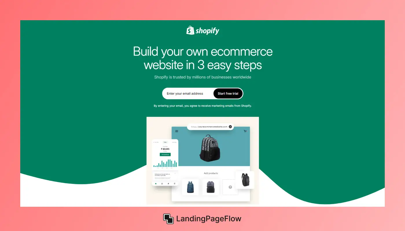
Why it Works?
- Clear Value Proposition: Shopify’s headline, “Start your free trial,” immediately communicates the benefit of the page.
- Minimal Distractions: The page is clean and focused solely on signing up for the free trial, with no additional links to divert attention.
- Simple, Effective CTA: The “Start free trial” button is bold, in a contrasting color, and strategically placed for easy access.
- Social Proof: Shopify includes trusted logos of companies using their service, building credibility and trust with new users.
Lessons to Apply:
- Make your value proposition immediately clear to the visitor.
- Use social proof, such as logos or testimonials, to enhance credibility.
3. Example 2: Airbnb Host Sign-Up Page
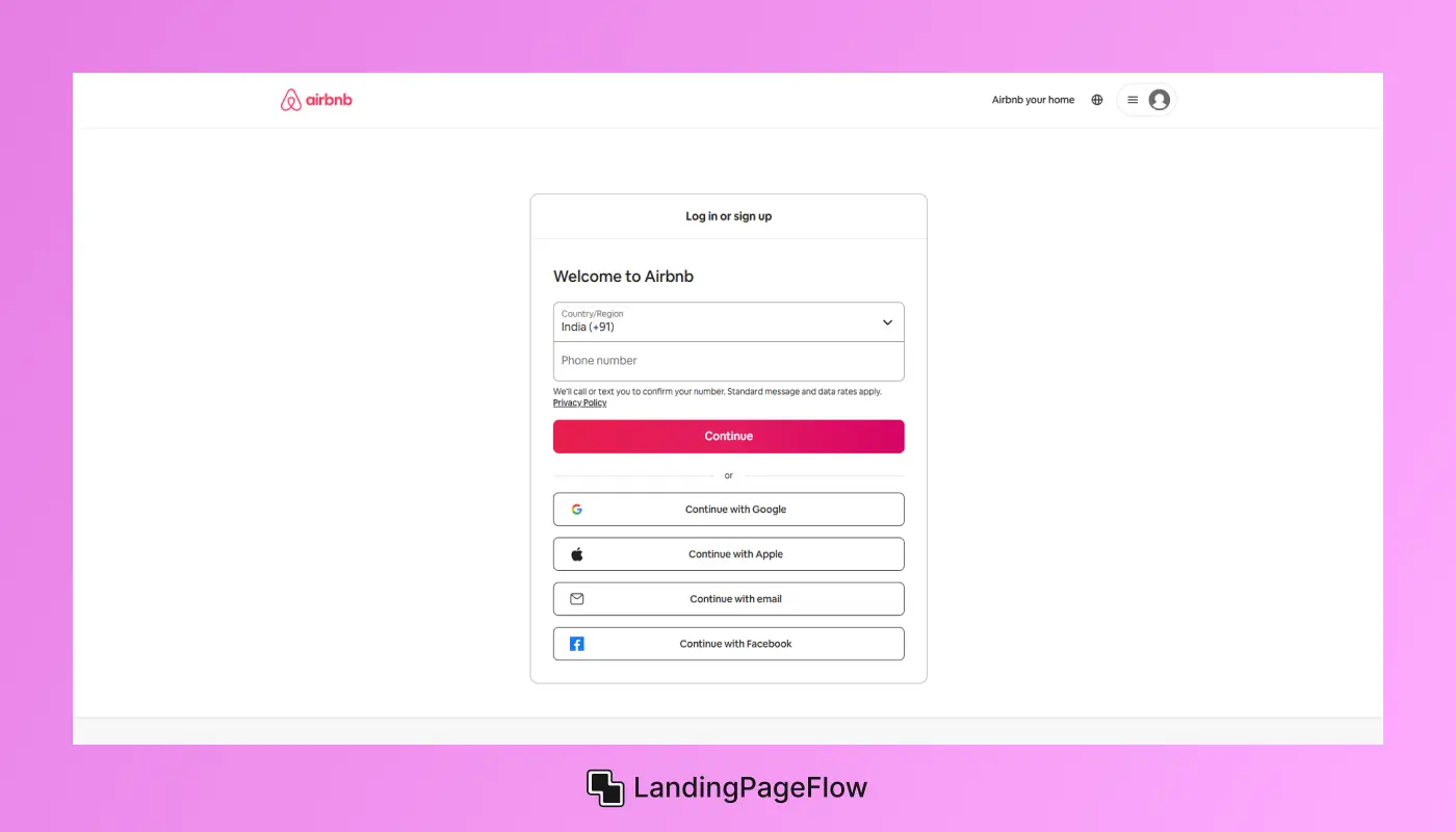
Why it Works?
- Personalized Experience: The headline is personalized, reading, “Make Extra Income as a Host.” This speaks directly to the visitor’s interest in earning extra money.
- Use of Video: Airbnb includes a short video showing real hosts, creating a relatable experience for the visitor.
- Clear Earnings Potential: The page includes a calculator that estimates potential earnings based on location, providing an immediate answer to the visitor’s question of “What’s in it for me?”
- CTA Focus: The CTA is a simple, high-contrast button labeled “Get Started,” making it easy for visitors to take the first step.
Lessons to Apply:
- Personalize your landing page to resonate with the visitor’s interests.
- Use interactive elements, like calculators or quizzes, to increase engagement.
4. Example 3: Netflix Free Trial Landing Page
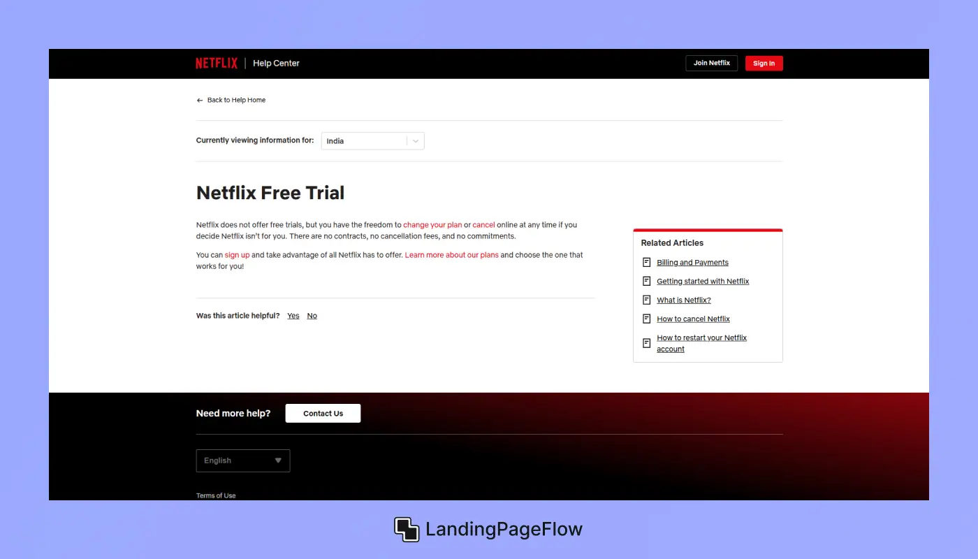
Why it Works?
- No Risk for the User: Netflix uses a “Cancel Anytime” message, reassuring users they won’t be tied down.
- Visuals of the Product Experience: The page shows Netflix on multiple devices, highlighting its versatility.
- Streamlined Sign-Up Process: The CTA reads, “Try 30 Days Free,” with a quick, two-step sign-up process that reduces friction.
- Consistent Branding: The page is dark and visually in line with the Netflix brand, with recognizable red buttons for action.
Lessons to Apply:
- Reduce user hesitation by addressing common concerns like canceling or costs.
- Keep the process simple with minimal steps to complete the conversion.
5. Example 4: Uber Driver Recruitment Page
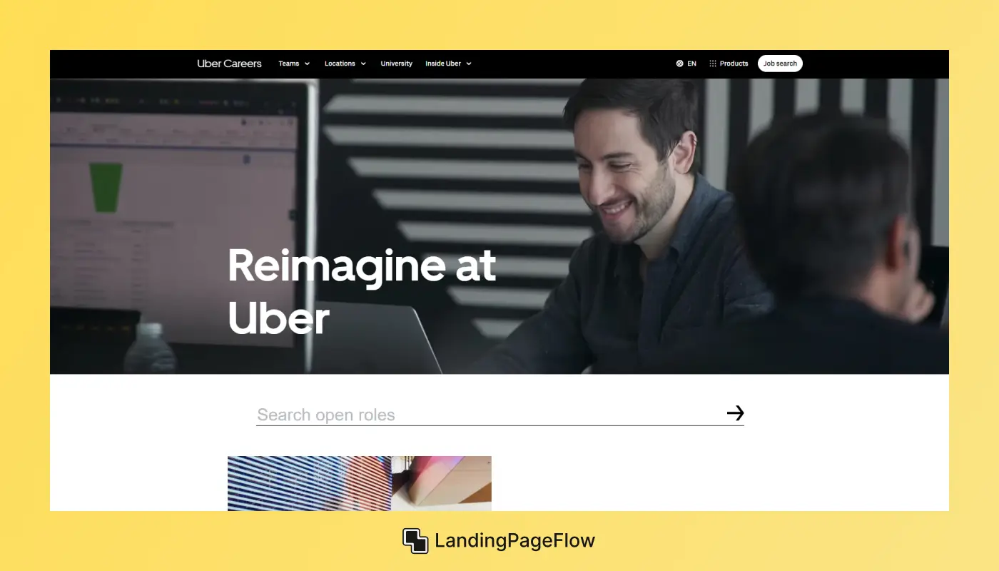
Why it Works?
- Targeted Headline: The headline “Earn Money on Your Schedule” appeals directly to Uber’s target audience – individuals looking for flexible income.
- Personalized Calculator: Like Airbnb, Uber includes a calculator showing potential earnings based on hours worked, which is highly relevant to their audience.
- Social Proof: The page highlights testimonials from current drivers, adding credibility and trust.
- No-Nonsense CTA: The CTA, “Sign up to drive,” is straightforward and action-oriented, making it clear what the visitor’s next step should be.
Lessons to Apply:
- Provide specific, relevant benefits that address the visitor’s needs.
- Include testimonials or user-generated content to create trust and relatability.
6. Key Takeaways For High-Converting Landing Pages
Each example demonstrates core elements that make these landing pages successful. Here’s how you can apply these strategies:
- Clarity in Messaging: Clear, concise headlines that communicate the page’s value make it easy for visitors to understand the benefits quickly.
- Strong CTA: The CTA should be prominent, action-oriented, and visually distinct from other elements on the page.
- Reduce Friction: Minimize the number of steps needed to complete the desired action and address common concerns to ease decision-making.
- Trust Signals: Social proof, customer testimonials, and recognizable brands help build trust with new users.
- Visual Consistency: Design should match the brand, and visuals should support the product or service experience without overwhelming the page.
Conclusion
Great landing pages are more than attractive designs; they are strategic tools crafted to guide users toward a decision. Brands that invest in these details see long-term rewards.
Looking at proven examples allows marketers to recognize patterns that influence trust, persuasion, and clarity. Every element plays a role in reducing doubt and driving action. Conversion rates often rise when attention is placed on simplicity and value delivery.
Visitors respond positively to pages that communicate benefits without unnecessary complexity. Adopting high-performing techniques ensures your landing page delivers measurable business impact.
Clear CTAs, responsive layouts, and smart copywriting make the difference. Future-ready businesses understand that user behavior evolves quickly. Regularly studying and applying insights from top examples keeps you competitive in a crowded market.

FAQ
1. What defines a high-performing landing page?
A high-performing landing page is one that successfully guides visitors toward a specific goal, such as sign-ups or sales, while maintaining clarity and engagement.
2. How can design impact landing page conversions?
Design directly affects user experience. Clear layouts, strong visuals, and focused CTAs reduce confusion and increase the likelihood of conversions.
3. Do I need different landing pages for different campaigns?
Yes. Tailoring each landing page to a specific audience or campaign improves relevance, which increases user trust and drives higher engagement.
4. Why is mobile responsiveness essential for landing pages?
Most users browse on mobile devices. A mobile-optimized landing page ensures accessibility, faster loading, and seamless navigation for all visitors.
5. What role do testimonials play on landing pages?
Testimonials and reviews serve as trust signals. They validate your offering and help potential customers feel more confident in making a purchase.
6. How often should I update my landing page design?
Regular updates are key. Testing different versions and analyzing performance ensures that your landing page evolves alongside user behavior and trends.

Ansif


.webp)


