Developing a guided experience for your audience is more important than merely using eye-catching graphics when designing a digital product landing page that converts. Every section must flow naturally, leading visitors toward action without distractions.
Successful landing pages rely on clear messaging, persuasive copy, and intuitive layouts that remove barriers to conversion. A well-crafted page builds trust while showcasing the unique benefits of your product.
Attention spans online are short, so your design must combine clarity with creativity to keep users engaged. Strong visuals, concise headlines, and compelling calls to action make the difference between a bounce and a conversion.
Your landing page should act as a bridge between curiosity and commitment. By aligning design choices with user psychology, you encourage visitors to act confidently.
An effective structure blends storytelling and strategy, ensuring every scroll reveals value. Optimizing for conversions means testing, refining, and enhancing both design and messaging.
"Unsure why your landing page isn’t working?
Grab your free guide today & learn proven methods that boost results."
Table of Contents
- Why Landing Page Design Matters For Digital Products?
- Elements of an Effective Digital Product Landing Page
- Best Practices For Designing a High-Converting Landing Page
- Optimization Strategies to Maximize Conversions
- Examples of Successful Digital Product Landing Pages
- Common Pitfalls to Avoid in Landing Page Design
1. Why Landing Page Design Matters For Digital Products?
A landing page serves as the bridge between your digital product and its target audience. Unlike a general website page, which might serve multiple purposes, a landing page is single-minded in its focus: to convert visitors.
Reasons Landing Pages Are Essential
- Focused Attention: Visitors are funneled toward one specific action, reducing distractions and improving the likelihood of conversions.
- Showcase Value Quickly: With a clean layout and clear messaging, visitors can immediately understand the value of your product.
- Boost Credibility: Elements like testimonials, trust badges, and social proof build confidence in your brand.
Without a compelling and well-optimized landing page, even the best digital products can struggle to gain traction.
2. Elements of an Effective Digital Product Landing Page
An effective landing page balances design, content, and user psychology. Here are the essential elements that every successful page needs:
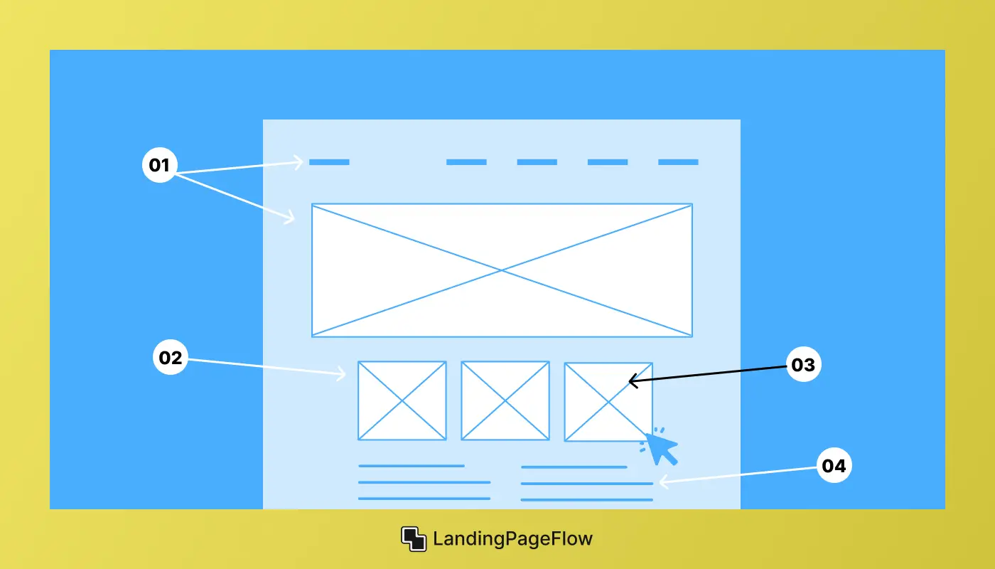
1. Attention-Grabbing Headline
- Your headline is the first thing visitors notice. It should succinctly convey the product’s core benefit.
- Example: “Effortless Task Management—Streamline Your Workflow Today!”
2. Supporting Subheadline
- Expand on the headline to provide context and highlight what makes your product unique.
- Example: “Save weekly hours with our intuitive, AI-powered task manager.”
3. High-Impact Visuals
- Use visuals like product screenshots, demo videos, or animations that demonstrate your product in action.
- Ensure all images are high-quality and mobile-friendly.
4. Clear Value Proposition
- Identify the pain points your product solves and explain how it benefits the user.
- Example: “No more juggling multiple tools. Manage your entire workflow in one place.”
5. Engaging Call-to-Action (CTA)
- Create bold and direct CTAs that guide visitors toward the desired action.
- Example: “Start Your Free Trial” or “Download Now.”
- Use contrasting colors to ensure the CTA stands out on the page.
6. Social Proof
- Incorporate user testimonials, reviews, or case studies to establish trust.
- Display logos of brands or media outlets that have endorsed your product.
7. Feature Highlights
- Use bullet points, icons, or short paragraphs to showcase key features.
- Focus on benefits, explaining why each feature matters to the user.
8. Transparent Pricing
- If pricing applies, present it clearly. Offer comparison tables for multiple tiers, highlighting the most popular option.
9. Frequently Asked Questions (FAQ)
- Address common objections or uncertainties to reassure potential customers.
10. Mobile Responsiveness
- A significant portion of traffic comes from mobile devices, so ensure your landing page adapts seamlessly to smaller screens.
3. Best Practices For Designing a High-Converting Landing Page

1. Prioritize Simplicity
A cluttered design can overwhelm visitors. Stick to clean layouts and focus on your primary goal: conversion.
2. Maintain a Visual Hierarchy
- Use size, color, and positioning to guide visitors’ attention to critical elements like the headline, visuals, and CTA.
- Place your main CTA above the fold, but repeat it throughout the page for emphasis.
3. Consistent Branding
Ensure your landing page aligns with your overall brand identity, including fonts, colors, and tone of voice.
4. Leverage White Space
White space keeps your design uncluttered, helping key information stand out.
5. Use Interactive Elements
Features like sliders, hover effects, or clickable tabs can make your page more engaging.
4. Optimization Strategies to Maximize Conversions
Building the landing page is only half the battle. Optimizing it continuously is what drives long-term success.
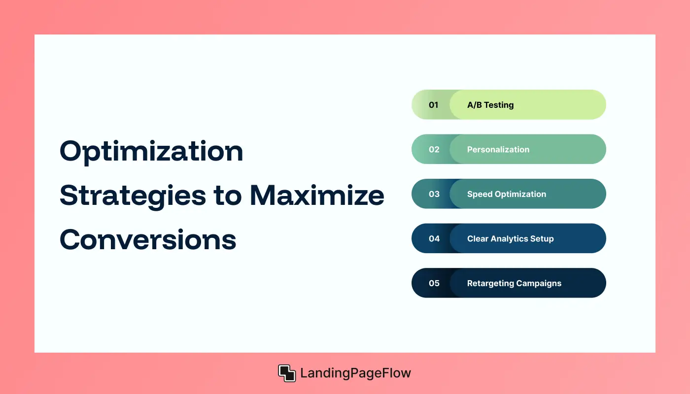
1. A/B Testing
- Experiment with different headlines, layouts, CTAs, and imagery.
- Focus on measurable improvements, like click-through rates and time spent on the page.
2. Personalization
- Dynamic content can tailor the experience based on the visitor’s location, behavior, or referral source.
3. Speed Optimization
- Slow-loading pages lose potential customers. Use tools like Google PageSpeed Insights to monitor and improve performance.
4. Clear Analytics Setup
- Tools like Google Analytics and heatmaps provide insights into visitor behavior, helping you identify drop-off points.
5. Retargeting Campaigns
- Use retargeting ads to re-engage visitors who didn’t convert on their first visit.
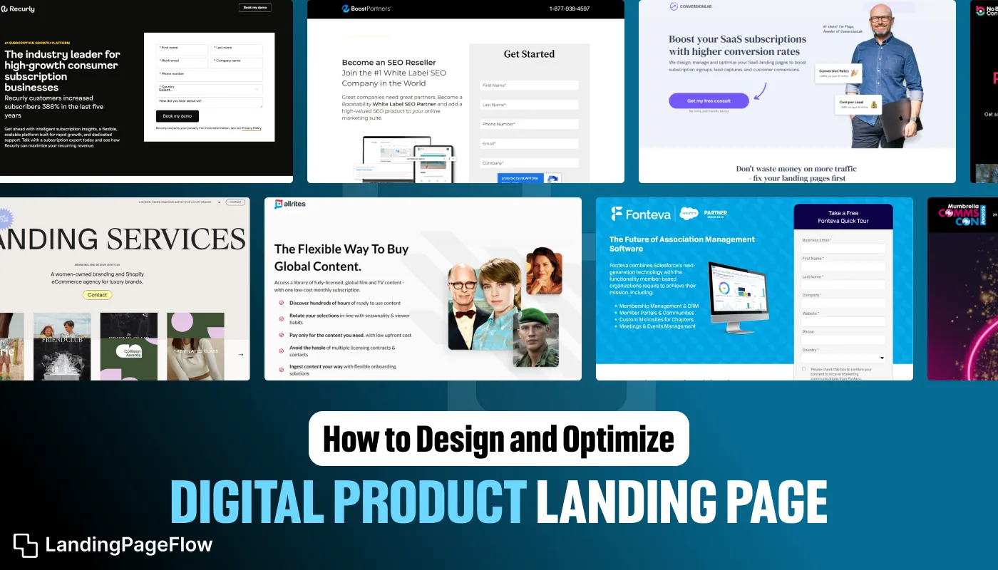
5. Examples of Successful Digital Product Landing Pages
Dropbox
- Headline: “Keep Life Organized. Anytime. Anywhere.”
- Why It Works: Minimalist design, strong social proof, and a clear CTA.
Slack
- Headline: “Where Work Happens.”
- Why It Works: A bold and concise value proposition paired with a visually engaging demo.
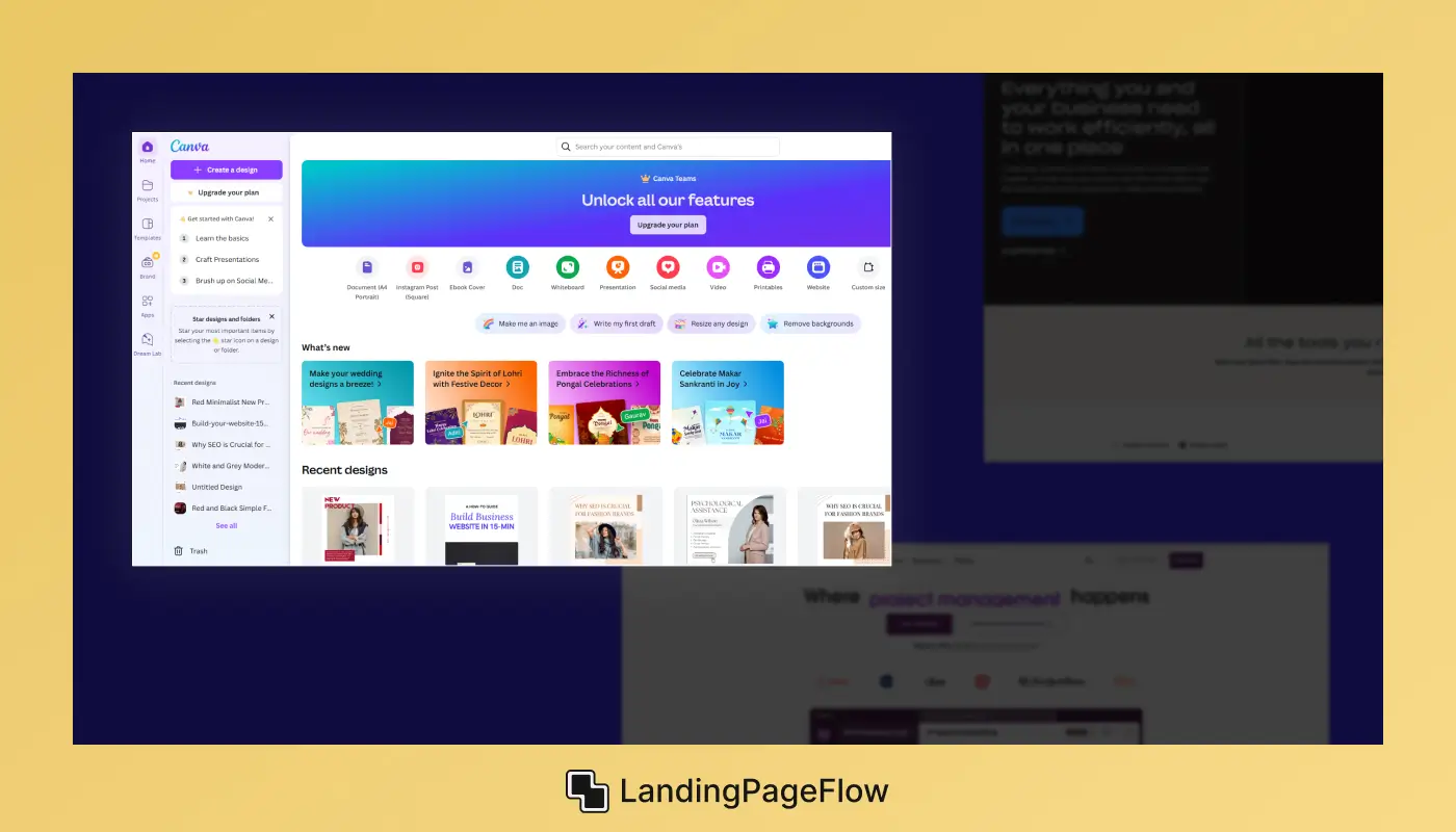
Canva
- Headline: “Design Anything. Publish Anywhere.”
- Why It Works: Vibrant visuals and a focus on user empowerment.
6. Common Pitfalls to Avoid in Landing Page Design
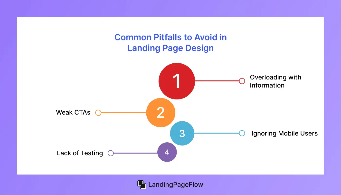
1. Overloading with Information
Too much text or unnecessary details can overwhelm and confuse visitors.
2. Weak CTAs
Generic CTAs like “Submit” fail to inspire action. Use actionable, benefit-driven language instead.
3. Ignoring Mobile Users
A non-responsive design alienates a significant portion of your audience.
4. Lack of Testing
Failing to test your page can leave you unaware of optimization opportunities.
Conclusion
The combination of both planning and imagination to create a digital product landing page that performs well. A clear message paired with effective design elements can build instant credibility.
Strong headlines, clean visuals, and well-placed CTAs keep users engaged while guiding them toward a decision. Every design choice should reduce friction and increase trust.
Performance is never static; ongoing testing and optimization help refine what works best for your audience. Even small changes can significantly improve conversions.
Conversion-driven design helps transform casual visitors into loyal customers. By focusing on clarity, psychology, and engagement, your page can consistently drive results.
Now is the moment to elevate your digital presence. A thoughtfully optimized landing page positions your product for long-term success and measurable business growth.

FAQ
1. What makes a digital product landing page effective?
An effective page uses clear messaging, persuasive design, and focused CTAs that guide visitors toward taking action without distractions.
2. How do I improve conversion rates on my landing page?
Test headlines, adjust layouts, refine CTAs, and optimize loading speed. Even small design and copy changes can drive significant improvements.
3. Should I include multiple CTAs on my landing page?
Yes, but they should align with one primary action. Place them strategically throughout the page to reinforce the conversion path.
4. What tools help optimize digital product landing pages?
Tools like Google Analytics, Hotjar, or A/B testing platforms give insights into user behavior and help refine page performance.
5. How important are visuals on a landing page?
Very important. Strong visuals build trust, highlight key benefits, and keep users engaged while reinforcing your brand identity.
6. Is mobile optimization necessary for conversions?
Absolutely. Most users browse on mobile devices, and a poorly optimized mobile landing page can drastically reduce conversion rates.

Ansif


.webp)


