Every digital brand knows that design choices can make or break a landing page. Visitors today expect smooth layouts, bold visuals, and messaging that instantly resonates.
Creating a landing page that performs well requires balancing creativity and strategy. From the headline to the final call-to-action, every section must serve a purpose.
Emotions play a crucial role in shaping visitor actions. Colors, typography, and visuals set the tone, while persuasive copy inspires users to stay longer and take action.
Marketers and designers can learn valuable lessons by studying what works for others. These insights reduce guesswork and allow you to build pages that speak directly to your audience.
Strong design isn’t about copying but understanding the principles behind success. By examining standout landing pages, you gain the tools to craft unique, impactful results.
"Ready to unlock the secrets of high-performing pages?
Grab your free expert guide & your landing page into a conversion powerhouse."
Table of Contents
- Introduction
- What Makes a Landing Page Design Great?
- Top Landing Page Designs and Key Takeaways
- Essential Elements For an Effective Landing Page
- Best Practices For Designing Your Landing Page
1. Introduction

Landing pages are single-purpose web pages crafted to persuade visitors to take a specific action, whether it’s signing up, making a purchase, or downloading a resource.
They’re optimized for conversions, designed to focus visitors on a single offer or goal.
By exploring some of the best landing page examples, you’ll discover the strategies and elements that help these pages convert, giving you a blueprint to improve your own landing page designs.
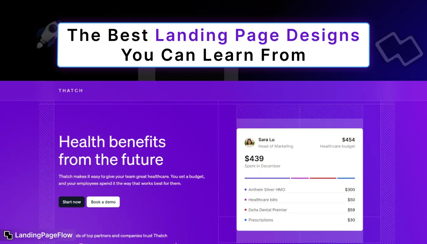
2. What Makes a Landing Page Design Great?

A great landing page is more than just eye-catching. It should be easy to navigate, have a clear call to action (CTA), and be designed with the target audience in mind. Some of the qualities of a high-performing landing page include:
- Concise, Clear Copy: The message should be simple.
- Strong Visuals: High-quality images or videos that highlight the product or service.
- Effective CTAs: Clear and compelling CTAs that drive action.
- Responsive Design: Optimized for both desktop and mobile devices.
- Fast Loading Speed: Quick load times to prevent bounce rates.
With these qualities in mind, let’s dive into some standout examples.
3. Top Landing Page Designs and Key Takeaways

a. Airbnb’s Hosting Page
- Overview: Airbnb’s landing page for prospective hosts focuses on enticing users to list their property.
The headline “Earn money as an Airbnb host” grabs attention with a promise, and the design features clean visuals and a simple form to estimate earnings. - What Works:
- Interactive Earnings Calculator: Users can immediately see potential earnings, making the offer more tangible.
- Minimalist Design: The layout is clean and free from distractions, keeping users focused on signing up.
- Social Proof: Testimonials from successful hosts add credibility.
- Takeaway: Use an interactive element, such as a calculator, to help visitors visualize the benefits of your product or service.
b. Shopify’s “Start a Business” Page
- Overview: Shopify’s landing page for new users emphasizes simplicity and user empowerment. With the headline “Bring your idea to life,” it encourages users to start their e-commerce journey.
- What Works:
- Clear, Action-Oriented CTA: The CTA, “Start free trial,” is prominent and repeated at multiple points.
- Short, Benefit-Driven Copy: Shopify briefly explains what users can achieve, appealing to entrepreneurial aspirations.
- Trust Signals: Customer testimonials, brand logos, and a brief overview of features build credibility.
- Takeaway: Keep your landing page copy short and focused on benefits, and use strong trust signals to assure users.
c. Slack’s “Why Slack?” Page
- Overview: Slack’s landing page targets businesses by highlighting productivity benefits and showing how teams can communicate more effectively using their platform.
- What Works:
- Compelling Headline: “Make work simpler, more pleasant, and more productive” immediately tells users how Slack can help them.
- Concise Visual Storytelling: Images and icons illustrate Slack’s functionality, reducing the need for lengthy explanations.
- Customer Stories: Case studies and testimonials reinforce Slack’s credibility and provide relatable use cases.
- Takeaway: Use customer stories and case studies to showcase real-world benefits and foster trust.
d. Squarespace’s Website Builder Page
- Overview: Squarespace’s landing page for website building showcases beautiful templates and focuses on the ease of building a website.
- What Works:
- Stunning Visuals: Images of template designs help visitors visualize their future website.
- Focus on Simplicity: The page emphasizes the ease of creating a website, appealing to beginners.
- Dynamic CTA: With a CTA like “Get Started,” the page encourages visitors to take immediate action.
- Takeaway: Showcase product visuals to help users imagine the possibilities and reduce perceived complexity.
e. Netflix’s Sign-Up Page
- Overview: Netflix’s landing page aims to convert visitors into subscribers, with a focus on the ease of canceling anytime.
- What Works:
- Simple Form Field: A single email field gets users started with minimal effort.
- Reassurance Copy: Phrases like “Cancel anytime” reduce perceived risk, making it easy for users to try the service.
- Bold CTA: “Get Started” is simple and inviting, reducing friction in the sign-up process.
- Takeaway: Use reassurance copy to reduce user hesitation and provide an effortless path to conversion.
4. Essential Elements For an Effective Landing Page

Headline
Your headline should capture attention and make it clear what your landing page offers. Keep it concise, benefit-driven, and aligned with your visitors’ needs.
Visuals
High-quality images, videos, or illustrations are crucial for showcasing your product or service and establishing an emotional connection with visitors.
Clear CTA
A strong CTA is essential for converting visitors. Make your CTA stand out with a bright color, and use action-oriented language, like “Get Started Now” or “Try Free.”
Social Proof
Customer testimonials, case studies, and reviews add credibility, showing visitors that others have benefitted from your product.
Minimal Navigation
To keep users focused on your offer, reduce navigation options. Limit distractions by removing unnecessary links and focusing on a single goal.
5. Best Practices For Designing Your Landing Page

a. Keep It Simple
Focus on one key message and a single CTA to avoid overwhelming visitors. Use a clean design to guide them towards the action you want them to take.
b. Optimize for Mobile
With the majority of users visiting websites on mobile devices, ensure that your landing page is responsive and offers a seamless experience on all screens.
c. Use A/B Testing
To find out what works best, try A/B testing different elements like headlines, CTAs, and images. Data-driven insights can help you optimize for higher conversions.
d. Speed Matters
A slow-loading landing page can deter visitors. Use compressed images, clean code, and fast-loading design to retain visitors and improve conversions.
Conclusion
Great landing page design goes beyond good looks. It delivers an experience that builds trust, simplifies navigation, and motivates users to act.
Every detail matters, from how fast the page loads to how compelling the headline sounds. When these elements align, conversion rates rise naturally. Brands that adapt their designs to changing user expectations stay ahead of the competition.
A thoughtful layout today can secure loyal customers tomorrow. Marketers who study winning examples gain confidence in shaping their own strategies. Design principles are universal, but application brings uniqueness to each page.
User-focused pages consistently outperform cluttered or confusing ones. Simplicity, structure, and relevance always win over flashy but unfocused designs.
Adopting lessons from the best allows you to build landing pages that don’t just attract traffic but convert visitors into long-term advocates for your brand.

FAQ
1. What makes a landing page design effective?
An effective landing page is clear, visually appealing, and user-focused. It guides visitors toward a specific goal without distractions.
2. How do colors influence landing page performance?
Colors trigger emotions and set the mood. For example, blue conveys trust, while red creates urgency, making color choice key for conversions.
3. Should I use long or short landing pages?
The length depends on your offer. Short pages work for simple products, while longer pages suit complex services requiring more explanation.
4. What role does mobile design play in 2026?
Mobile-first design is essential, as most users browse on smartphones. Responsive layouts and fast loading times directly improve results.
5. How many calls-to-action should a landing page have?
One clear primary call-to-action is best. Additional CTAs can be included, but they should support the same goal without confusing users.
6. How can I test the effectiveness of my landing page?
A/B testing is the best way. By comparing two versions of a page, you can measure which design, copy, or element produces higher conversions.

Ansif


.webp)


